
Brand identity
↓ Featured clients
Chicago Dental Specialists
RetailMeNot
Raise
Pure Dental Spa
CDT Remodeling
Barrier (Max Barrier 40)
Select logos + identities
A strong identity gives a brand something to stand on. DWC develops the visual language behind how a business looks, feels and communicates, shaping each element to work together with clarity and purpose. The goal is a brand that feels distinctive, consistent and true to itself.
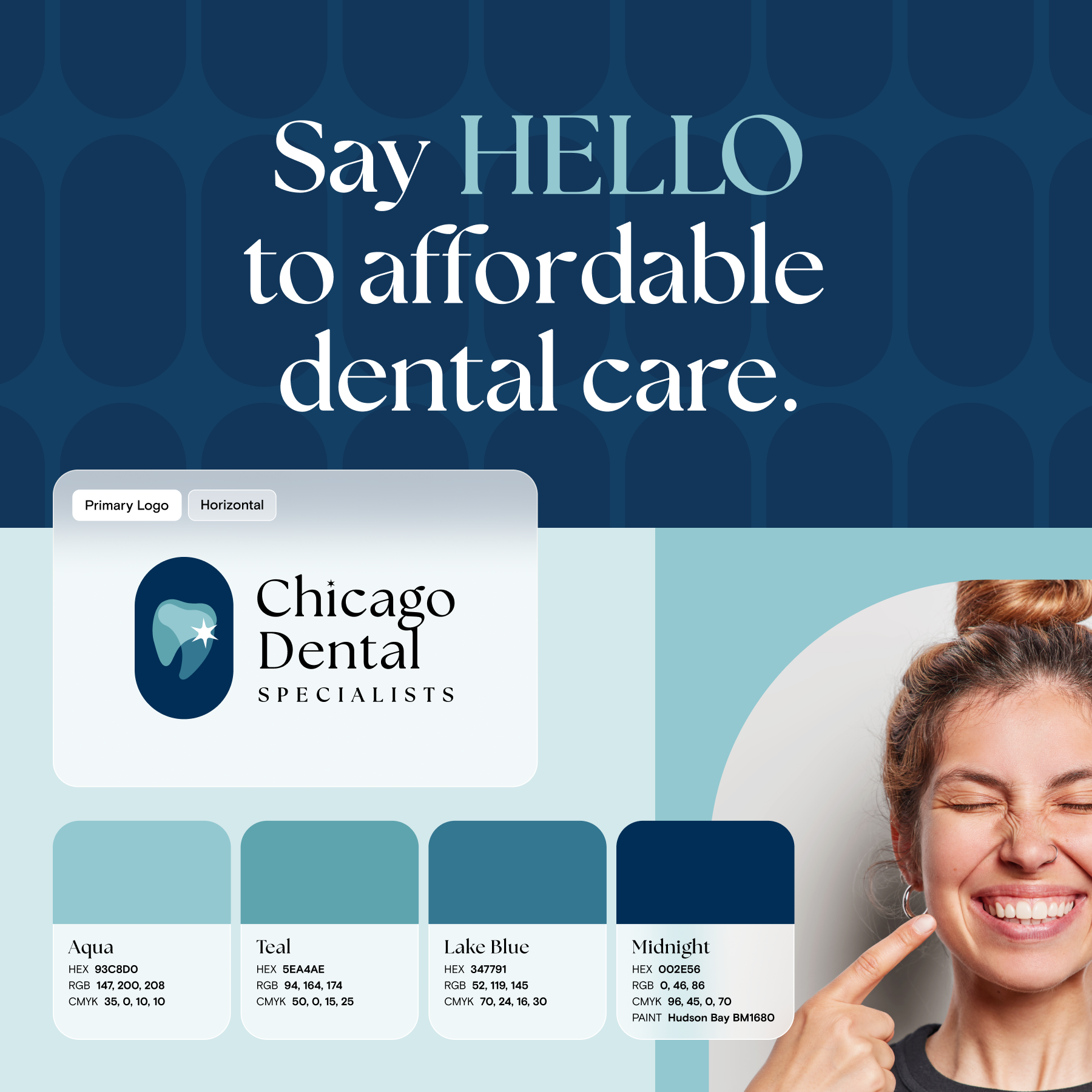
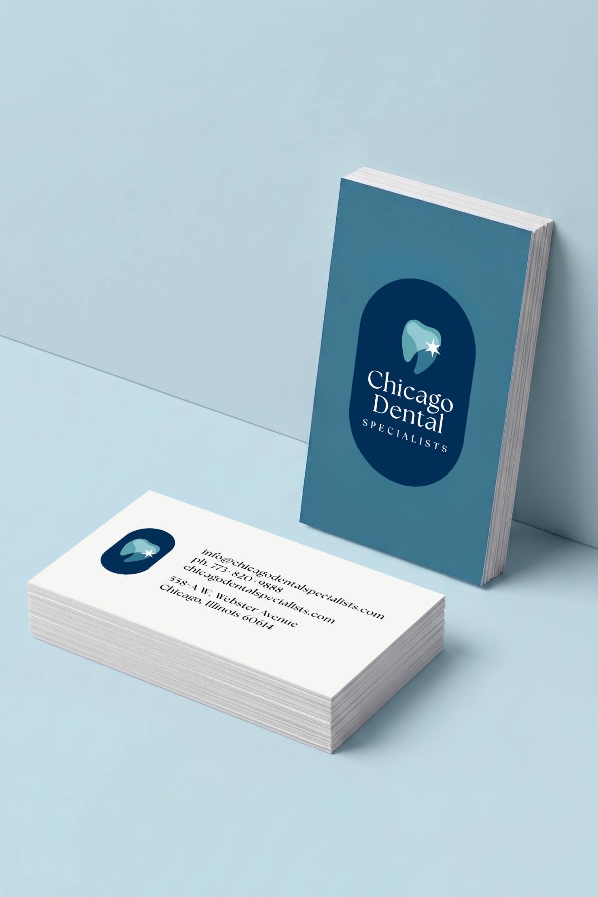
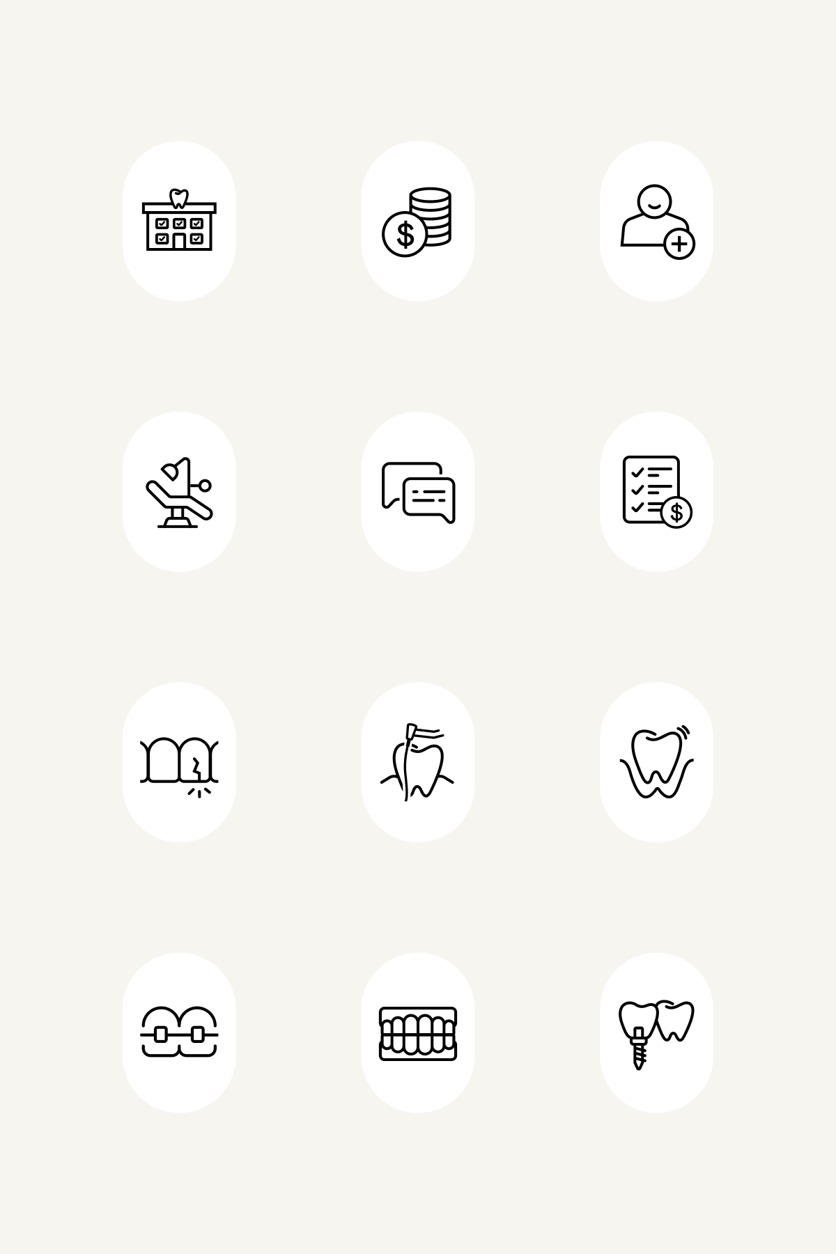
Chicago Dental Specialists
A specialty dental studio needed an identity that felt both expert and accessible. From logo and identity development through the full brand guidelines, each decision built toward a clear, ownable visual language—giving the practice a strong foundation and a recognizable presence from the very beginning.
↓ brand identity scope
Logo development
Iconography
Brand guidelines
Brand voice
Creative direction
Photography direction
Environmental brand direction
Business card design
Signage
site coming soon



RetailMeNot
An exploratory refresh helped reimagine how the RetailMeNot brand could look and behave across its broader ecosystem. The work expanded the visual identity through a more refined use of color, typography, imagery, iconography and supporting graphics, creating a framework for product and marketing to feel more connected.
↓ brand identity scope
Brand refresh concept
Visual identity development
Color + visual language
Iconography
Brand guidelines
Brand voice
Creative direction
Photography direction

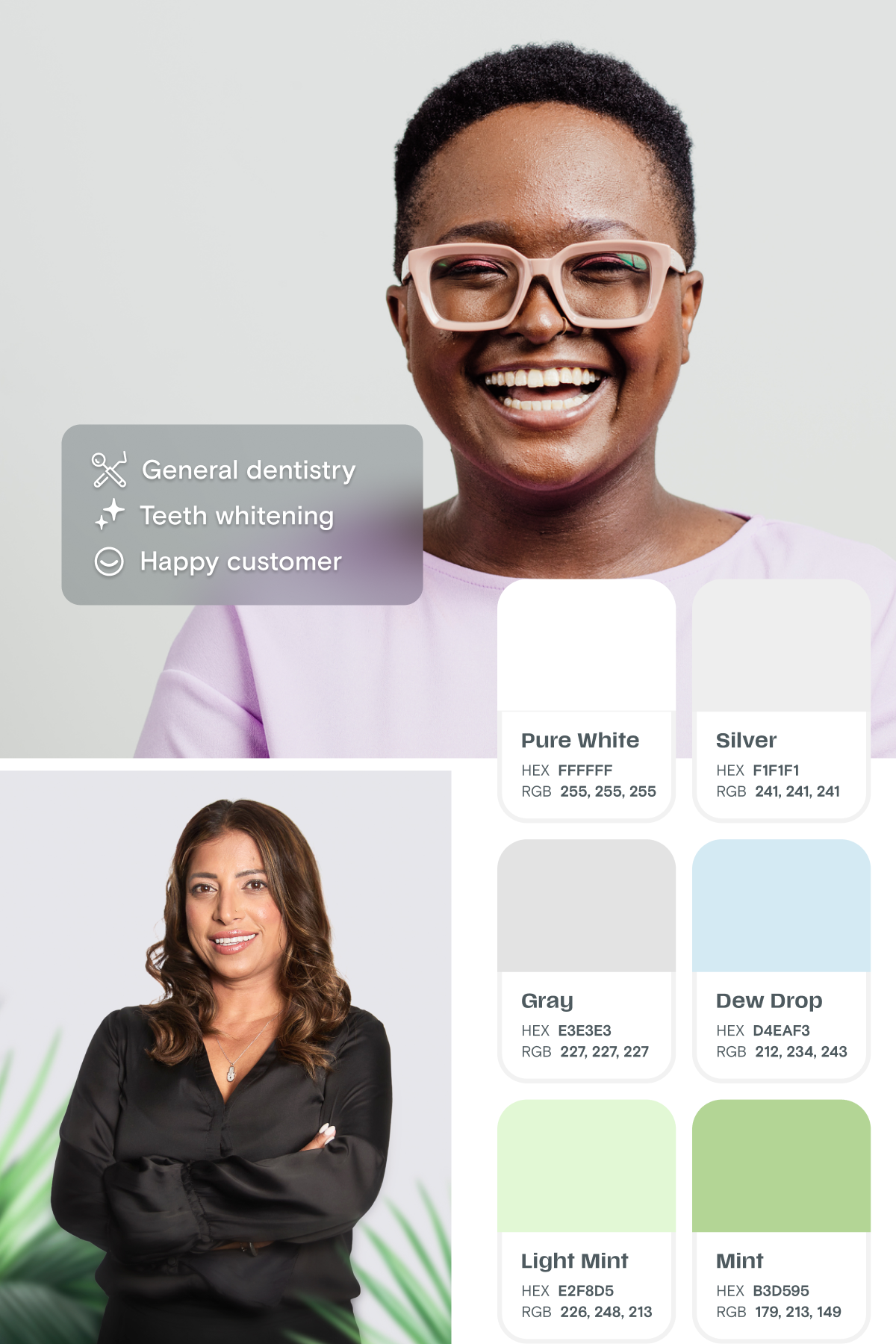
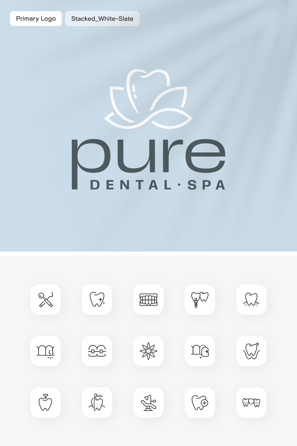
Pure Dental Spa
Comfort and hospitality shaped the identity from the start. Naming, logo development, brand voice, photography and environmental direction came together as a cohesive brand language, balancing the credibility of a dental practice with the calm, elevated feel of a spa.
↓ brand identity scope
Naming
Logo development
Iconography
Brand guidelines
Brand voice
Creative direction
Photography direction
Environmental brand direction
Business card design
Signage
Coming soon
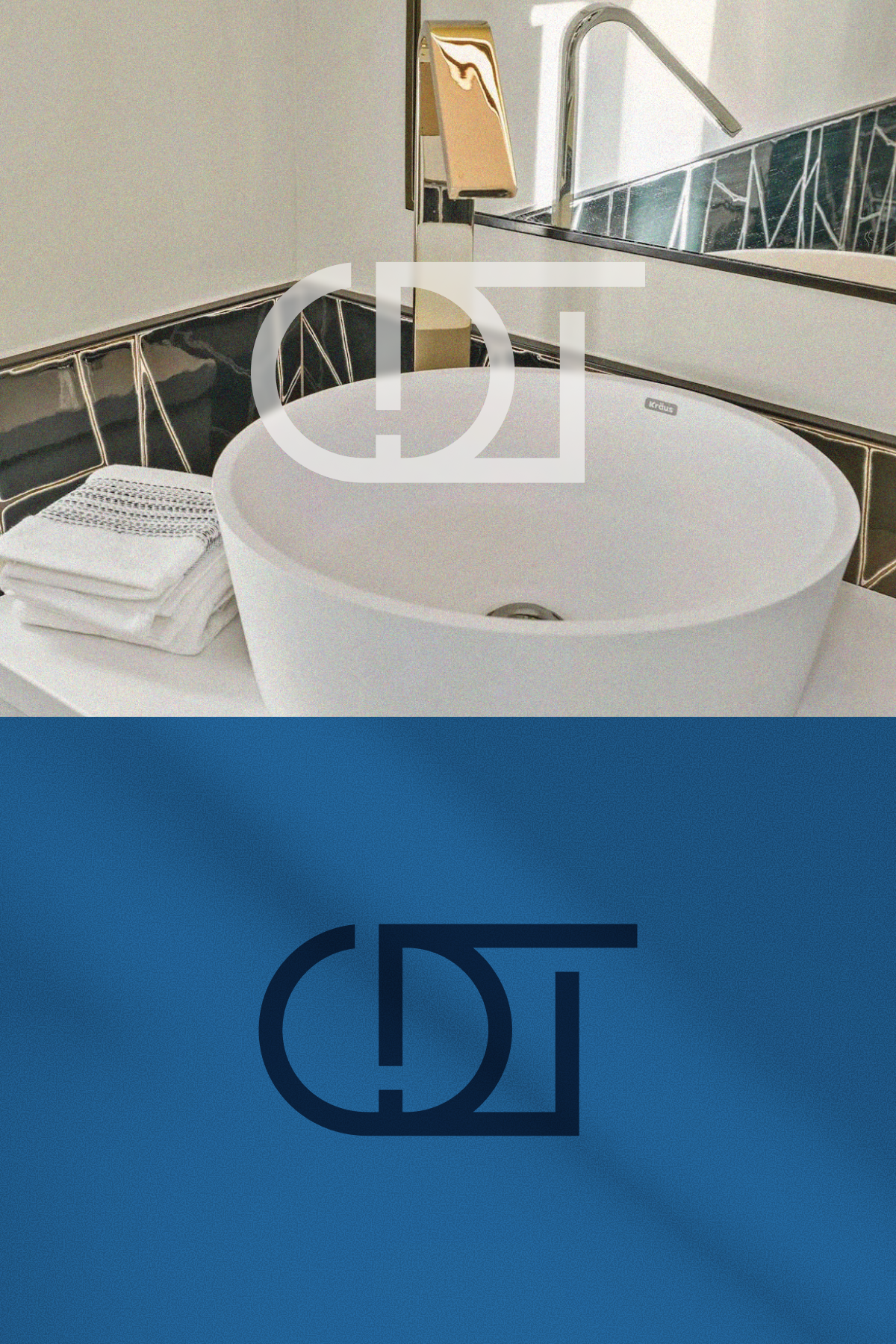
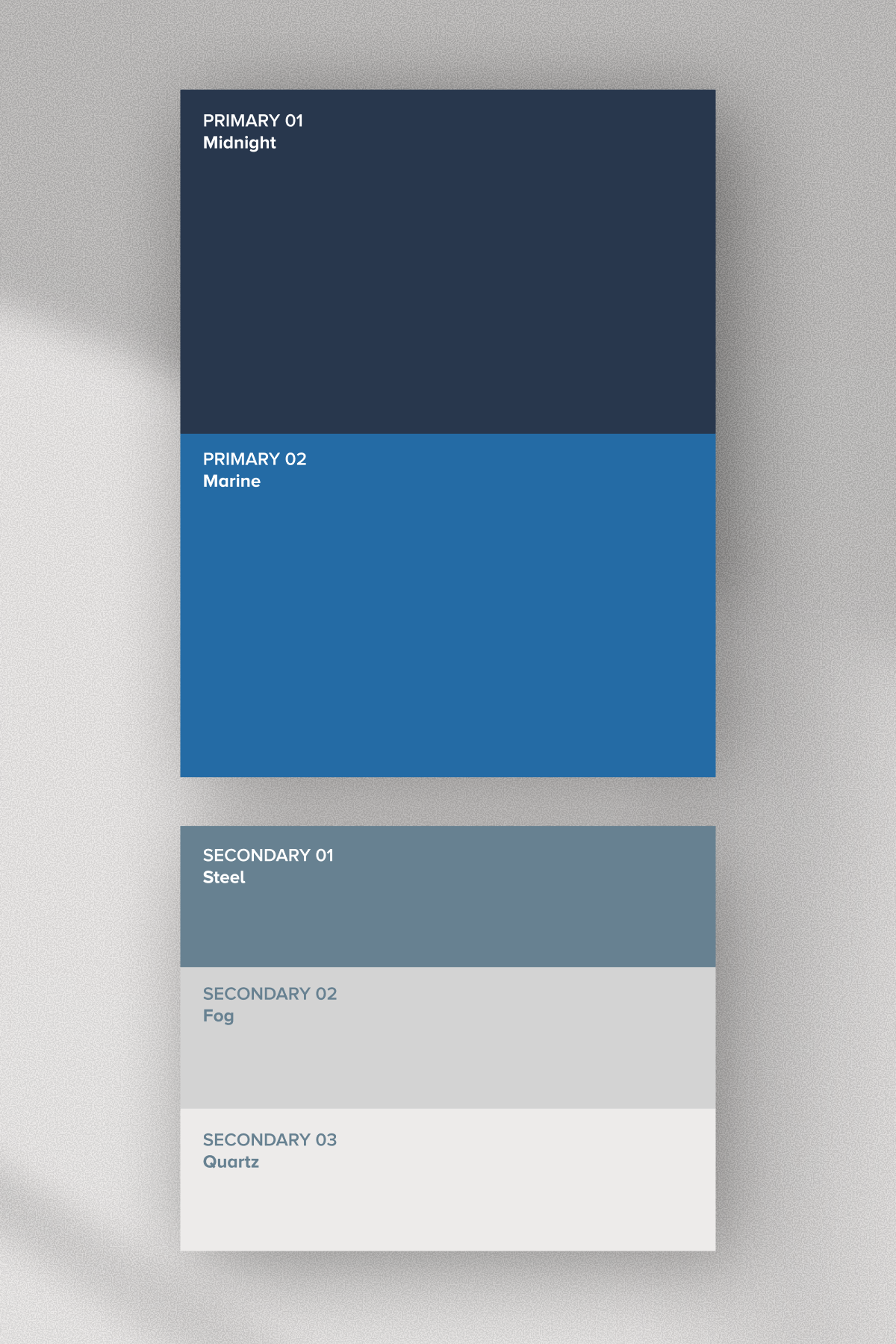
CDT Remodeling
Architectural structure became the foundation for an identity designed to feel as considered as the spaces being built. Linear forms inspired the custom monogram and broader visual language, resulting in a sophisticated, masculine brand with a clear connection to craftsmanship, structure and the remodeling process.
↓ brand identity scope
Logo + identity development
Iconography
Brand guidelines
Vehicle signage
Coming soon
Barrier
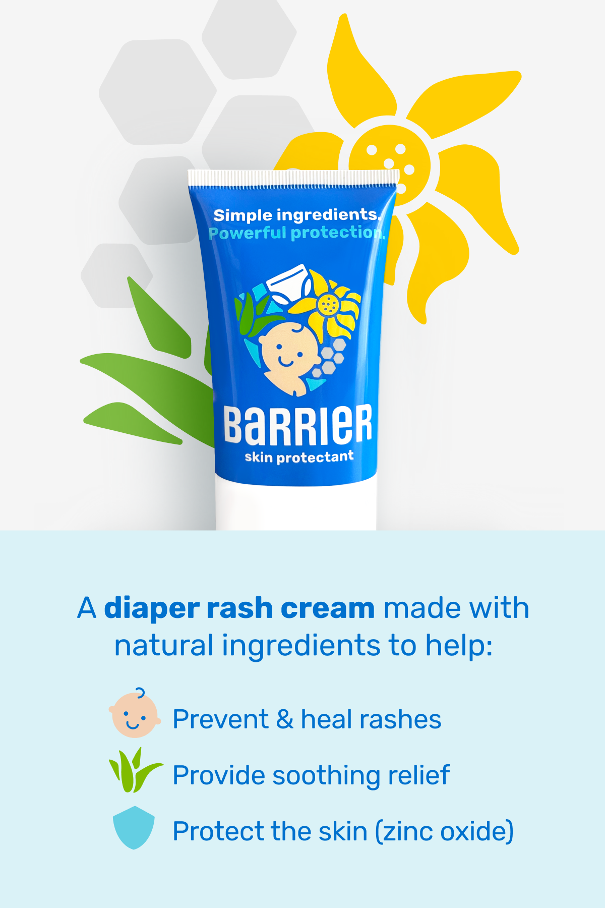
Protection made simple became the central idea behind the identity. Custom illustrations and iconography formed a playful visual language around the product’s natural ingredients, soothing benefits and family-first positioning, giving the brand a friendly presence without losing credibility.
↓ brand identity scope
Logo + identity development
Iconography + illustration
Brand voice
Creative direction
Photography direction
Coming soon
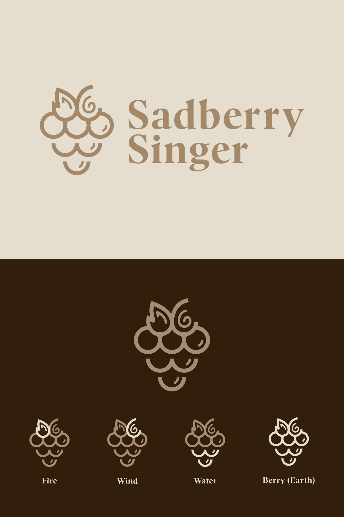
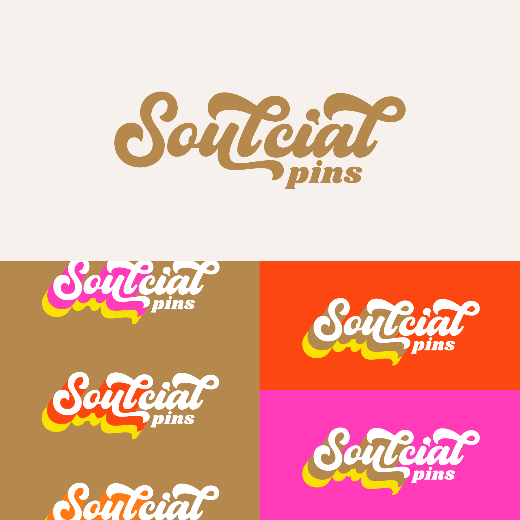
Select logos + identities
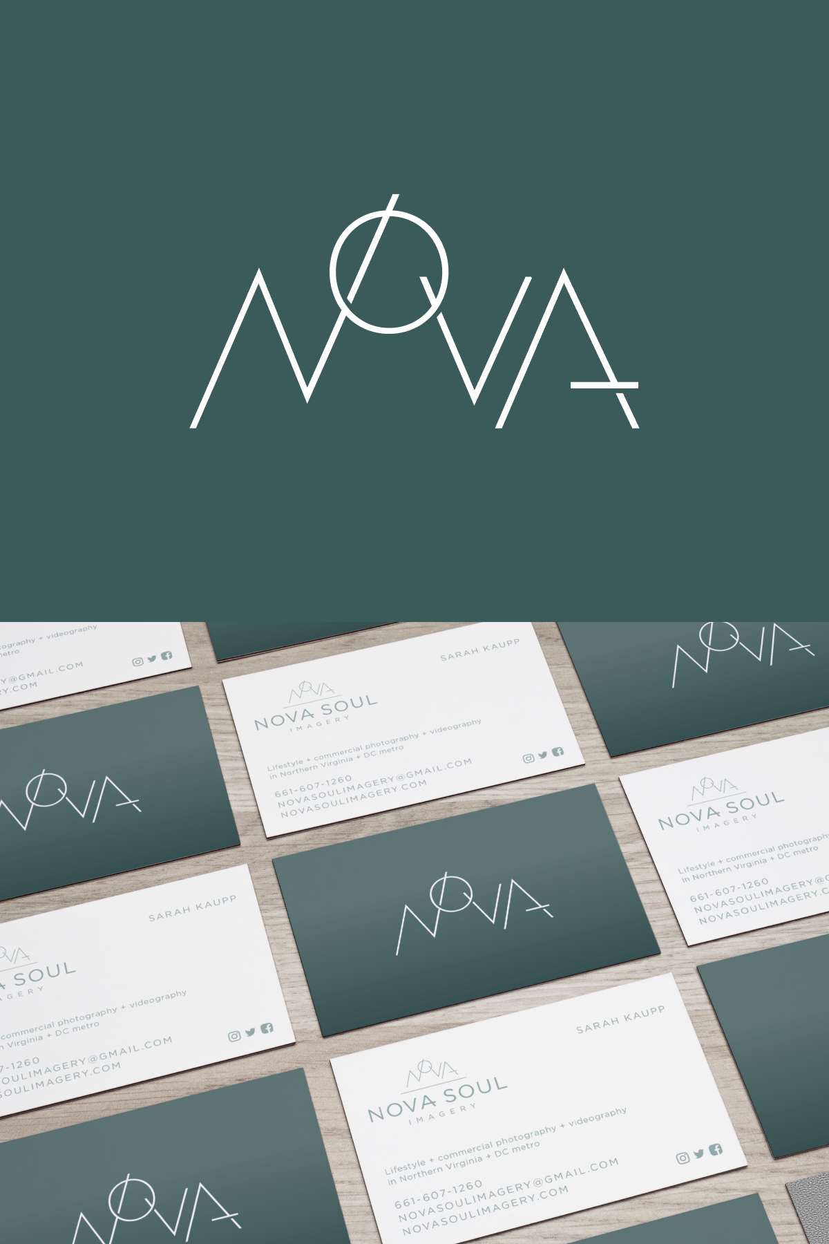
The work ranges from refined, minimal marks to more expressive logo systems and supporting brand elements. Each project was shaped around the personality and goals of the business, creating a visual direction that feels distinct, considered and never formulaic.
↓ brand identity scope
Logo + identity development
Iconography + illustration
Creative direction
Brand kit
Business card design
Coming soon