
Marketing + digital
↓ Featured clients
Chicago Dental Specialists
Raise
RetailMeNot
Pure Dental Spa
GranuLotion + MaxBarrier 40
Select campaign + print
A brand should be able to flex without losing itself. Marketing campaigns, content and digital experiences can each respond differently to their audience and purpose while still carrying the same underlying visual language. The goal is consistency in thinking, not sameness in execution—so every touchpoint strengthens the brand as a whole.
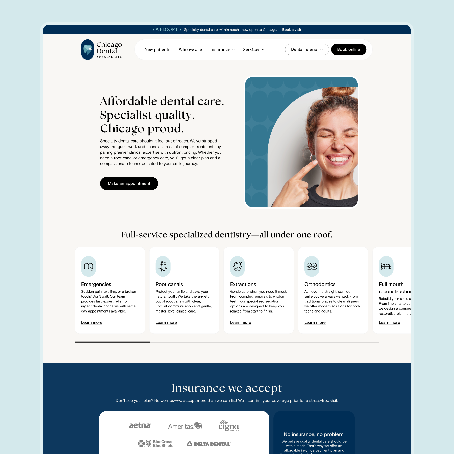
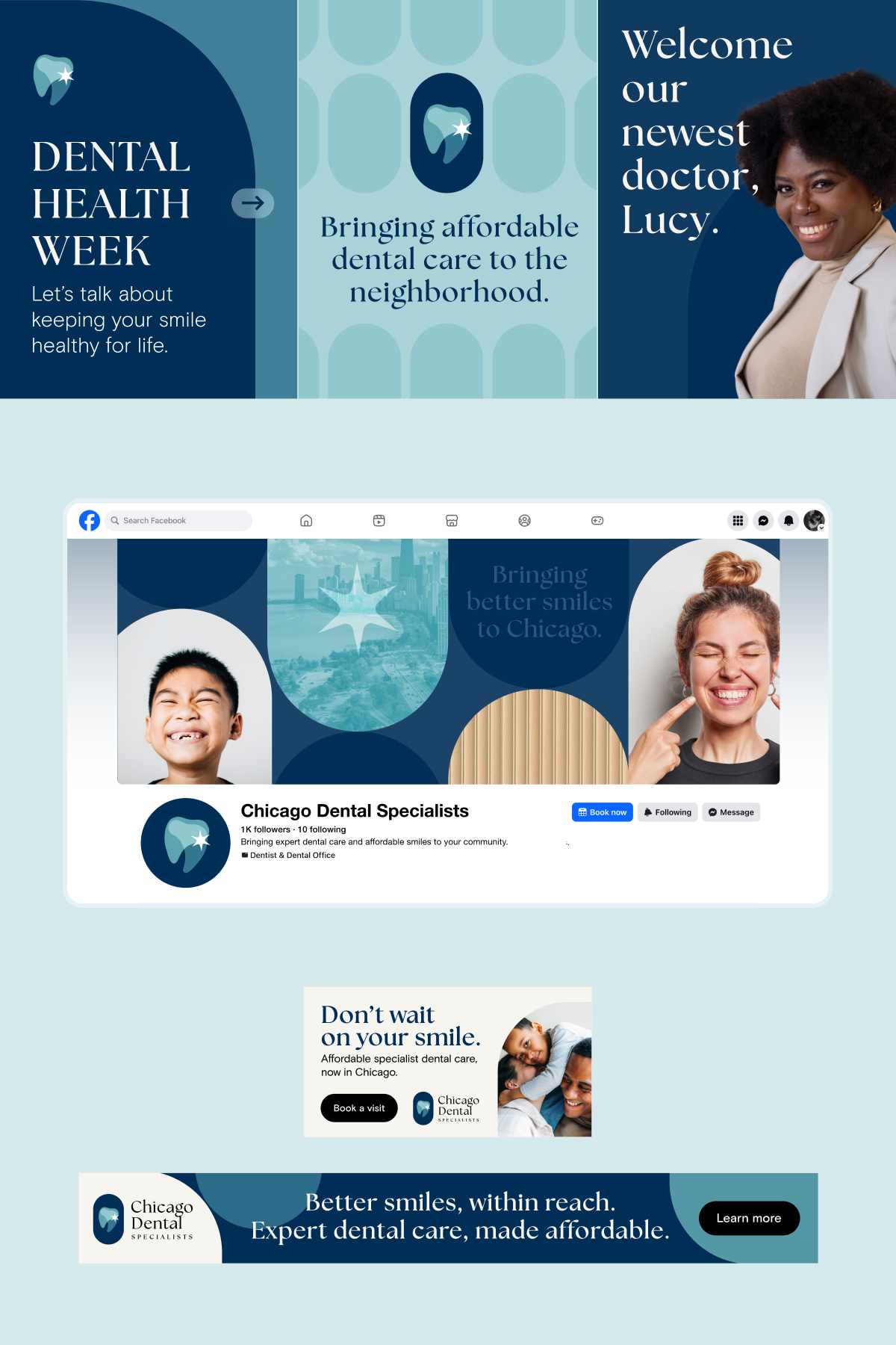
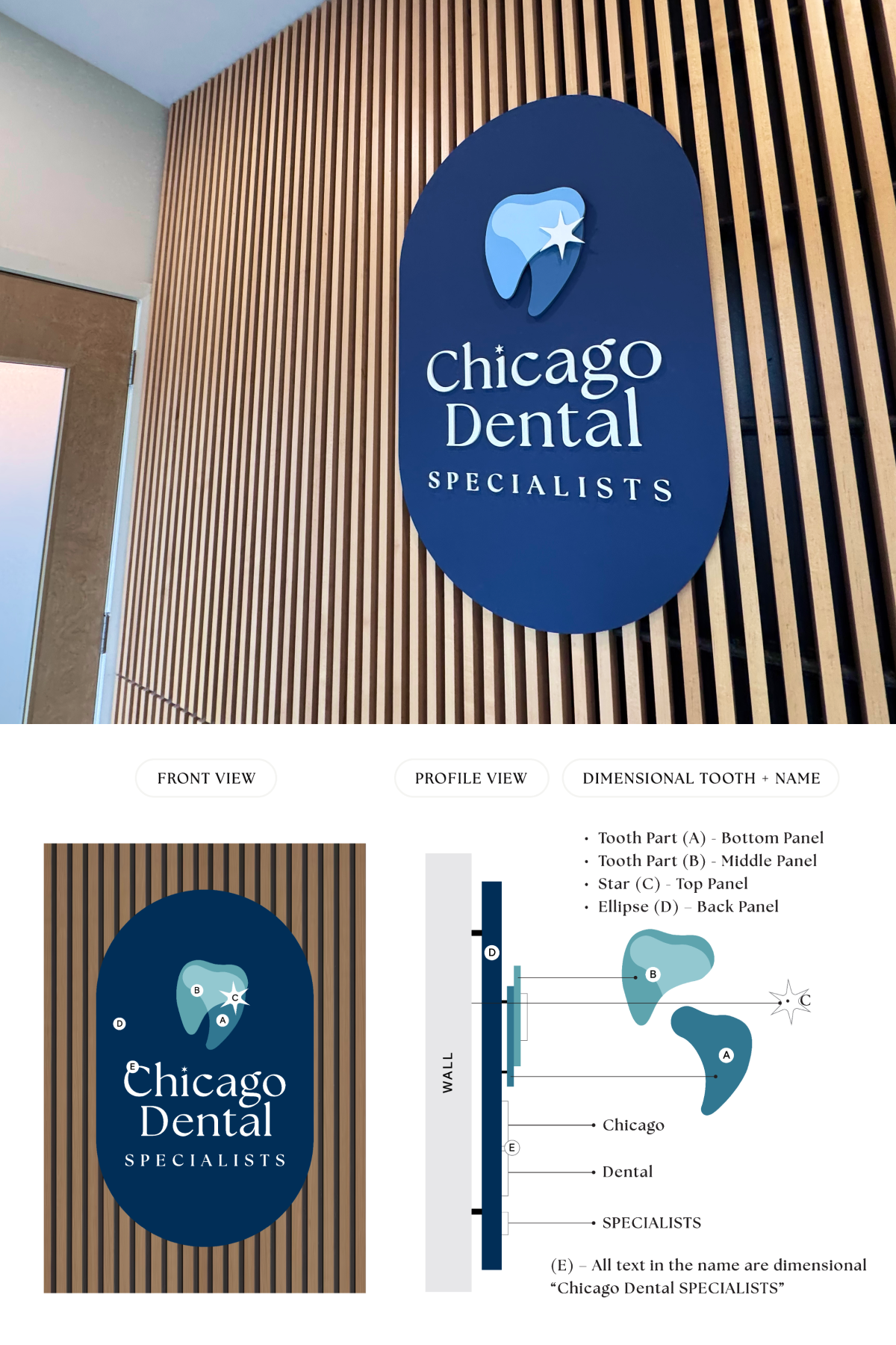
Chicago Dental Specialists
With the identity established, the visual language was put to work across website, social, paid media and environmental graphics. Each application responded to its own audience and purpose while reinforcing the same recognizable tone and character of the larger brand.
↓ marketing + digital scope
Creative direction
Photography + retouching
Copywriting
Website design
Social media design
Paid advertising
Apparel design
Environmental graphics + signage
Site coming soon
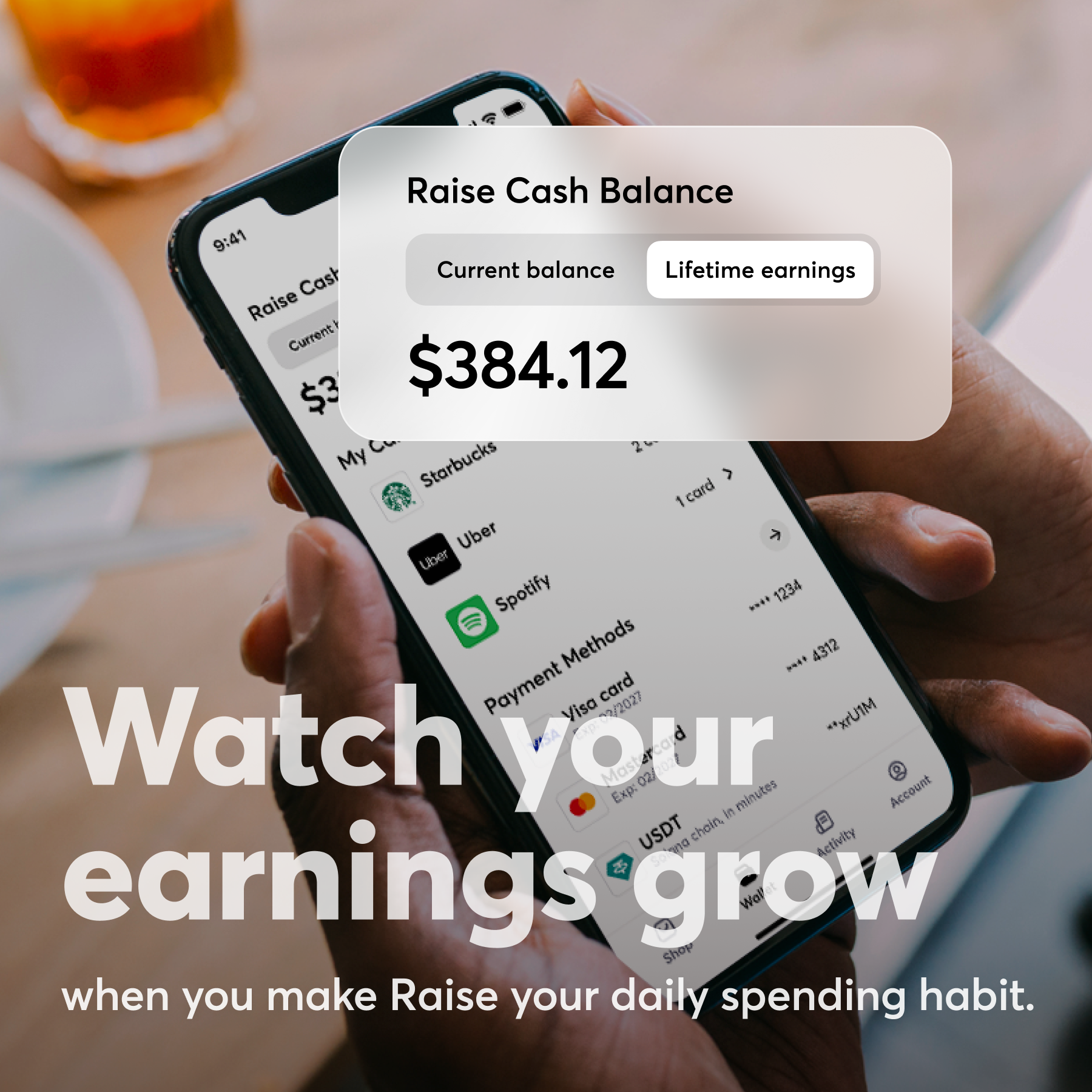
Raise
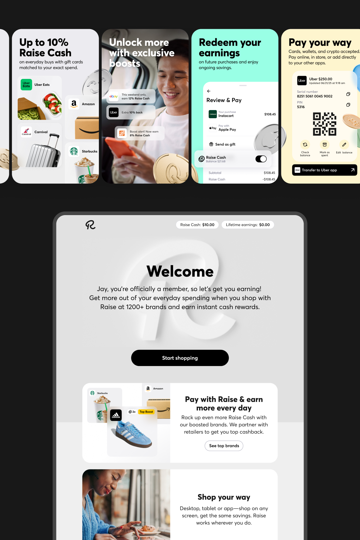
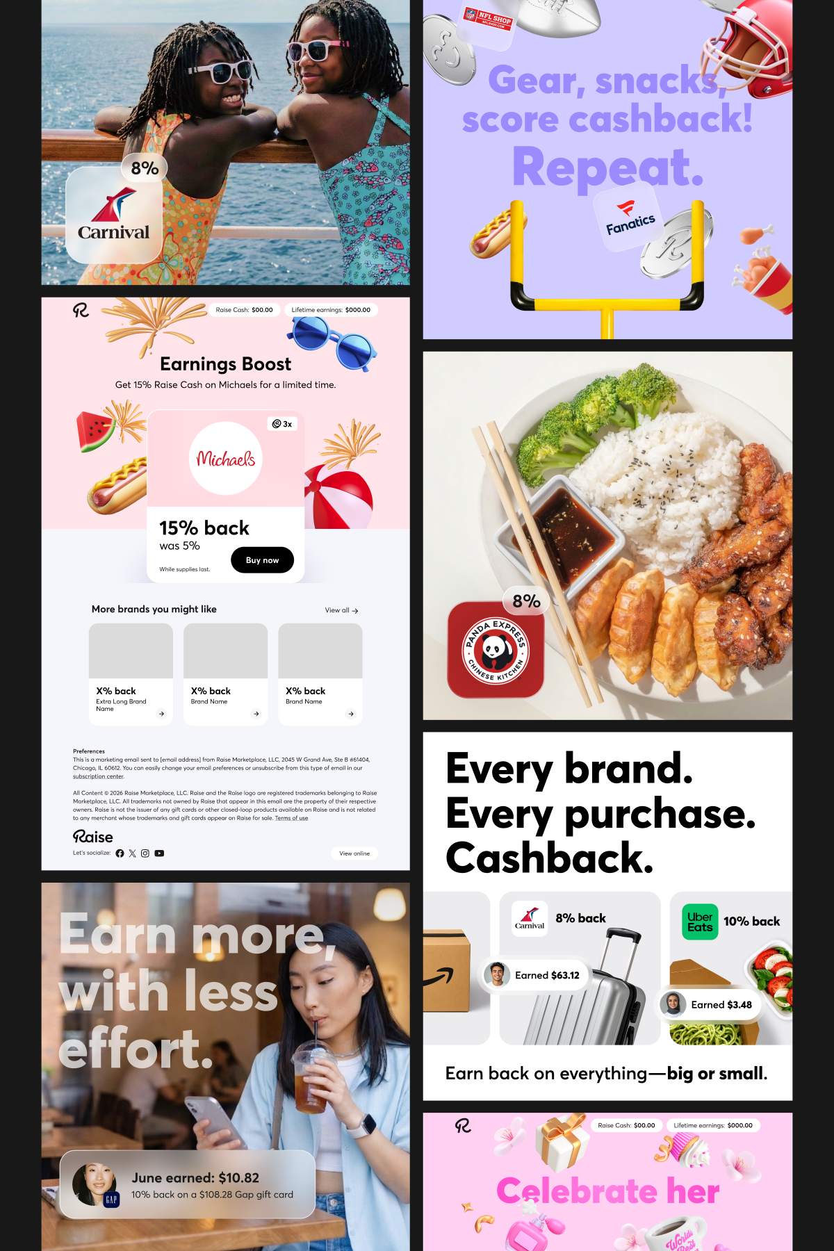
Years of collaboration across Marketing and Product created the opportunity to shape how the brand showed up across email, app, web, social and campaign work. The focus was on bringing greater consistency to the customer experience while allowing each channel to respond to its own audience and business need.
↓ marketing + design scope
Creative direction
Photography + retouching
Copywriting
Email + CRM
Website design
Social media design
Paid advertising
Seasonal campaigns
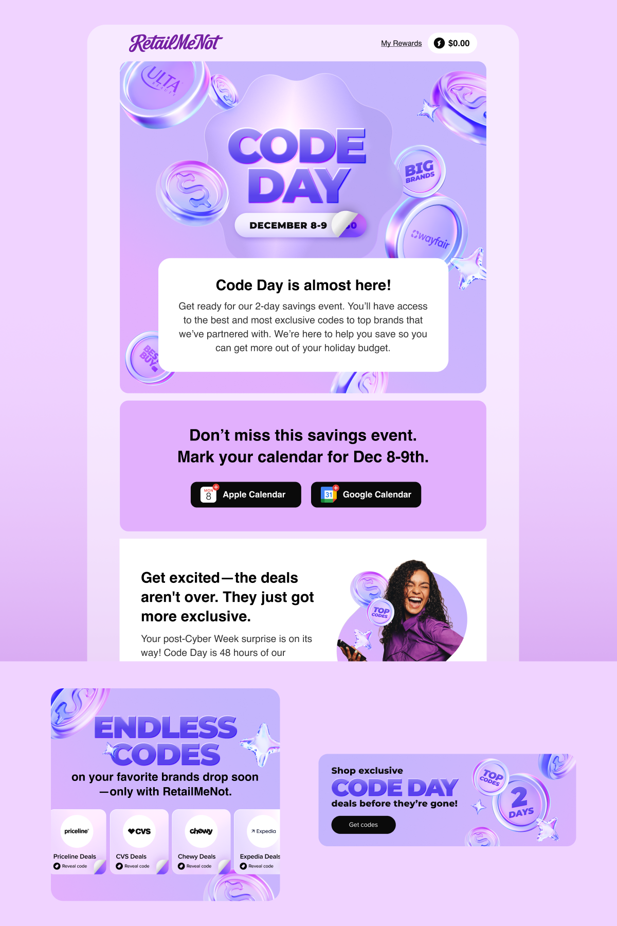
RetailMeNot
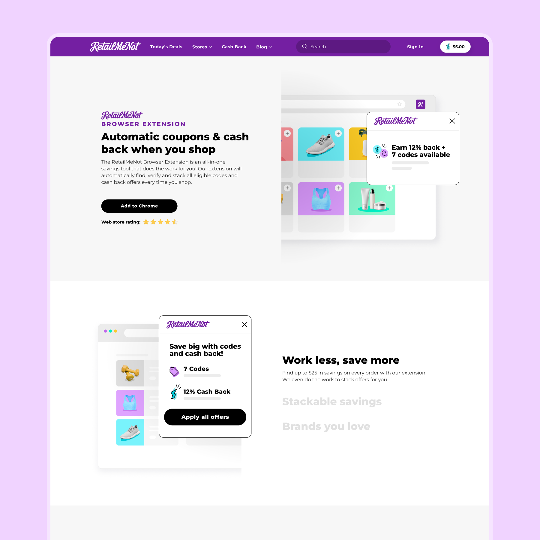
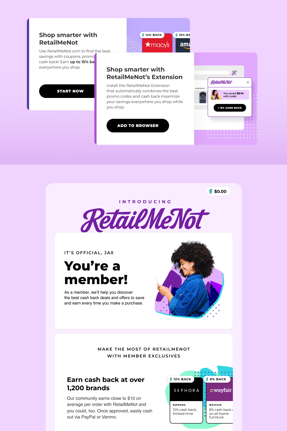
The work explored how a refreshed visual language could better connect RetailMeNot’s product and marketing experiences. Across web, email, social and seasonal campaigns, each application was designed to feel more modern and cohesive while still adapting to its own message, audience and purpose.
↓ marketing + design scope
Creative direction
Photography + retouching
Copywriting
Website design
Email + CRM
Social media design
Seasonal campaigns
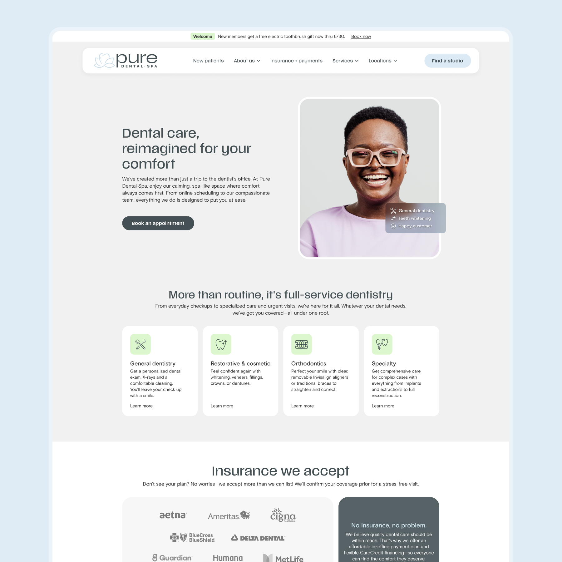

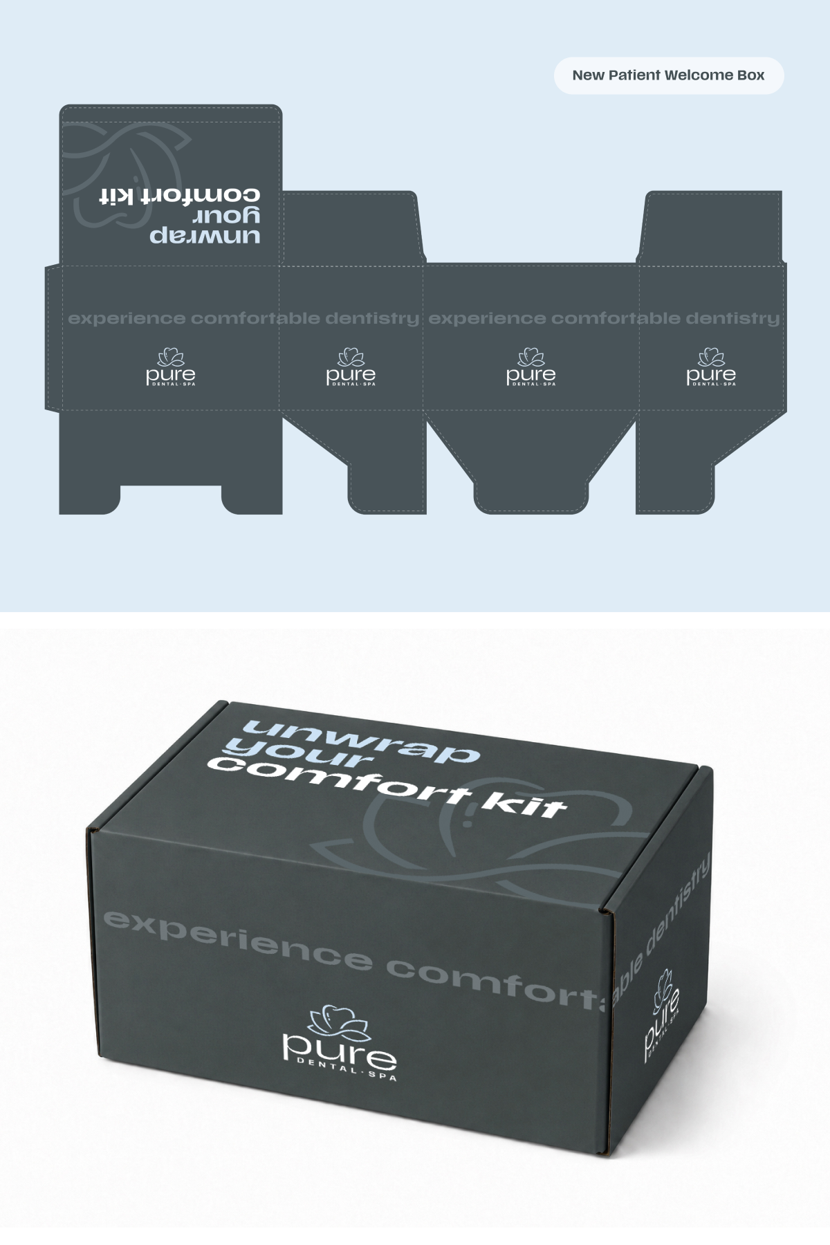
Pure Dental Spa
Comfort and hospitality continued beyond the identity into the everyday ways patients encountered the brand. Across website, social, packaging and supporting collateral, the visual language stayed polished and welcoming while adapting to different communication needs.
↓ marketing + digital scope
Creative direction
Photography + retouching
Copywriting
Website design
Social media design
Print collateral
Packaging design
Environmental graphics + signage
Coming soon
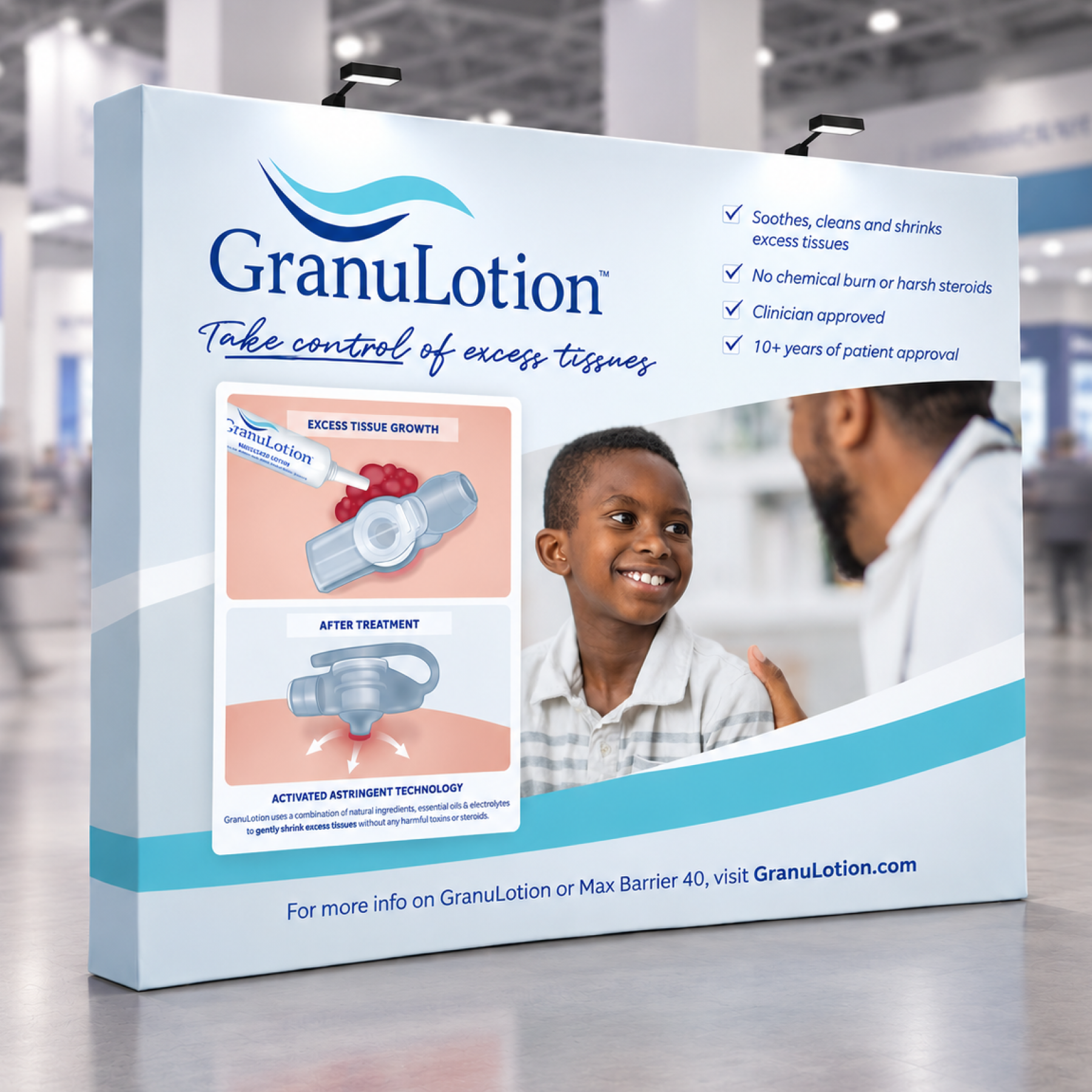
GranuLotion + Max Barrier 40
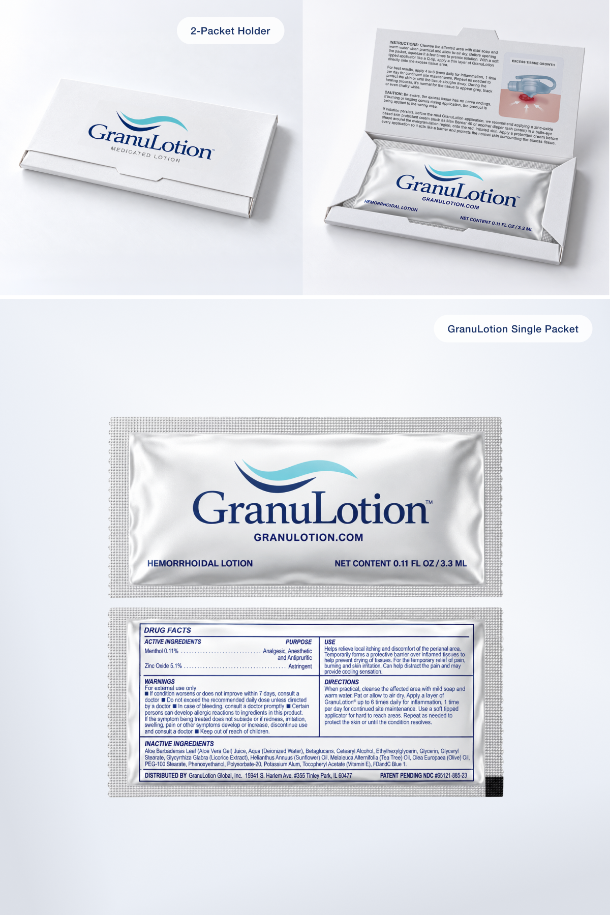
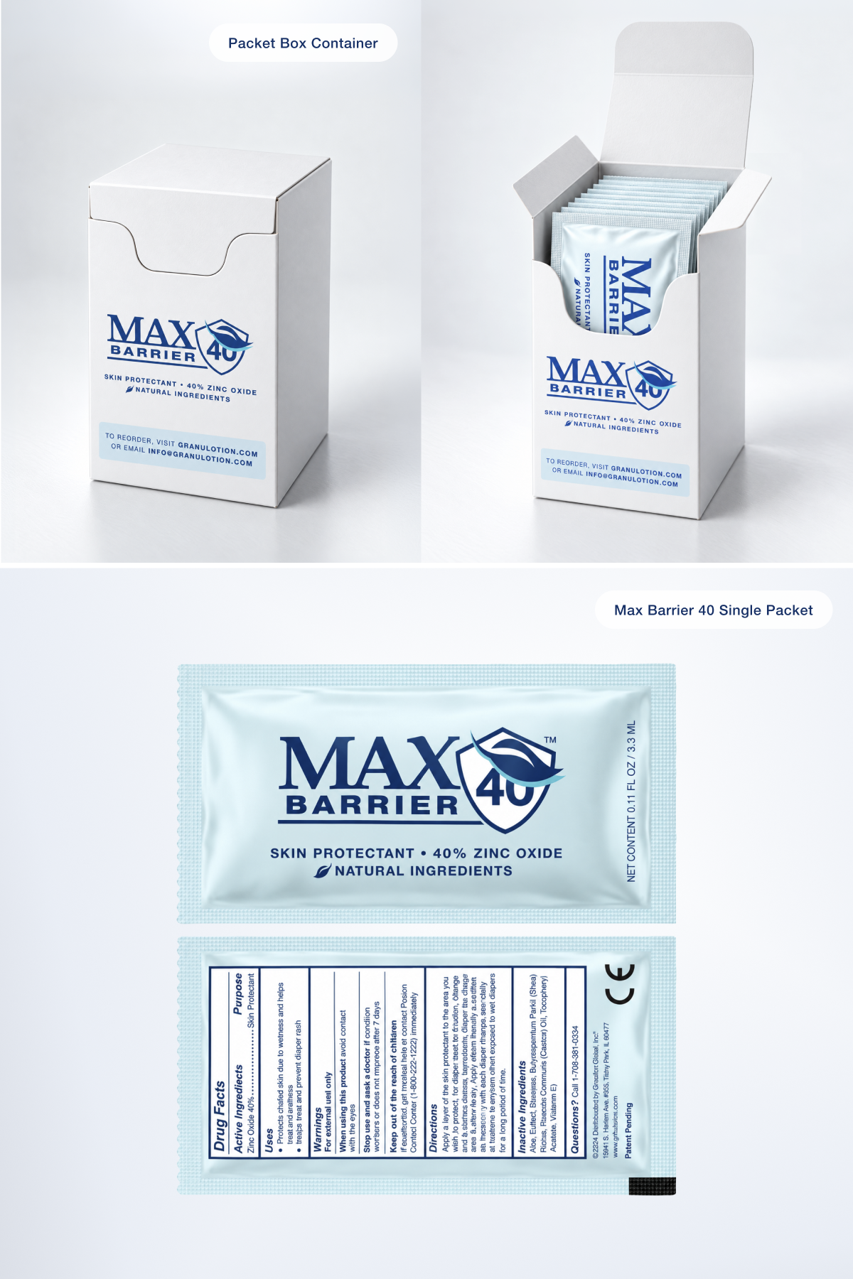
Working from an established identity, the visual language needed further development to create a stronger, more cohesive brand presence. That evolution extended to the new Max Barrier 40 product line across packaging, direct mail, print and environmental graphics. From the start, custom medical illustration became a critical part of the storytelling, helping explain complex product information clearly without relying on clinical imagery that felt too graphic for the audience the brand needed to reach.
↓ marketing + design scope
Creative direction
Copywriting
Photography + retouching
Illustration
Packaging design
Print collateral
Direct mail
Display graphics
Social media design
Coming soon
Select campaign + print
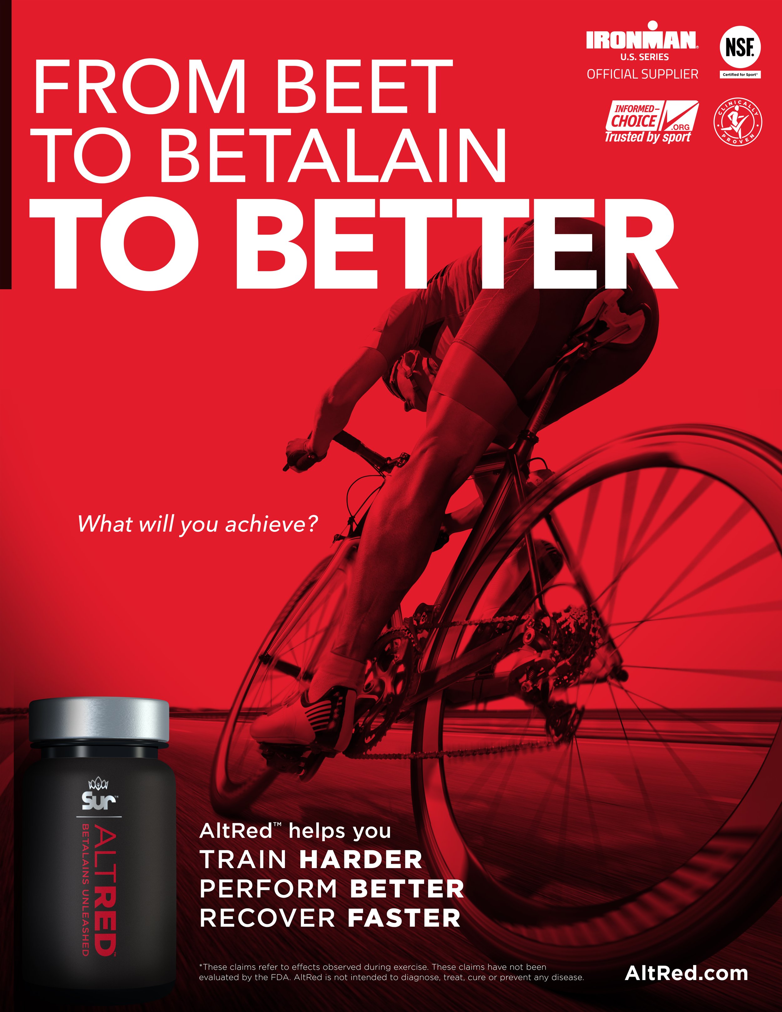
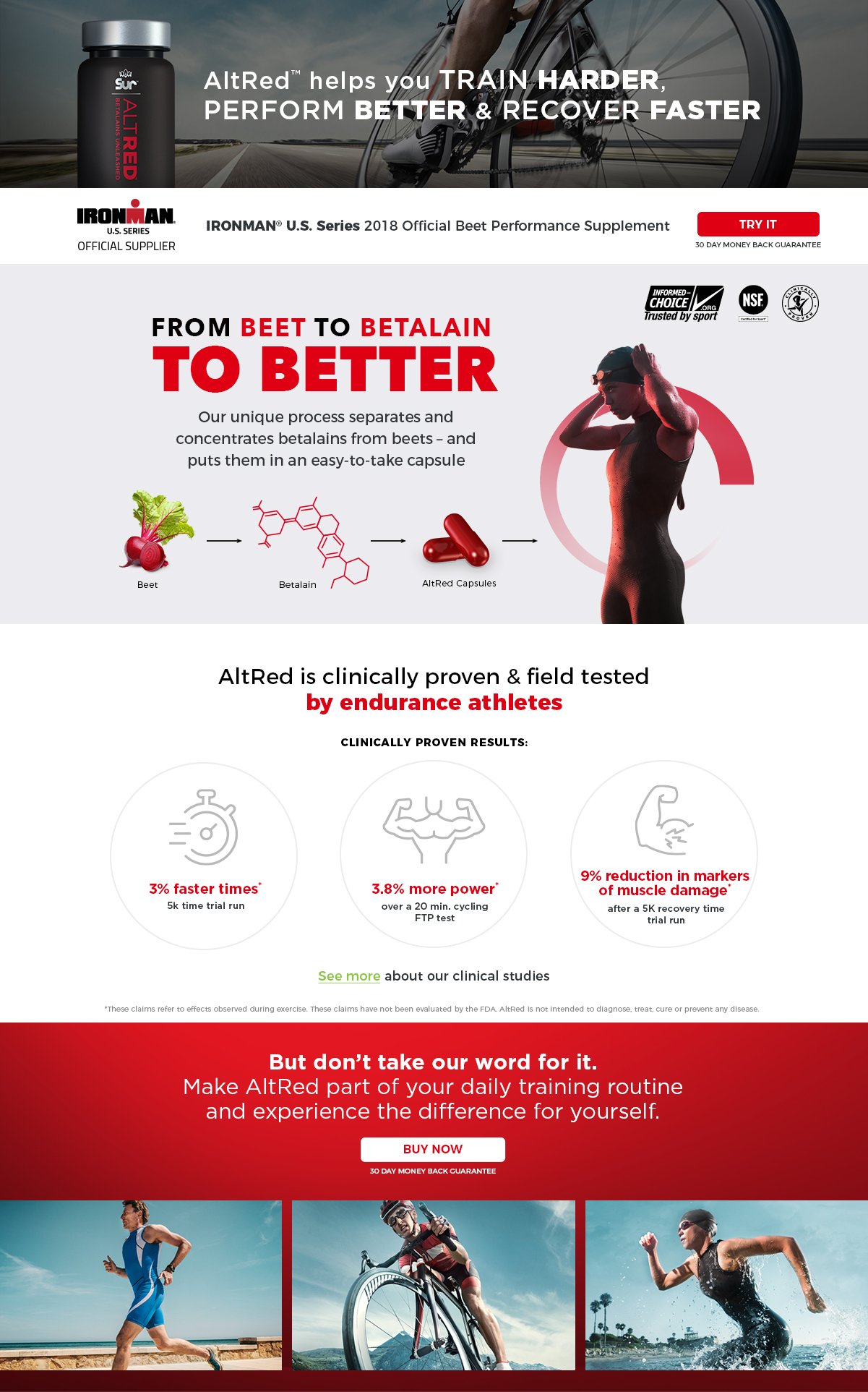
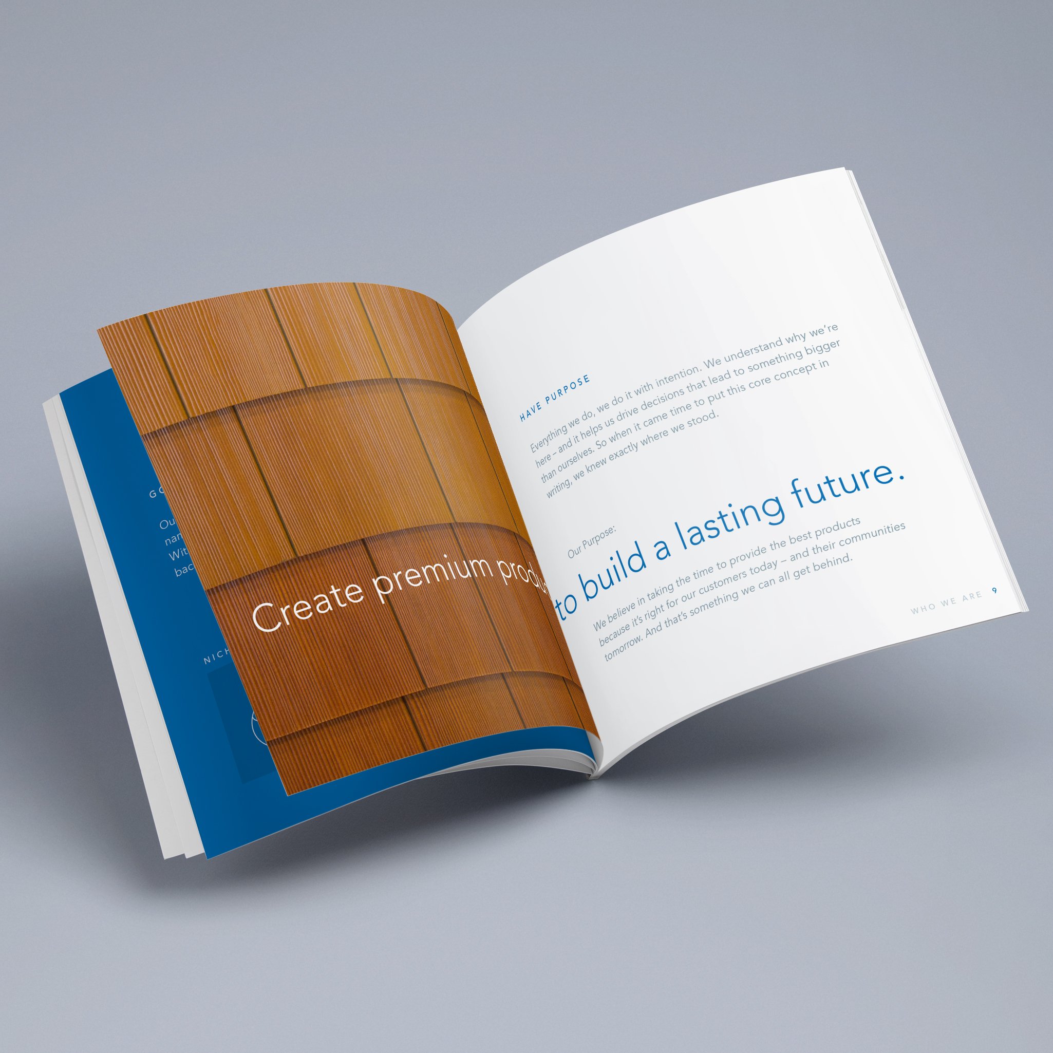
A mix of campaign and print work across different industries, audiences and business needs. Each project called for a different visual approach, from bold promotional concepts to more refined editorial and informational design—showing how a strong idea can adapt to the message, medium and brand behind it.
↓ marketing + design scope
Creative direction
Photography + retouching
Copywriting
Website design
Social media design
Print advertising
Brochure design
Infographic + illustrations
Coming soon