
featured work
Raise
→ Brand identity
→ Marketing + digital
Role + contribution: The long-term relationship with Raise created continuity across years of brand evolution, allowing the work to grow from ongoing marketing support into a broader role shaping how the brand looked and communicated across their digital channels. Having previously served as Associate Creative Director from 2015–2016, I returned as a senior contract designer from 2018–2026 with an established understanding of the brand, the team and how the business communicated with customers.
The role covered the full digital ecosystem—shaping visual direction across email/CRM, web, app and social, while supporting weekly merchandising, seasonal campaigns, product launches and other fast-moving company initiatives. In close collaboration with the Product team, the focus was on keeping the experience visually aligned as the brand evolved, creating stronger consistency between customer-facing marketing and the product itself.
Across that time, Raise went through multiple brand refreshes. The most recent work featured here focuses on how the latest direction was translated and further developed across digital channels. While the initial logo identity refresh was created with an external branding agency, the larger opportunity was defining how that brand would actually live, flex and communicate in-market. That meant refining the visual language, building out digital applications and creating a more cohesive system that could scale across everyday content, campaigns and product experiences.
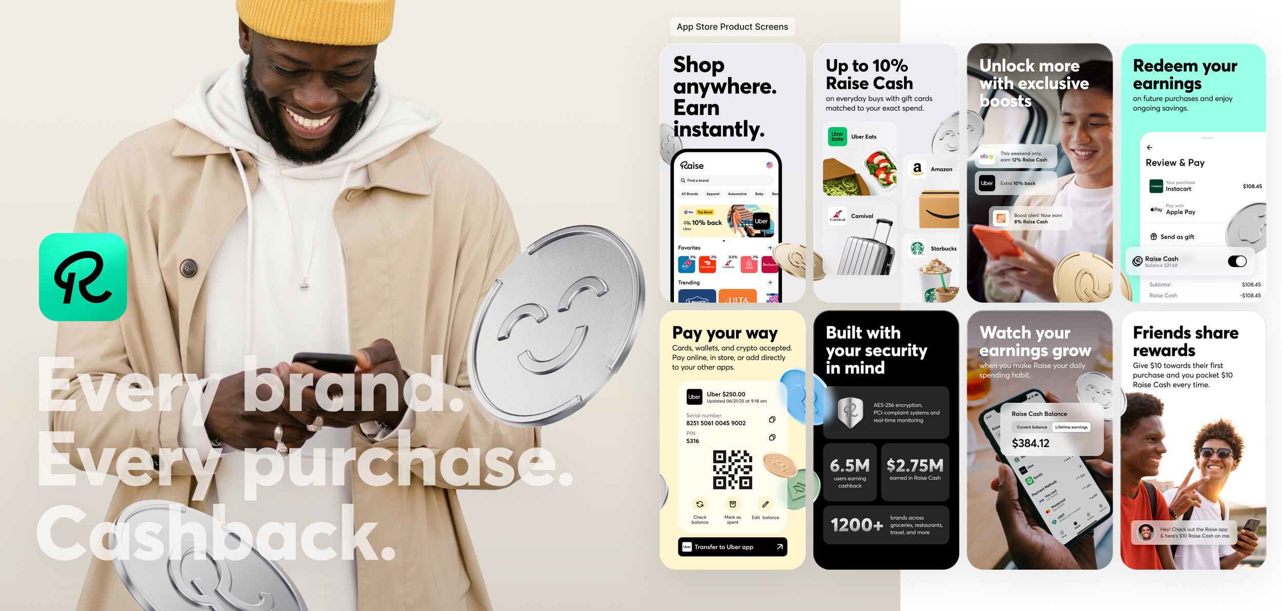
The Raise brand, evolved.
Challenge: Raise helps consumers earn cashback on everyday purchases through its app and website, from coffee and lunch to travel experiences and purchases big or small. The challenge was making that value feel immediate and memorable while keeping Raise top of mind as part of a shopper’s everyday routine. The brand needed to communicate a simple behavior: check Raise first, shop as usual and get more value out of each purchase.
Objective: Evolve the visual language into something more modern, elevated and established without losing the accessibility of the product. Messaging needed to stay simple and compelling, while the design created stronger recognition around cashback, savings and the Raise experience. Just as importantly, the marketing needed to connect back to the product itself so the brand felt consistent from promotion to purchase.
Inspiration: The direction drew inspiration from modern financial and payment brands such as Revolut, Wealthsimple and PayPal, where clean interfaces, dimensional graphics and restrained color create a sense of confidence and ease. Rather than relying on saturated color everywhere, the palette was used more strategically depending on the message and channel.
Outcome: For Raise, the refreshed direction translated into a more refined visual system built around bold typography, warm lifestyle photography, product UI, dimensional coin graphics and a more selective use of the brand palette. Together, those elements gave the brand a clearer point of view while creating stronger connections between the idea of savings, the product experience and the everyday moments where Raise fits into a customer’s life.
The App Store product screens became one of the clearest expressions of that system working together: lifestyle photography brought warmth and relatability, dimensional coins reinforced the value of earning and saving, simple UI callouts connected the marketing back to the product, and bold messaging made the benefit easy to understand at a glance.
Being embedded with the team across those touchpoints made it possible to guide how the brand adapted from one channel to the next—maintaining a clear visual point of view while allowing each expression to respond to its own audience, message and business need.
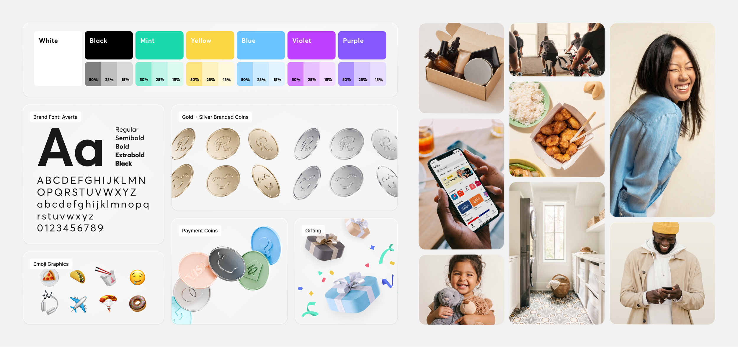
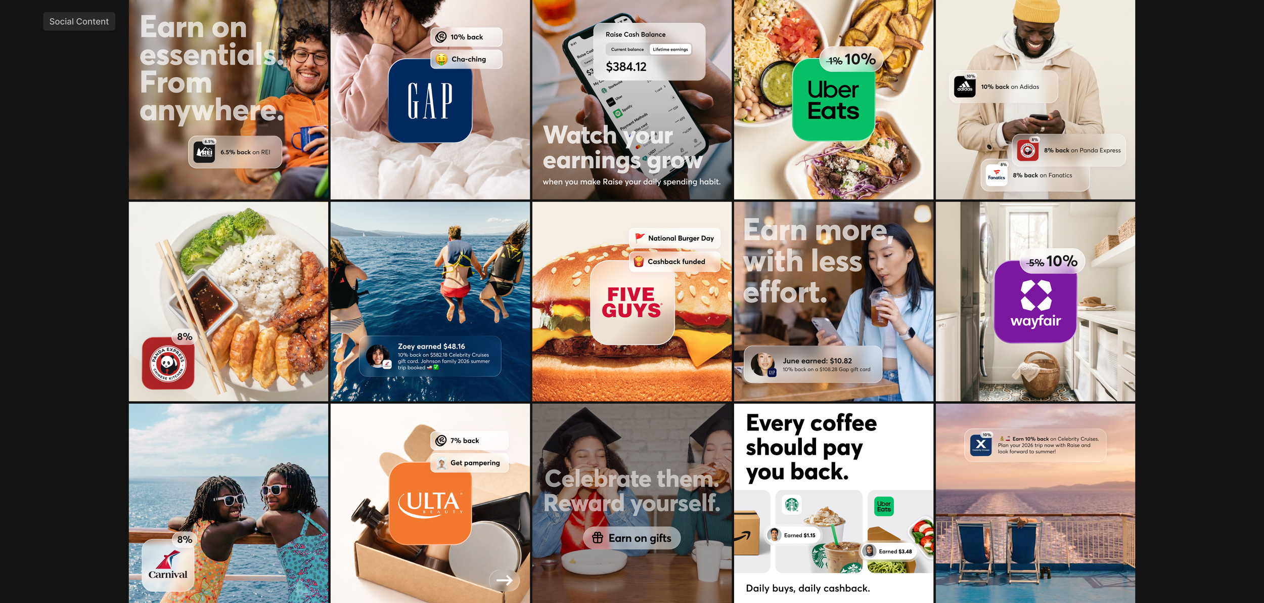
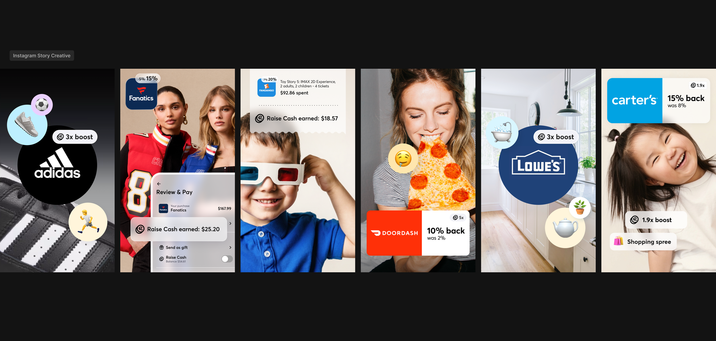
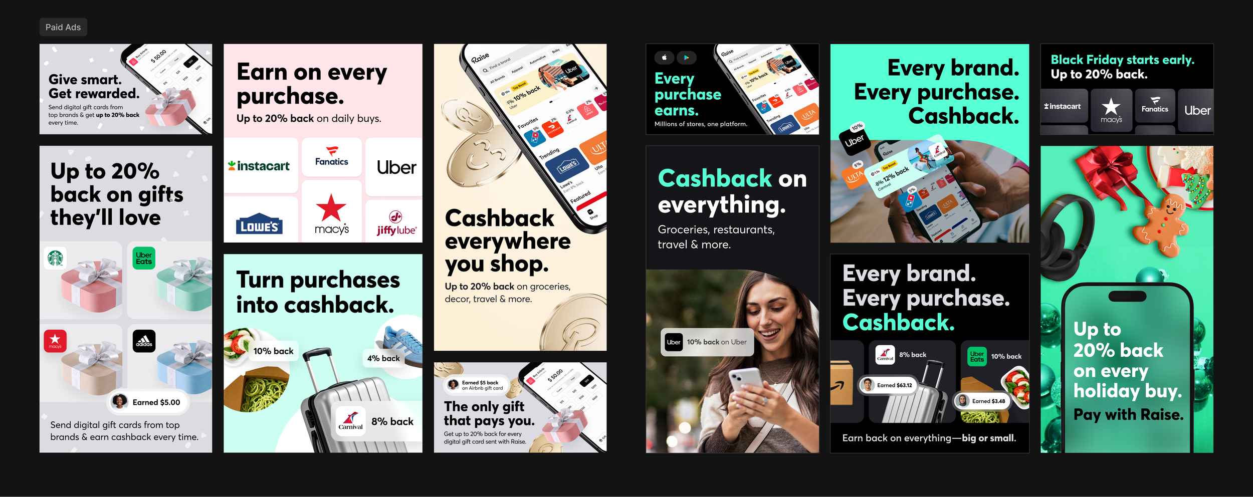
Social + paid ads
Social and paid advertising became two distinct expressions of the same visual system. Across both, warm lifestyle photography, bold typography, clear savings messages and simplified product UI created a recognizable connection back to the Raise experience while giving each channel room to respond to a different audience and objective.
Social content leaned more expressive and lifestyle-driven, showing how Raise fits naturally into everyday spending moments while reinforcing real brands and real earning opportunities. Emojis were introduced selectively as part of that language—familiar visual cues already embedded in everyday communication. Used strategically alongside relevant brands or moments, they added personality and made the content feel more conversational, relatable and native to the social environment.
Paid advertising took a more disciplined approach, designed for quick comprehension and acquisition. Clear savings messages, recognizable brands, product UI and lifestyle imagery were pared down to their most essential elements so the value of Raise could register immediately.
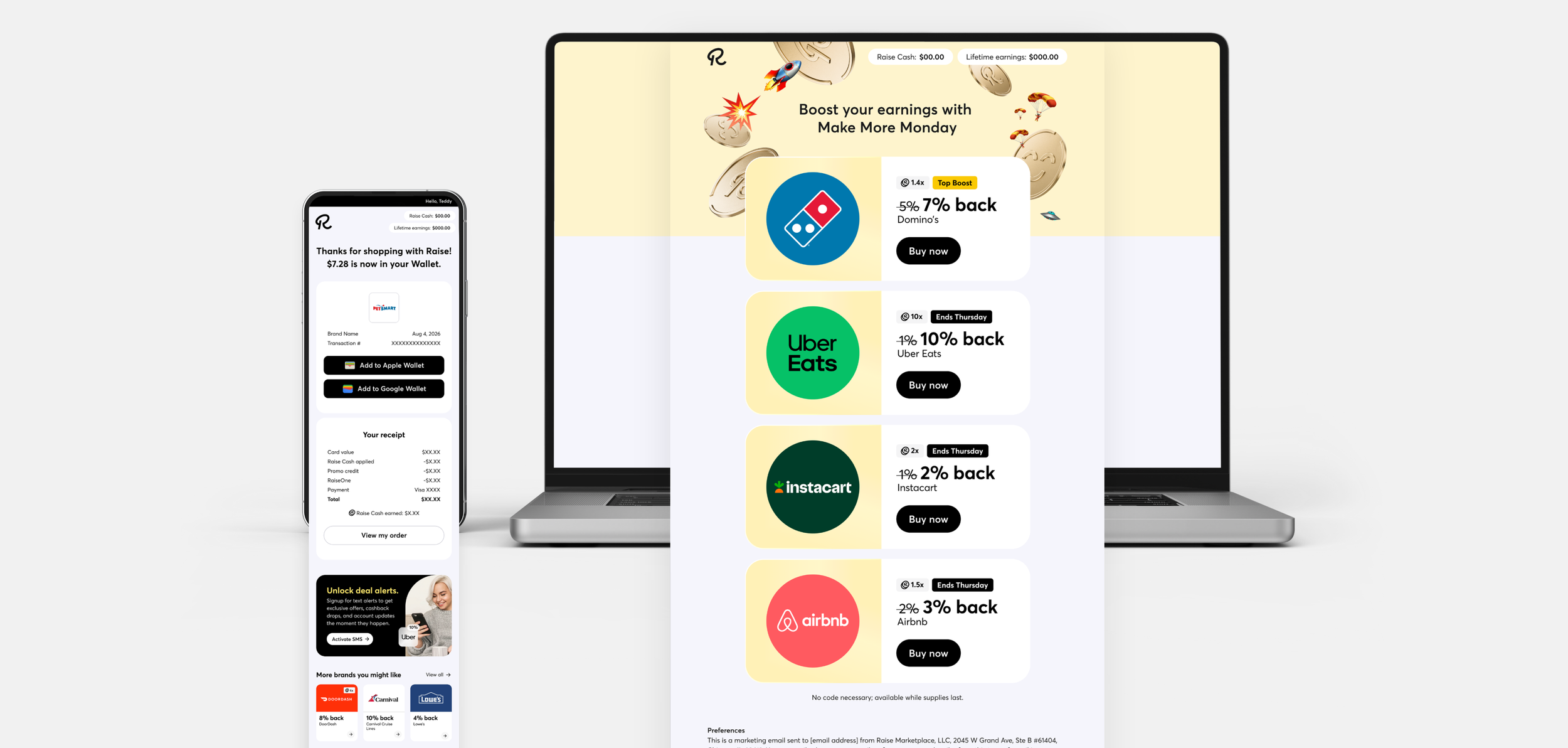
General content merchandising
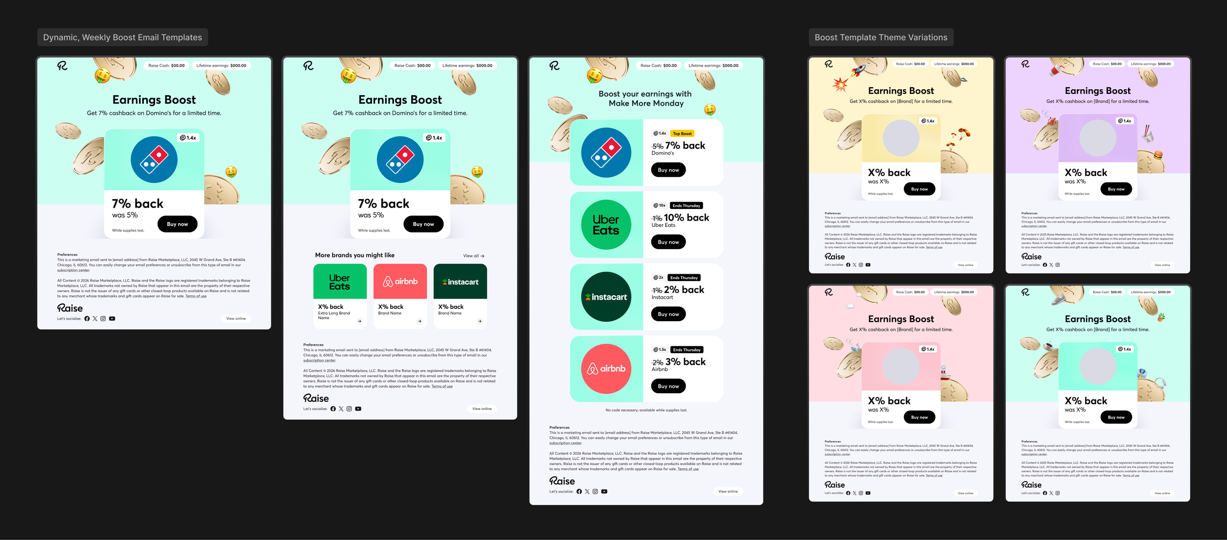
Weekly content merchandising required a system that could move quickly without losing consistency across channels. In close collaboration with the Lifecycle Marketing Manager, the weekly rotation of featured brands and boosted offers was carried across email/CRM, app, web and social.
For email/CRM, flexible templates were developed around a repeatable structure so messaging, featured brands and savings values could be updated efficiently from week to week. Close collaboration with the email developer helped ensure the coded experience matched the design intent while remaining easy for the Lifecycle team to manage within Sailthru.
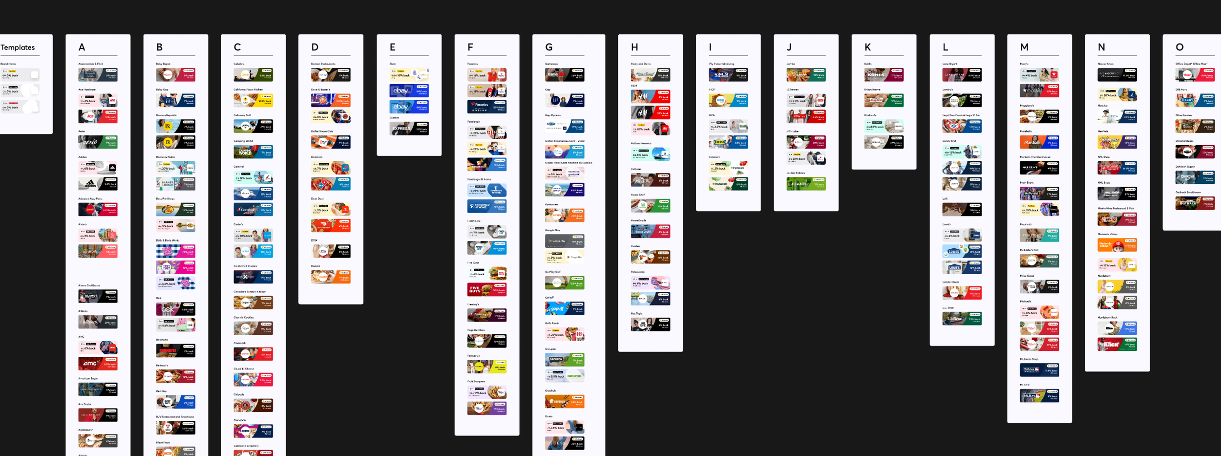
That same merchandising approach extended into the app and web experience, where supporting banners and promotional graphics were produced for the brands and offers featured each week. The result was a more scalable content system that balanced speed, flexibility and brand consistency across a high-volume marketing cadence.
Seasonal marketing campaigns
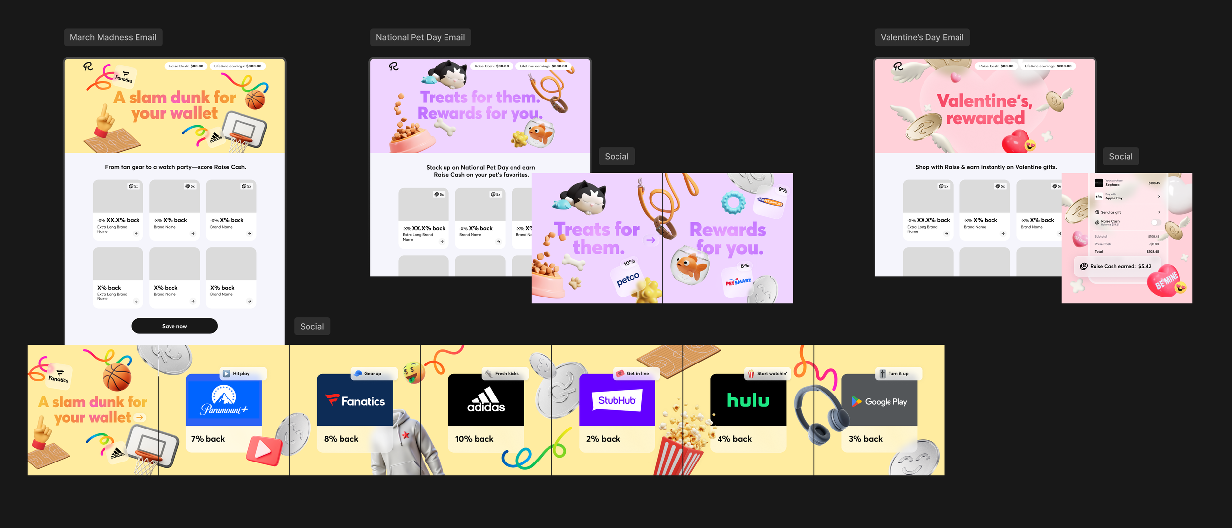
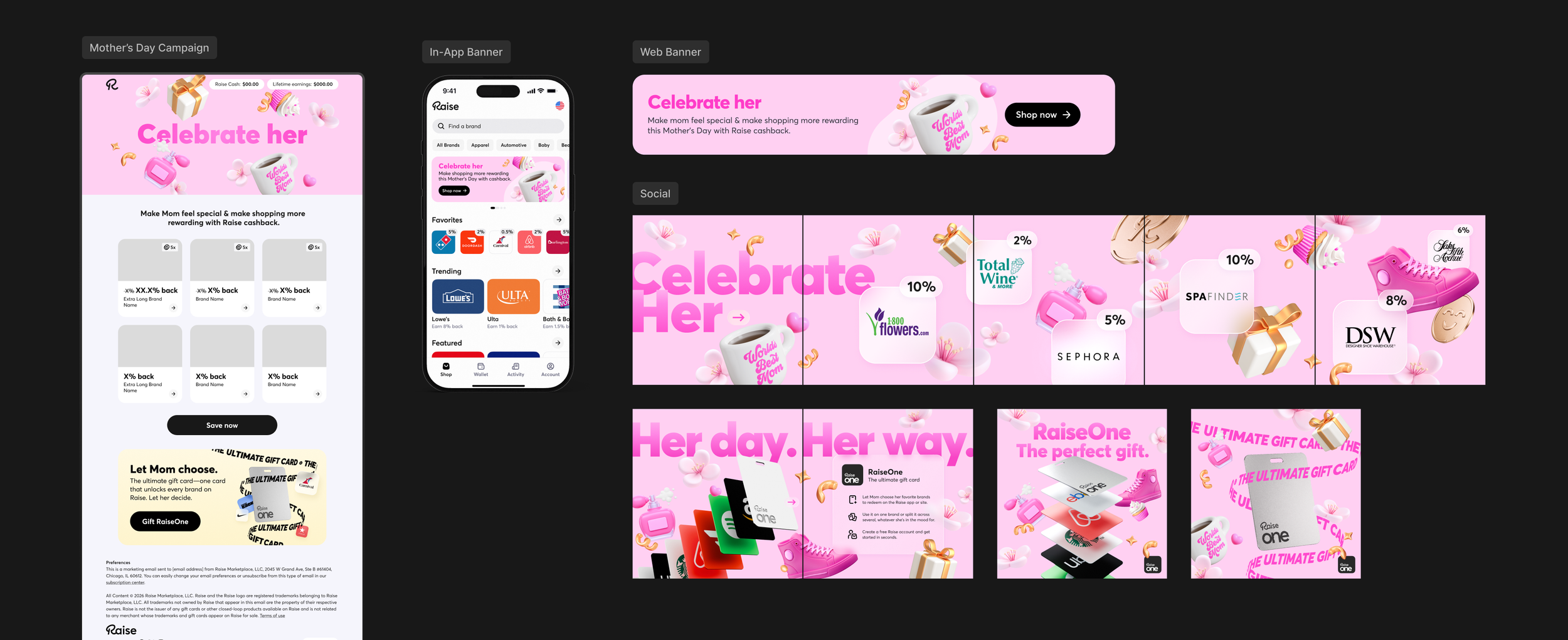
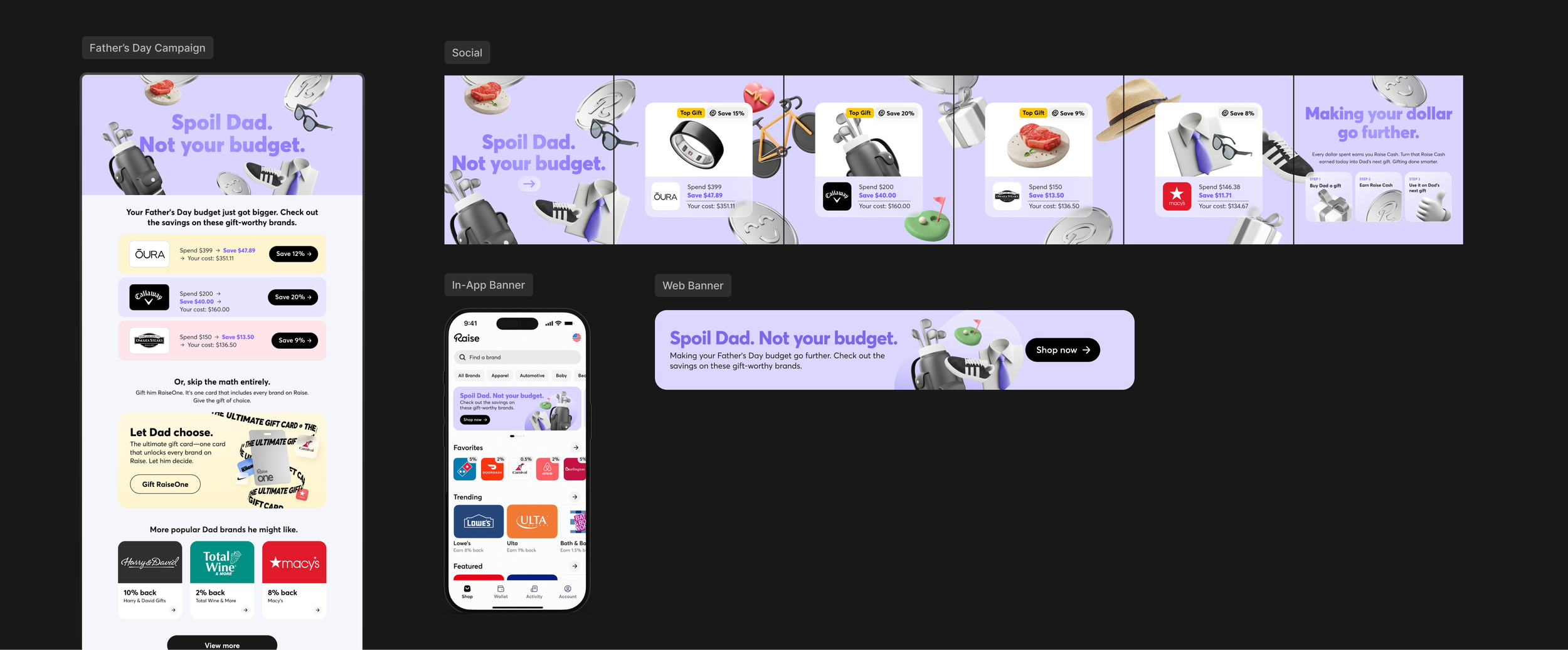
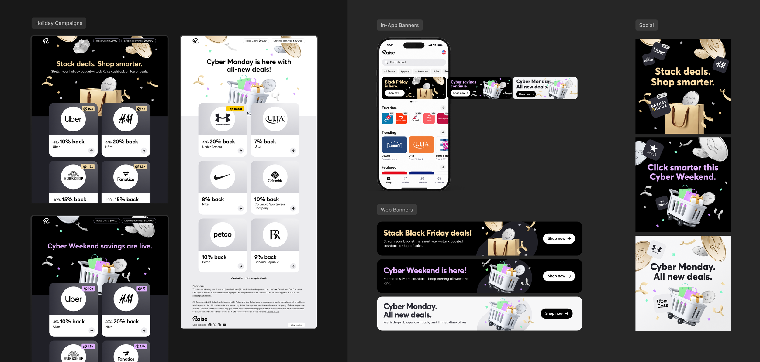
Seasonal campaigns created an opportunity to push the Raise visual language further and bring more personality into the brand. Beyond the coins, dimensional objects were curated around each season to reflect the types of purchases customers might naturally make for the occasion. These elements made each campaign feel more specific and memorable while reinforcing how Raise could fit into a wide range of spending moments and help customers earn more along the way.
The hero graphic became the most expressive layer of the campaign system, combining bold typography, dimensional objects and promotional messaging into a more dynamic visual story. Color helped set the tone for each campaign while keeping the creative cohesive across email, app, web and social. The goal was to create moments of surprise and delight that felt less like routine merchandising and more like a branded experience.
To keep production efficient, each campaign worked within a flexible structure rather than being fully custom-coded from top to bottom. This allowed the creative to feel distinct and campaign-specific while keeping development time more manageable.
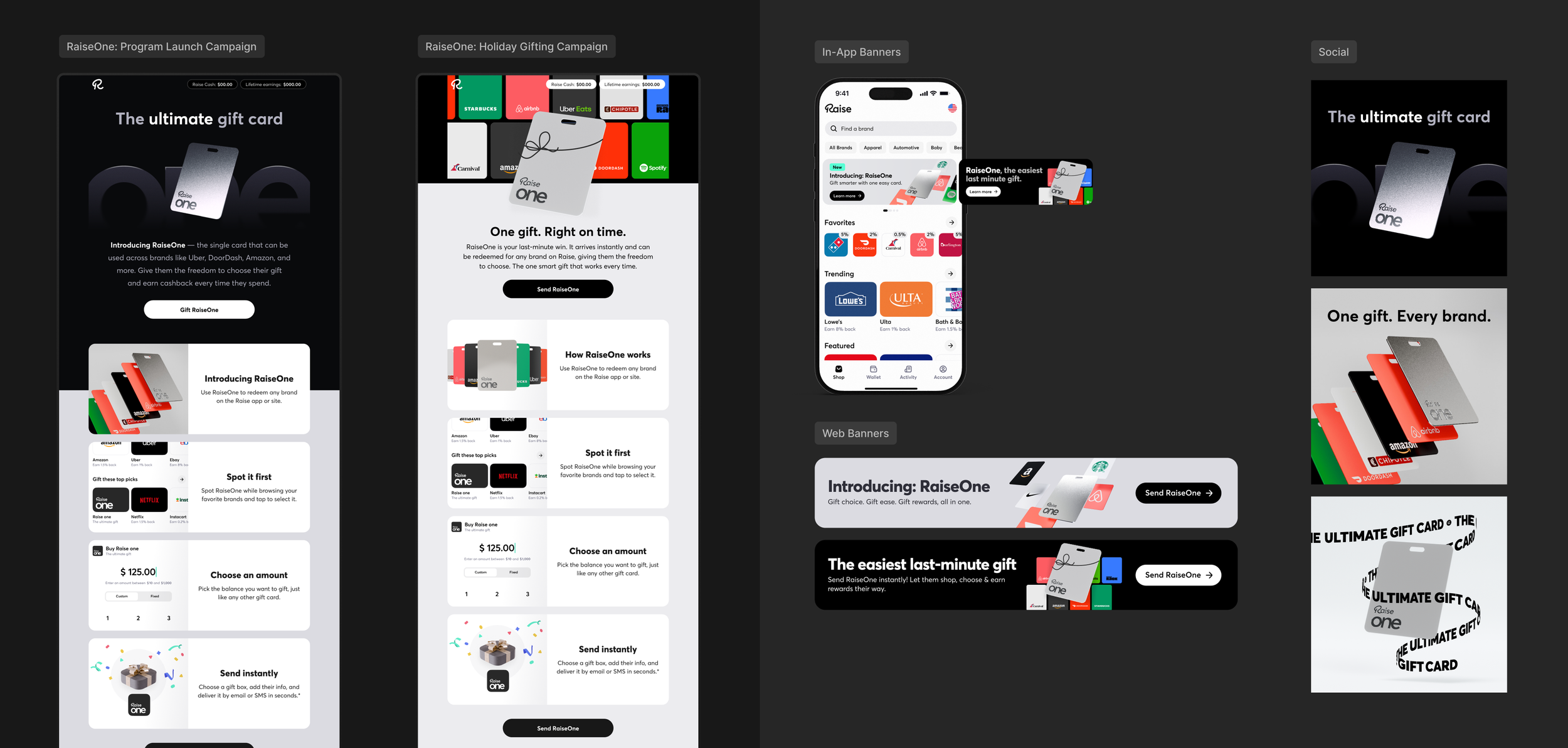
Product launch: RaiseOne
RaiseOne introduced a new kind of gift card within the Raise ecosystem: one card that could be redeemed across any participating brand on the platform. The launch needed to clearly communicate that flexibility while removing the pressure of choosing the “right” brand for the gift recipient.
Working closely with the Marketing and Product teams, the campaign was shaped around the full customer journey—from understanding what RaiseOne was to knowing how to purchase, gift and redeem it. The messaging and visual language needed to stay closely aligned with the product experience so the promise made in marketing felt consistent once customers entered the app.
A new email structure was developed specifically for the launch, with the hero establishing the core value proposition and the body breaking the experience into clear, visual steps. That same launch language extended across in-app banners, web and social, creating a coordinated introduction to the product across channels.
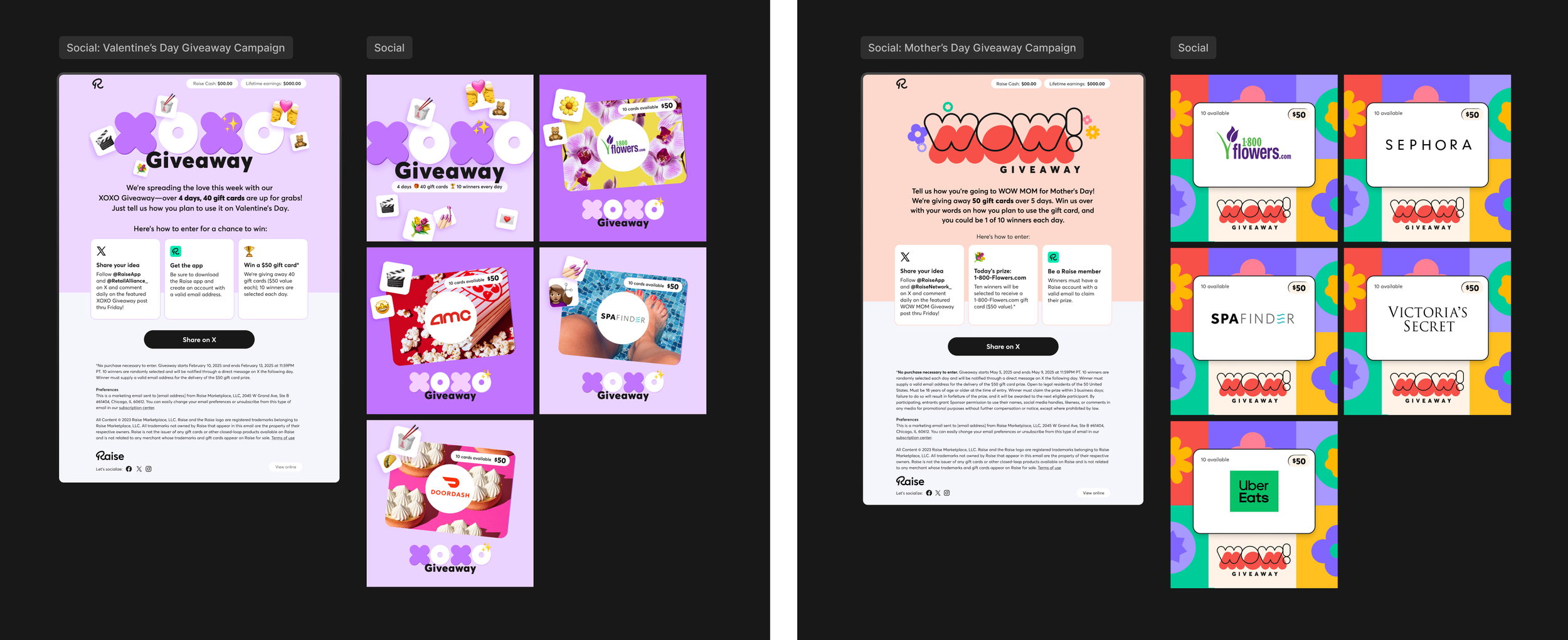
Social giveaways
The social giveaways were designed as short-run campaign identities that could build recognition and momentum across several days of content. Each promotion had its own visual language, helping the daily posts feel connected while giving the seasonal theme—Valentine’s Day or Mother’s Day—a distinct personality.
The campaigns were built to drive engagement and grow Raise’s social audience, with a particular focus on X. Entry mechanics encouraged users to comment, respond to the seasonal prompt and return for multiple days of gift card giveaways, turning the promotion into an ongoing conversation rather than a single post.
The format proved successful enough to repeat, with engagement and follower growth increasing on X. Visually, these campaigns sit slightly ahead of the latest brand refresh, using a broader color palette, flatter graphic elements and more overt emoji-driven details. Some of that thinking—specifically the use of emojis—continued into the newer system in a more selective, refined way.
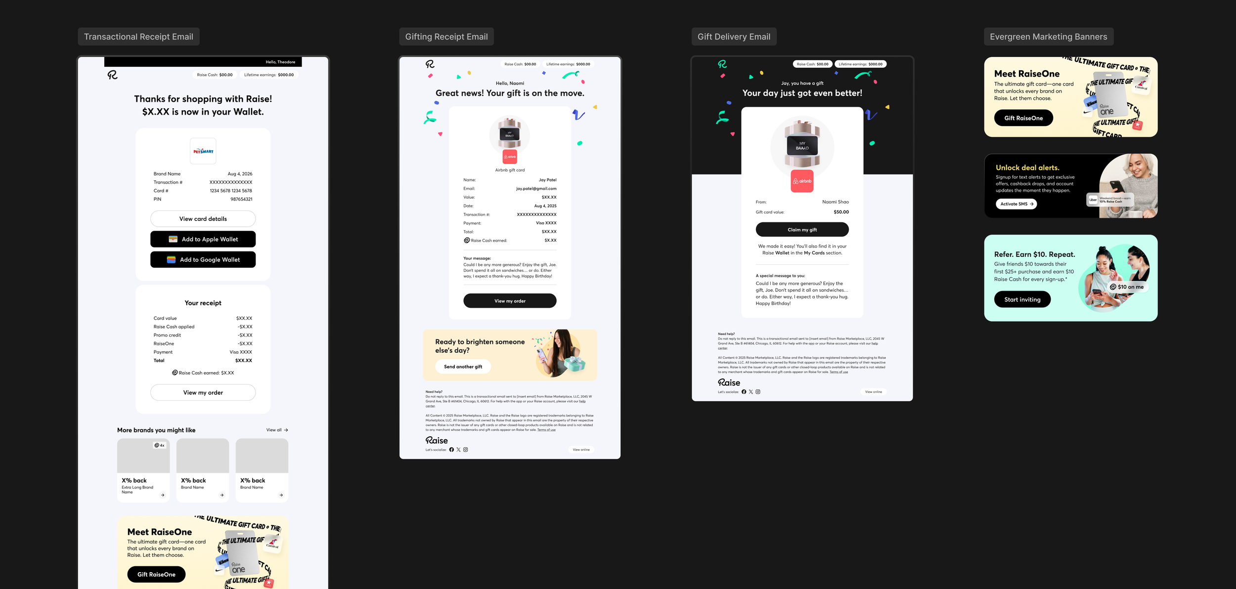
Transactional emails
Transactional emails required a different kind of design discipline. Unlike the more expressive campaign work, these communications needed to prioritize clarity, hierarchy and trust.
Working closely with the Lifecycle Product Manager, each email was structured around the critical information a customer needed at that point in the journey—purchase details, gifting status, delivery information, account actions and other dynamic data pulled directly from the system. A consistent framework allowed those fields to change based on the user flow without disrupting the overall experience.
Visually, the design was intentionally pared back, using a clean layout, restrained color and strong information hierarchy. Branded marketing modules could then be introduced selectively to highlight relevant products or next actions without competing with the primary transactional message.
↓ Full design scope
Brand development
Creative direction
Photography direction
Copywriting
Email + CRM
Transactional emails
Website design
Social media design
Seasonal campaigns
Paid advertising
A strategic thinker who helps solve marketing challenges through great design.
Geri Robinson
Former VP of Marketing
Raise.com