
featured work
RetailMeNot
→ Brand identity
→ Marketing + digital
Role + contribution: I was hired as a contract visual designer from 2023–2025, primarily supporting Product team initiatives while also contributing to select Marketing projects, from email to seasonal campaign work.
To familiarize myself with RetailMeNot’s product ecosystem, it began with auditing key user touchpoints across web, app and email, including the new-user sign-up journey. That work helped identify where the user experience, visual design and brand expression felt inconsistent with the direction the brand was evolving toward.
Alongside larger product initiatives focused on improving, refreshing and modernizing the experience, I also supported shorter-turn projects within their active sprints. The role balanced independent design ownership with close collaboration across Product, Marketing and Development, moving fluidly between exploratory concepts, interface refinements and day-to-day production needs.
A visual ecosystem reset.
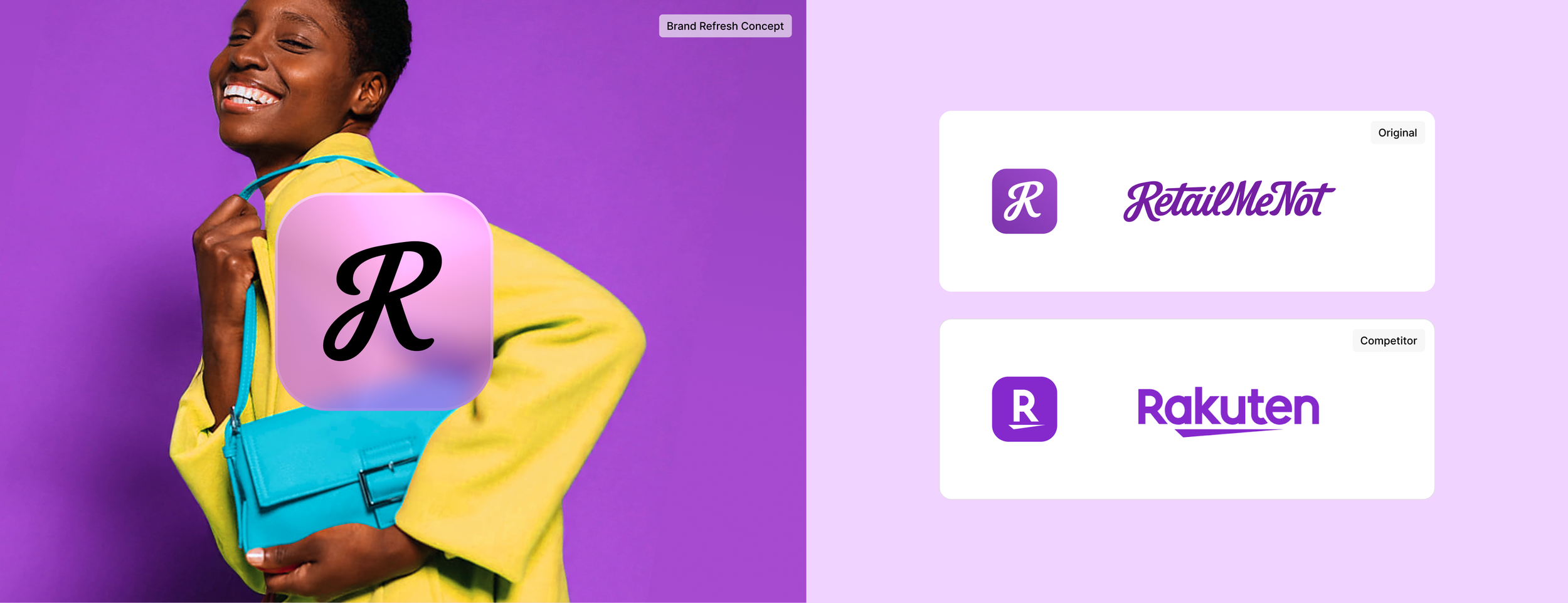
Challenge: RetailMeNot’s digital ecosystem had become visually fragmented across app, web, email, social and seasonal campaigns. With multiple teams creating content, there was no shared visual framework to keep the brand cohesive across channels. The work also needed to create greater distinction from competitors, particularly where similar purple branding and an “R” monogram created confusion in user testing.
Objective: Explore how Product and Marketing could operate within one connected visual language without rebuilding the underlying product structure. The goal was to evolve the established RetailMeNot brand, create clearer consistency across channels and give multiple teams a flexible system for producing work that still felt distinctly RetailMeNot.
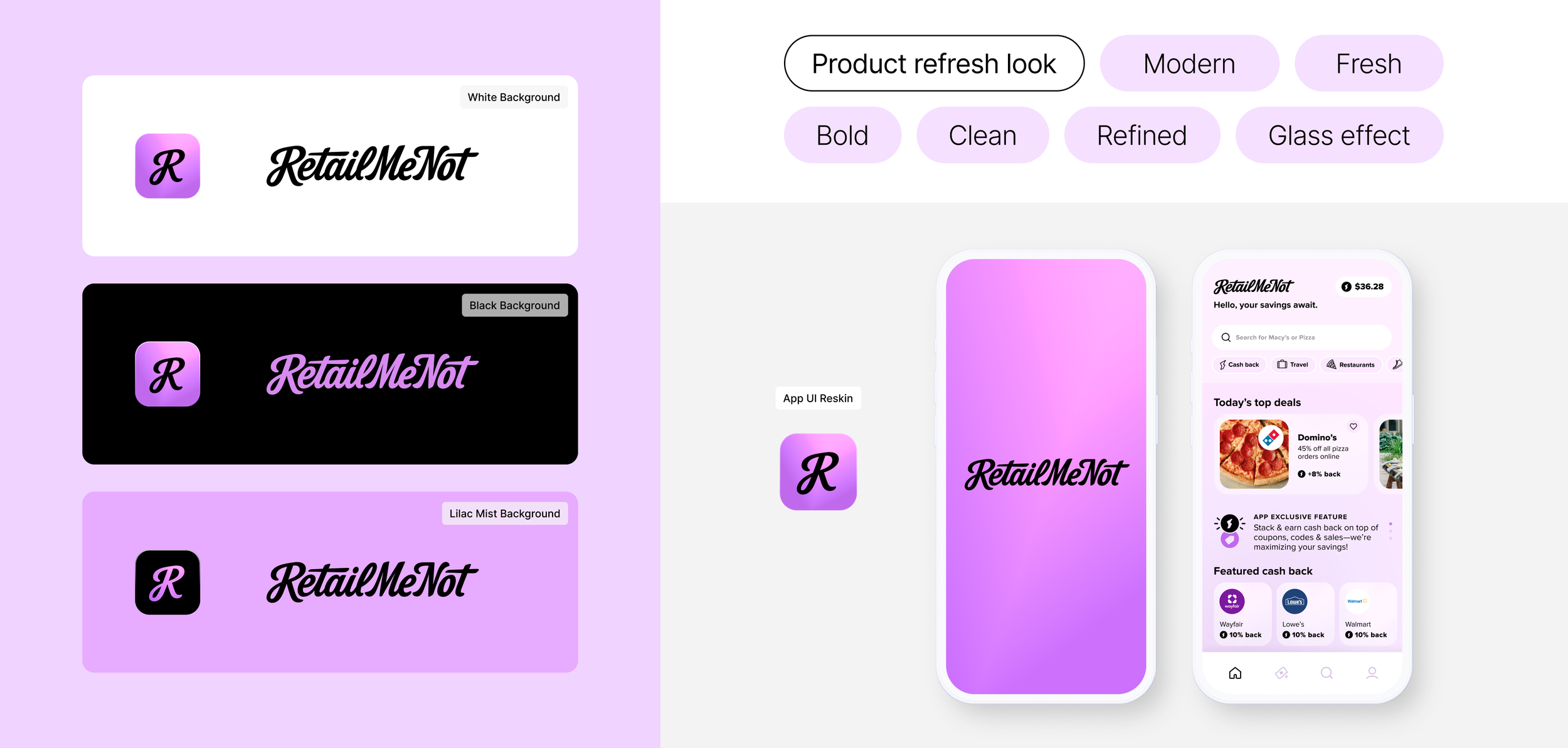
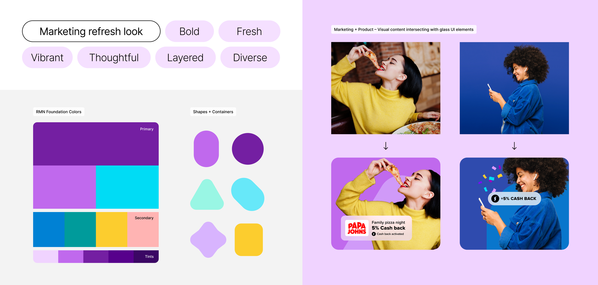
Inspiration: Research into 2025–26 design trends showed glassmorphism, transparency and layered UI treatments becoming increasingly common across established product systems and marketing communications. Inspired by brands like Apple, PayPal and Airbnb, they demonstrated how this clean, glass-like interface style can create a more contemporary digital experience while still supporting flexible brand expression. For RetailMeNot, adapting this approach offered a way to modernize the brand, better reflect today’s digital-first landscape and create greater flexibility across product, marketing and cross-merchandising applications.
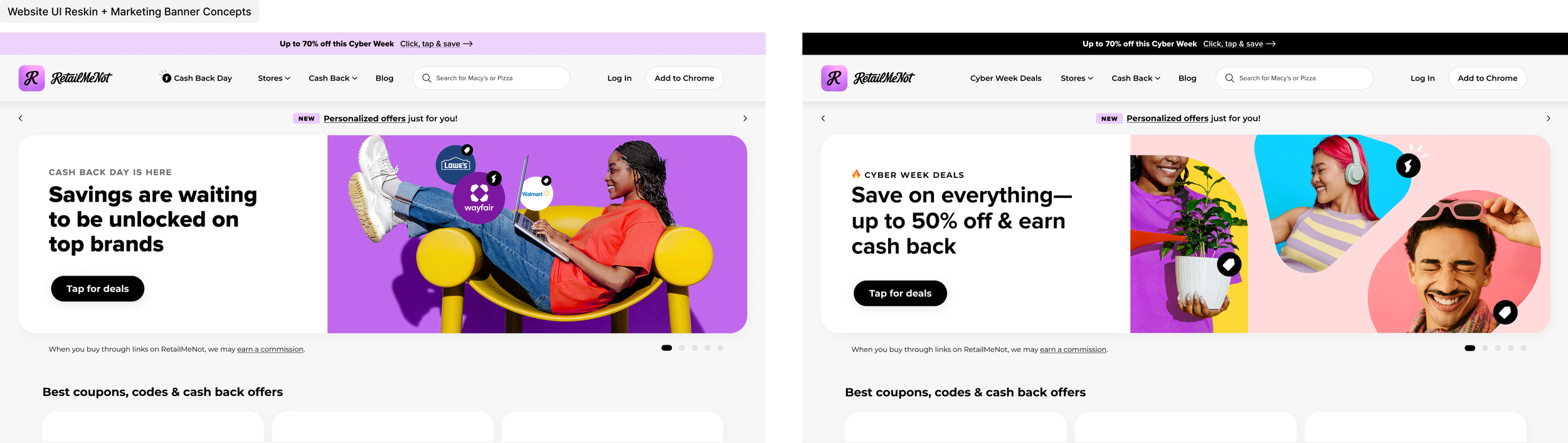
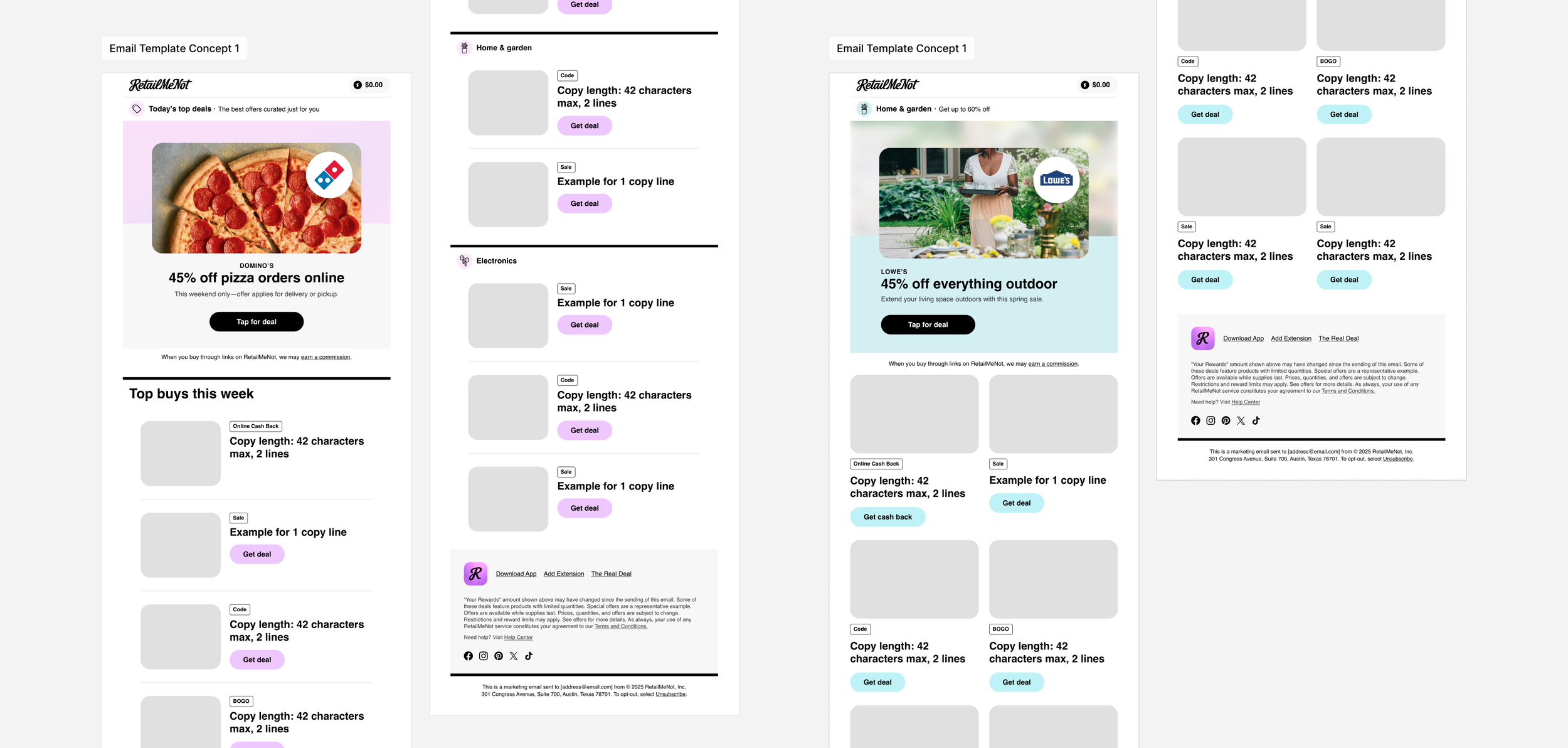
Outcome: Simplify the UI universally so the brand and merchandise content could take greater visual priority. A restrained interface palette of black, white, light gray and a softened RetailMeNot purple, paired with cleaner styling and reusable glass-like modules, created a more cohesive framework across app, web and email. This clearer visual hierarchy gives the vibrant retail imagery and curated promotional content more room to lead, while keeping each experience connected to the broader brand.
A quieter UI.
A louder brand.
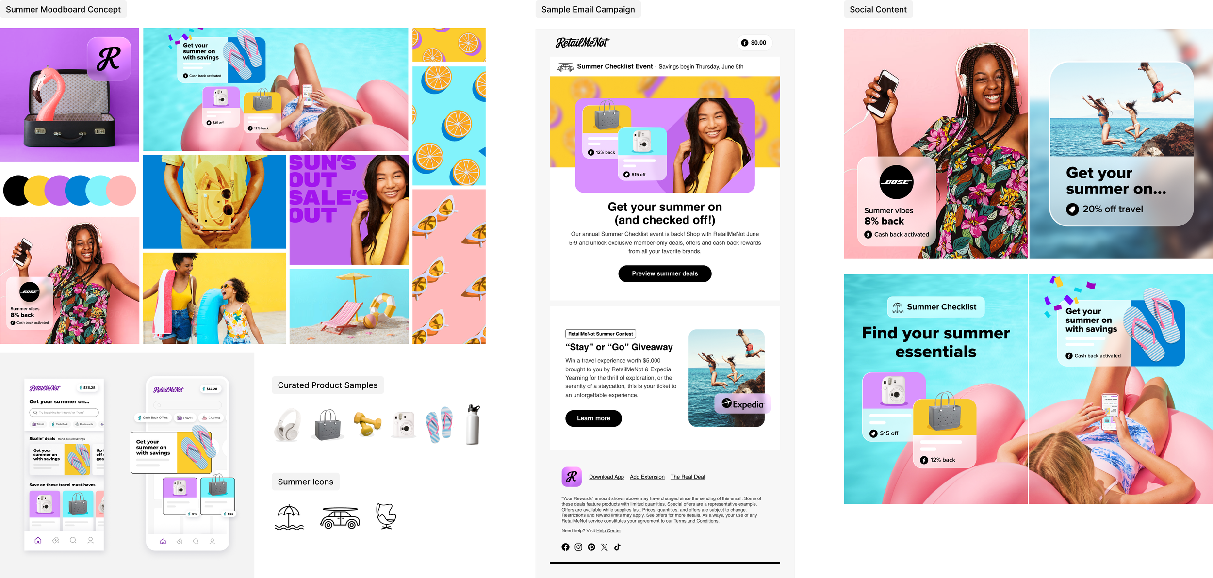
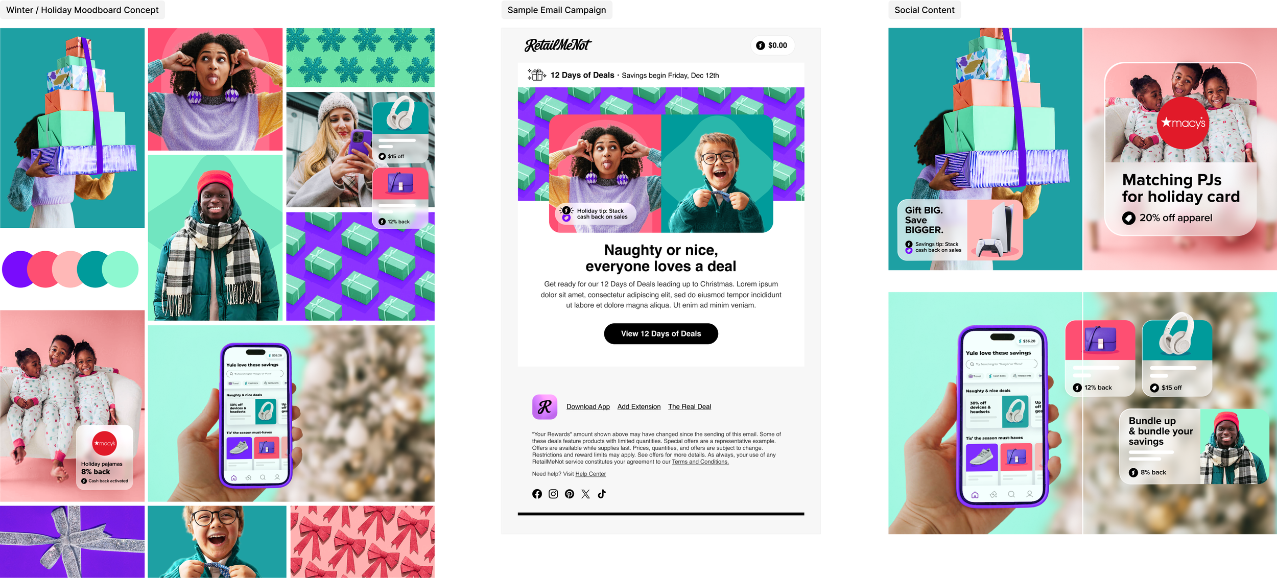
Challenge: With the product UI simplified, the next question was how RetailMeNot’s marketing communications could become more expressive without losing connection to the broader brand. I was tasked to “stress test” the refreshed visual direction through seasonal campaign concepts, using summer and holiday as two distinctly different examples. The goal was to see how far the creative could flex while still feeling unmistakably RetailMeNot across email, social, web and product touchpoints.
Objective: Build a flexible visual system that could work alongside the cleaner Product experience while giving Marketing more room for storytelling, merchandising and seasonal expression. The system needed to support multiple creators, adapt across campaigns and channels, and still connect back to one shared visual language.
Outcome: Start with RetailMeNot’s established foundation colors, then expand them through seasonal tints and complementary accents to create distinct campaign palettes. Familiar shapes became flexible color-blocking devices that added energy, structure and consistency, while curated lifestyle imagery helped establish the mood of each season.
Moodboards first defined each campaign’s color, imagery and tone, then the system was stress tested across email, social and web applications. Glass-like modules carried through as a connective device for key promotional information such as cash back, offers and savings, linking Marketing visually back to how the customer might interact with the Product experience.
Even as the seasonal palettes shifted, each direction retained at least one recognizable RetailMeNot purple and a balance of bold, brighter accents. That consistency allowed the creative to flex from one campaign to the next while remaining grounded in the same brand.
Codifying the visual system.
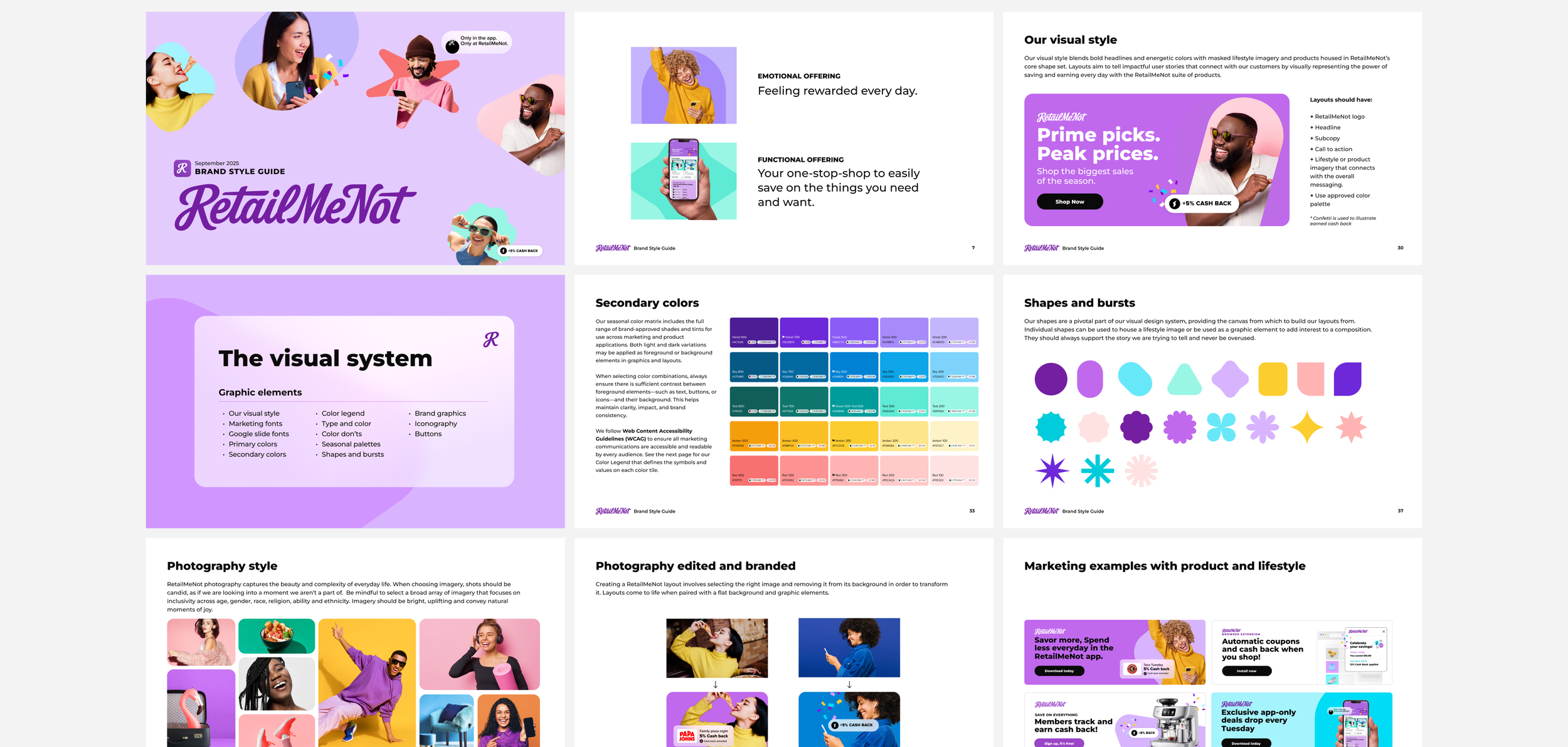
Challenge: Take the learnings from the visual stress tests and define the rules behind what was working into a brand style guide. With multiple designers creating across email, web, app and social, the system needed to be clear enough that different hands could contribute while the work still laddered up to one larger brand.
Objective: Translate the evolving visual direction into a flexible, shared framework for Product and Marketing. The brand style guide needed to cover color, typography, imagery, shapes and graphic treatments, while also showing how those elements could be composed together so different designers could create work that still felt connected across channels.
Outcome: As the refreshed direction moved into real campaign work, other designers began adapting the core elements, expanding seasonal palettes and building on the established library of shapes and graphic devices. Even with individual creative interpretation, the work remained visually connected, validating that the system could flex without losing the brand.
Working closely with the lead product designer and broader creative team, we evolved the existing Marketing brand style guide to capture those shared learnings and define how the visual system should be applied moving forward. The result was a practical reference built from real work, giving multiple creators a common foundation while still leaving room for expression.
Streamlined pages.
Clearer product value.
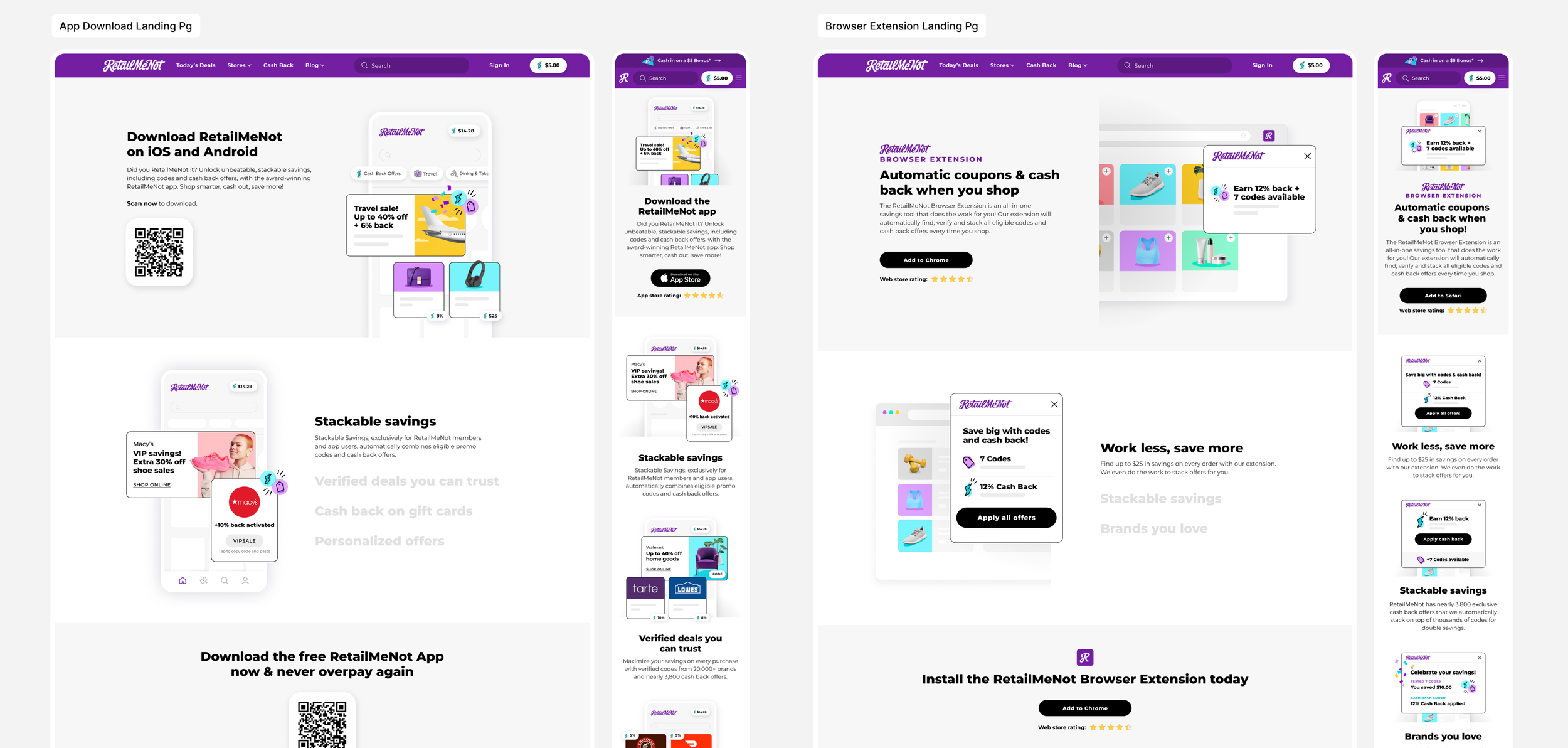
Challenge: Refresh RetailMeNot’s App Download and Browser Extension web pages across desktop, tablet and mobile. Each page needed to quickly communicate how the product works, the savings opportunities it unlocks and why downloading or installing it is worthwhile, without overcrowding the experience with overly detailed UI screens. The work also needed to represent a broad range of shopping categories and partners without relying heavily on brand logos.
Objective: Create a clearer product story built around a few key benefits, showing consumers what each tool does, how it fits into their shopping experience and where the value comes from. The layouts needed to balance product education with visual merchandising, adapt cleanly across responsive breakpoints and remain consistent with the evolving RetailMeNot visual system.
Outcome: Continued to simplify the UI so the product framework receded and the visual communication takes lead. RetailMeNot’s foundation colors, bold color blocking, curated product imagery and layered callout modules reinforced the refreshed brand direction while showcasing the breadth of shopping categories. Select product screens were used to demonstrate functionality, supported by concise messaging focused on cash back, codes, savings and ease of use. The result was a cleaner, more responsive experience that made each product easier to understand at a glance.
A distinct look for Code Day.
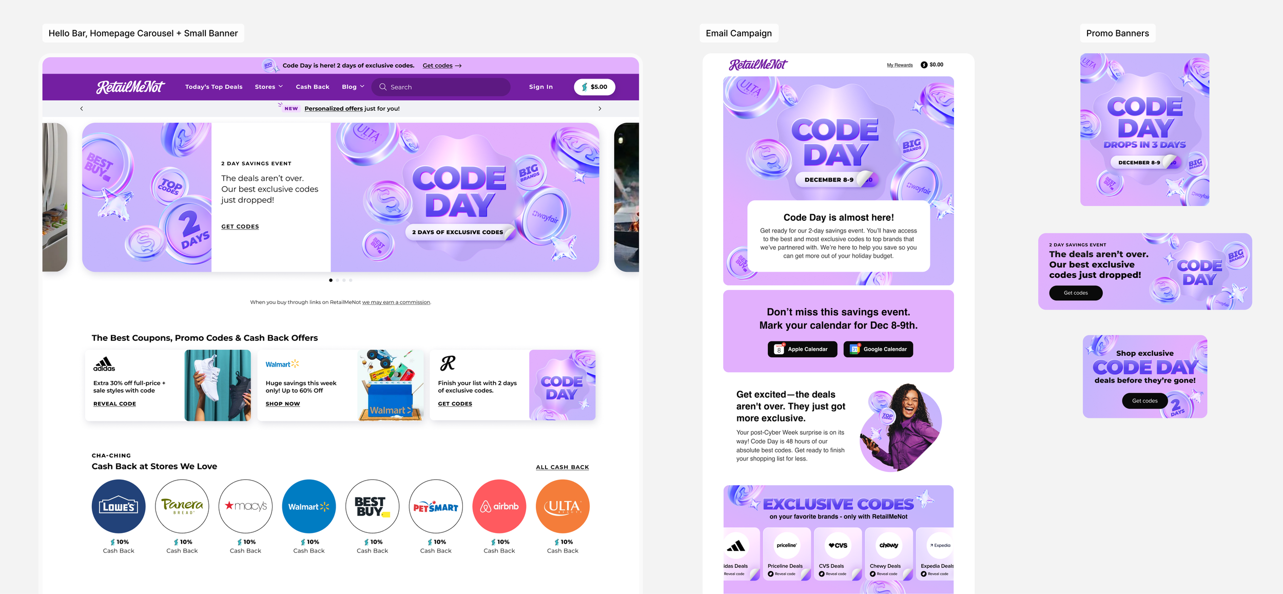
Challenge: Develop a visual identity for a new RetailMeNot marketing initiative, Code Day, launching during an already crowded holiday promotional calendar. With campaigns like Black Friday and Cash Back Day running back to back, Code Day needed to feel clearly ownable, elevated and distinct while still connecting to the evolving RetailMeNot brand.
Objective: Create a campaign expression that feels new, exclusive and event-driven without losing the visual equity already established through the broader refresh. The look needed enough flexibility to scale across homepage placements, email and supporting promotional banners while maintaining one recognizable campaign presence.
Outcome: Build the campaign around lighter and richer tints of RMN purple, using soft gradients, dimensional forms and glass-like effects to create a more elevated, contemporary feel. Partner logos were either tinted purple or rendered in monochromatic black to maintain control of the campaign palette and overall visual hierarchy. The refreshed system was pushed further through layered, futuristic graphics and savings-focused visual cues, balanced by bold, direct messaging. The result was a distinct campaign identity that felt premium and special, yet recognizably RetailMeNot.
↓ Full design scope
Brand refresh concept
Visual identity development
Color + visual language
Iconography
Brand guidelines
Creative direction
Photography direction
Copywriting
Website design
Email + CRM
Social media design
Seasonal campaigns
… she’ll execute it with precision and a level of excellence that is hard to find.
Tara Coughlin
Former Lead Product Designer
RetailMeNot.com