
featured work
Chicago Dental Specialists
→ Brand identity
→ Marketing + digital
→ Interiors
Role + contribution: Chicago Dental Specialists became a full-spectrum brand engagement, giving DWC the opportunity to shape the brand from the ground up and carry one creative vision across nearly every customer-facing touchpoint.
Starting with naming, brand concept development and a complete visual and verbal identity, the work extended across digital, marketing and the physical environment. Rather than treating each expression as a separate project, every decision was shaped to reinforce the same brand story and visual language.
Working closely with the client and their vendors, including the contractor and developer, I helped guide the work from concept through implementation across both digital and physical environments. The result is a cohesive experience that feels connected at every scale, from screen to space.

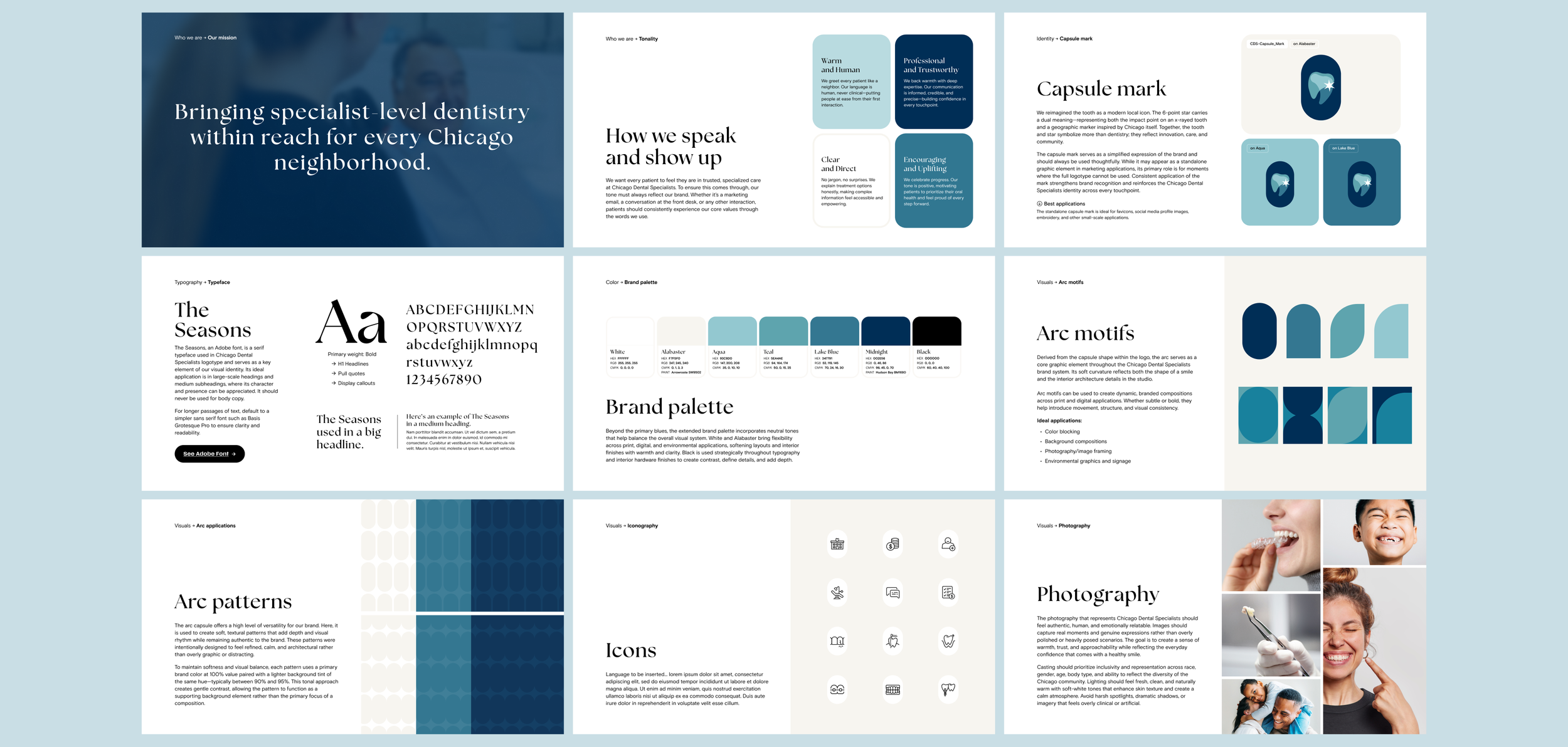
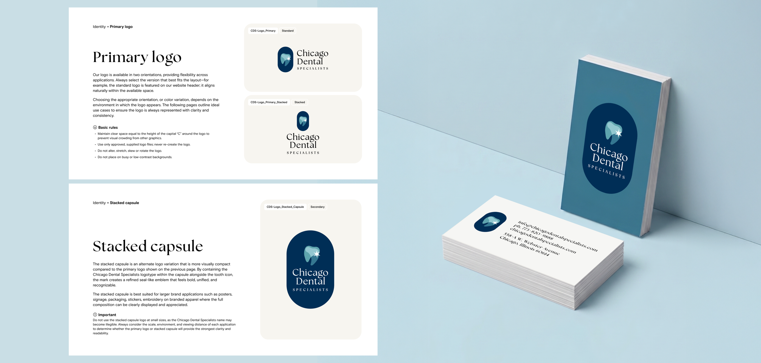
Visual identity + brand guidelines
Challenge: Create a distinct identity for a new specialty dental practice that balanced expertise and sophistication with warmth and accessibility. Visually, it needed to feel polished and credible without becoming overly formal or exclusive, making the brand feel welcoming and attainable across Chicago neighborhoods.
Objective: Build an ownable visual and verbal identity that could carry that positioning consistently across every expression of the brand. The identity also needed enough flexibility to translate from digital and marketing to signage and the physical interior, creating one connected experience at every scale.
Inspiration: With Chicago already part of the brand name, I wanted the identity to carry a visual sense of place as well. The palette draws from the lakefront, using deep navy, lake blue, teal and aqua. The tooth mark is paired with a six-point star that carries dual meaning: marking the point of impact on an x-ray and a geographic marker inspired by the city.
Outcome: Curated a visual and verbal identity that feels authentic and distinctly CDS, with each element designed to work together as part of one recognizable brand language. From the core identity to photography and supporting graphics, the system was built to extend naturally across applications and environments. The brand guidelines brought those elements together into a clear framework, helping the client maintain consistency, protect the integrity of the identity and give the brand room to grow.
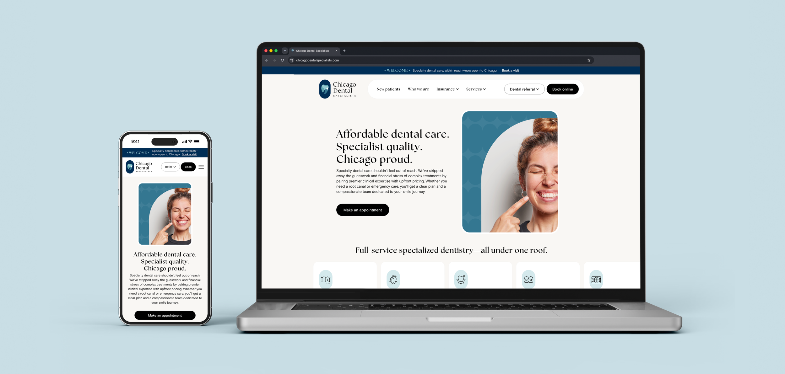
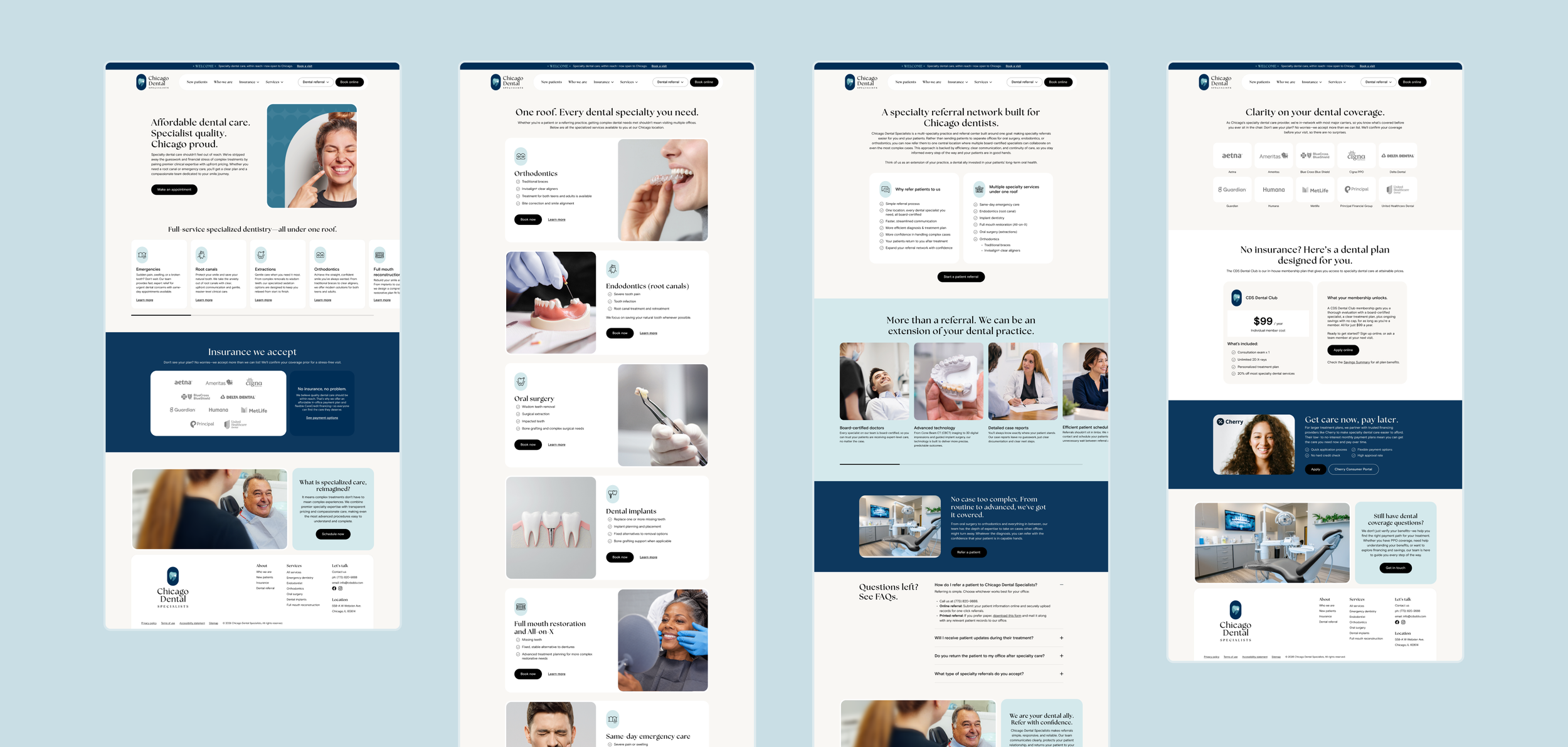
Website design
The CDS visual identity comes fully into focus on the website, where the established brand system is applied to a complete digital experience. Across the interface, the alabaster-white backdrop, bold typography, lake-inspired color palette, playful ellipse pattern, iconography and soft curves reinforce that identity in a clear, cohesive way. Rather than treating the website as a separate design exercise, every visual decision builds on the same system.
The front-facing website UI was developed across desktop, tablet and mobile, shaping the layout, hierarchy, navigation, components, forms and calls to action. Brand voice, copywriting, photography selection and retouching were considered alongside the interface, allowing the visual and verbal experience to work together as one system. Close collaboration with the developer through implementation helped preserve the original design intent and maintain consistency from the brand guidelines through to the live site.
Site coming soon

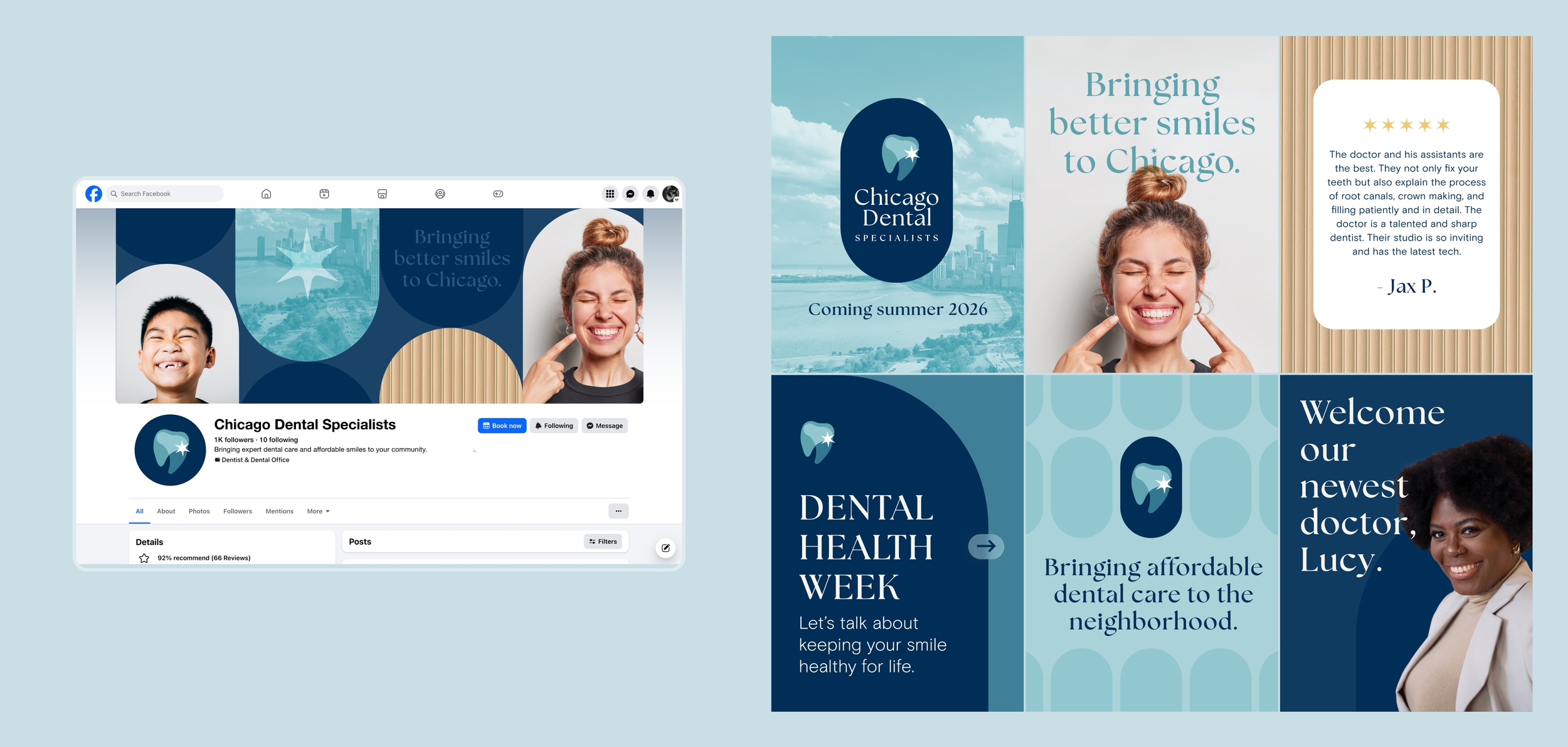
Digital advertising + social content
Paid advertising required a more disciplined expression of the CDS identity: clear messaging, strong hierarchy, breathing room for the brand mark and direct calls to action, with the visual language adapted across multiple banner formats.
Social content allowed the brand to become more expressive. The established palette, capsule patterns and shapes, photography and typography were pushed further through bolder compositions, campaign messaging, patient reviews and community-focused content. The goal was to give the brand enough flexibility to feel engaging in the feed without losing the consistency and recognition of the broader identity.

Interior + exterior signage
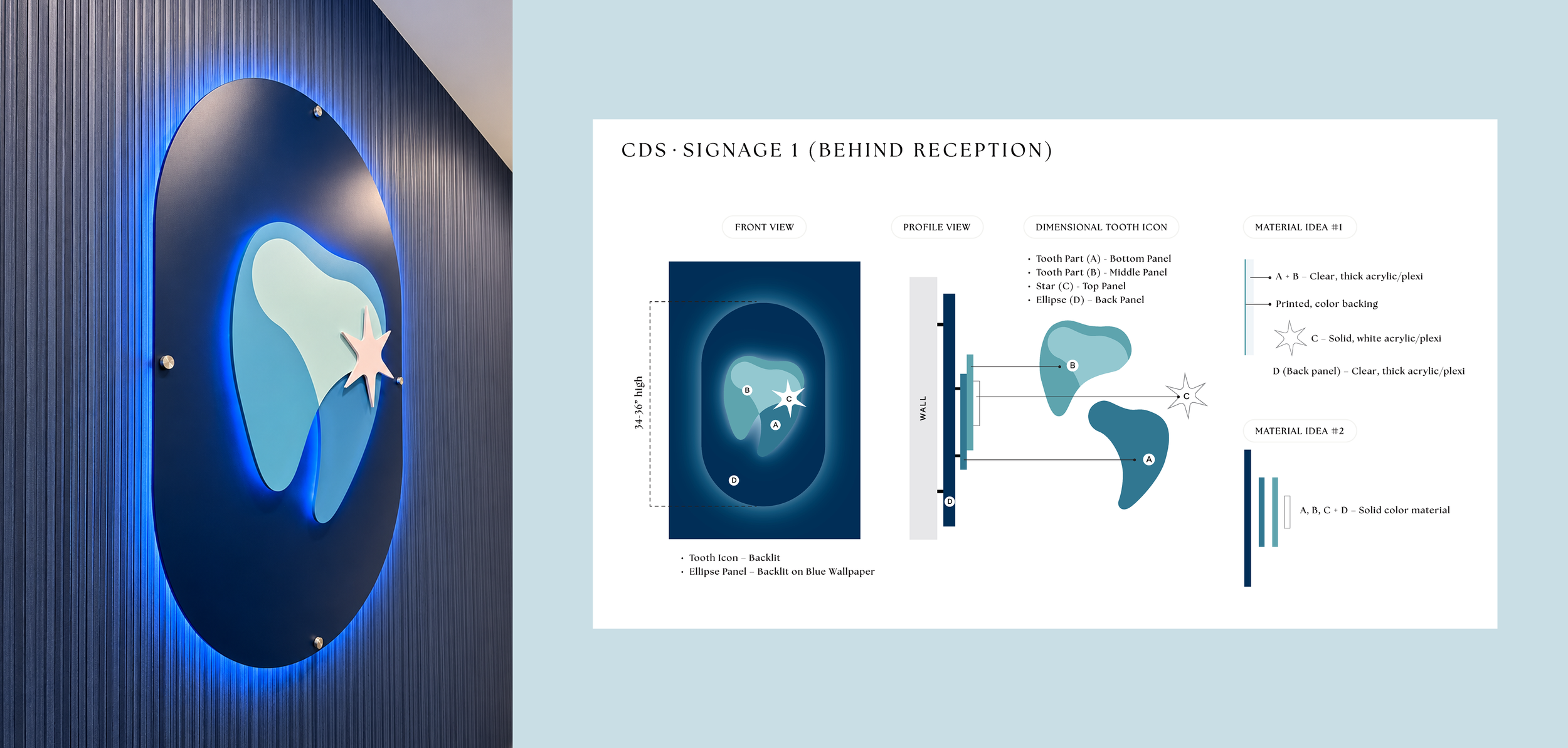
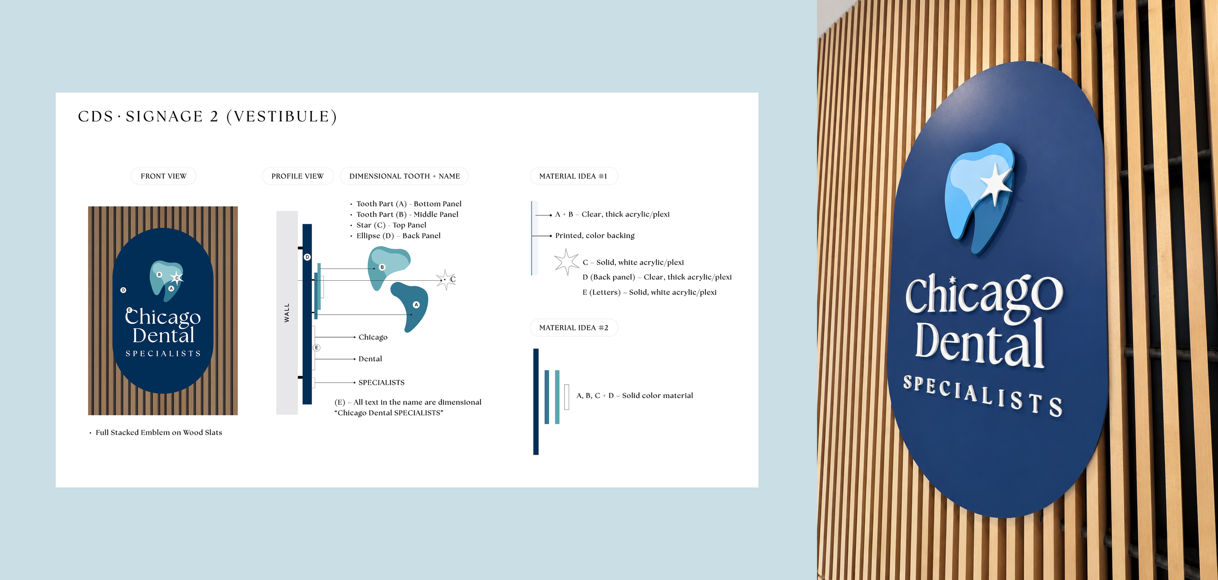
Signage extended the CDS identity beyond the page and into the physical environment. Rather than applying the logo onto a flat surface, the goal was to give it dimension, depth and material presence appropriate to the surrounding architecture.
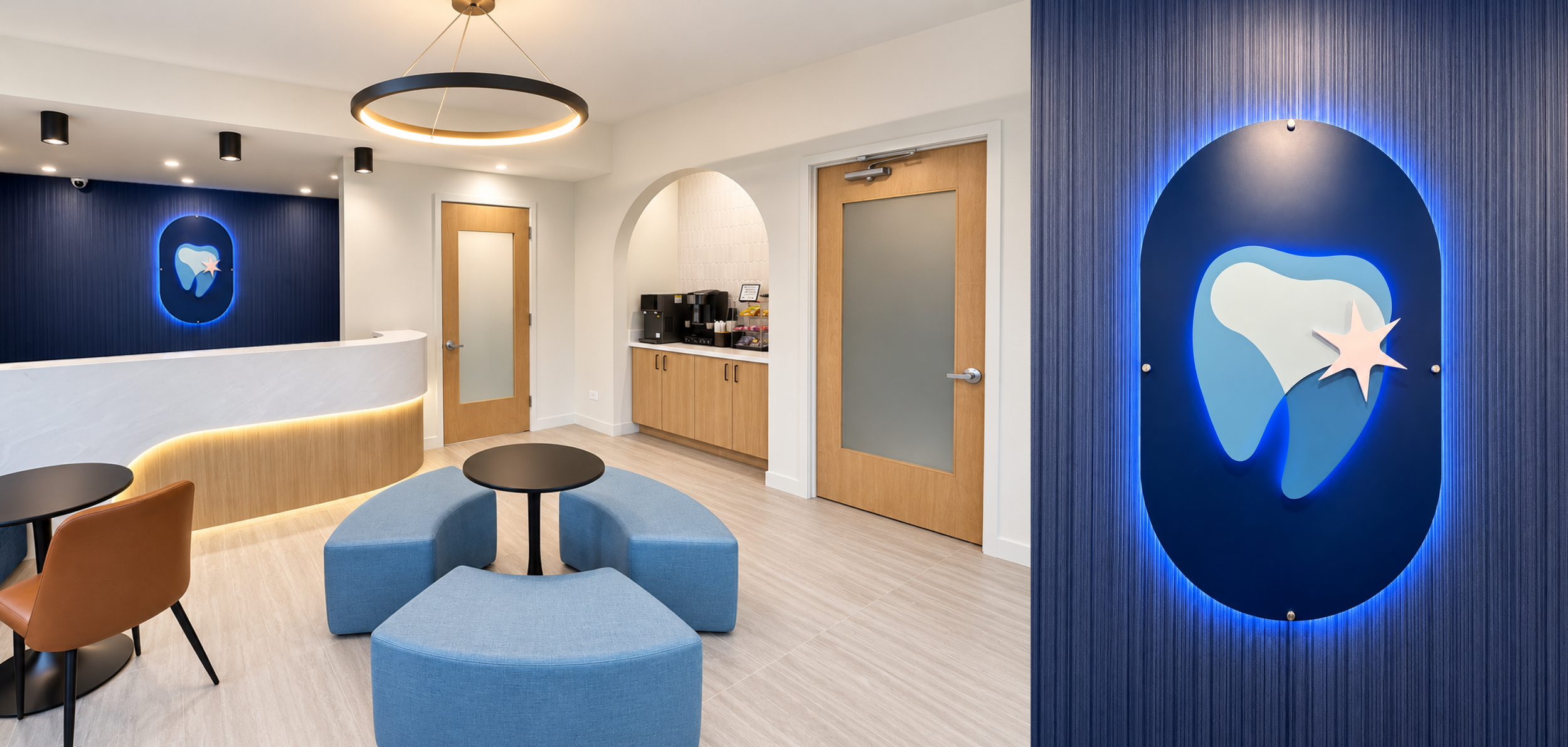
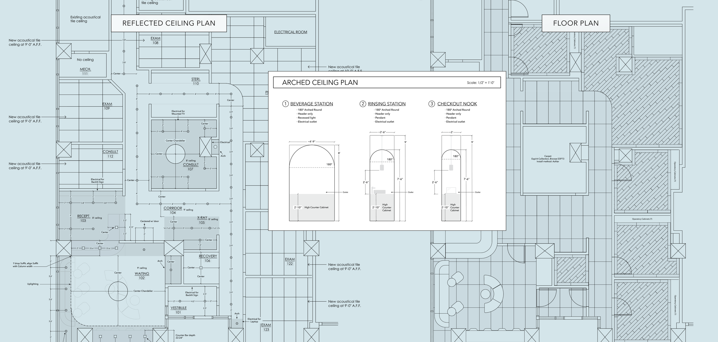
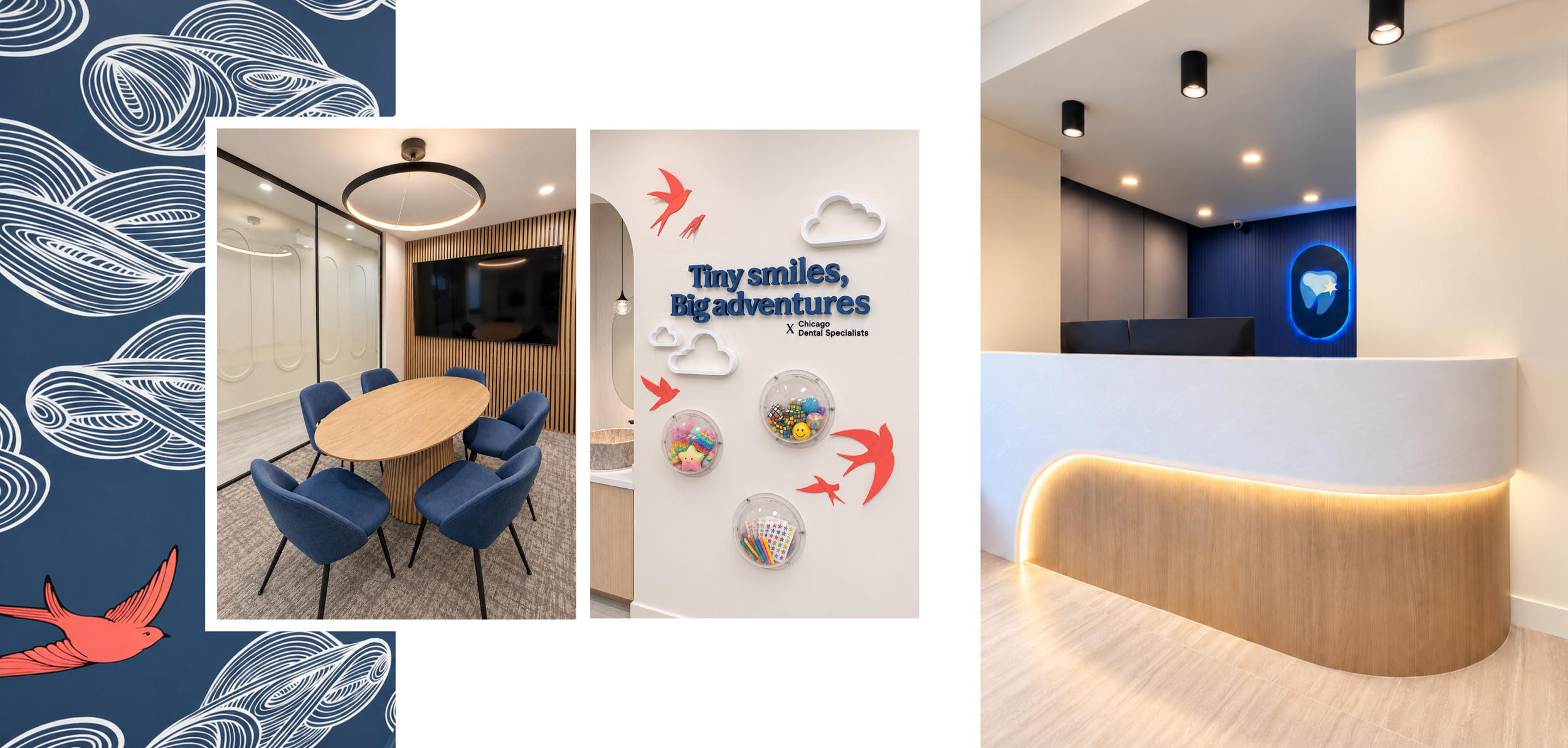
Concepts and dimensional specifications were developed for the sign vendor, outlining the overlapping layers, materials and lighting. Inside the lobby, behind the reception desk, the capsule mark floated off the wall to allow for backlighting, creating separation from the textured blue backdrop and giving the identity a stronger visual presence.
Interior design, strategically shaped by the brand.
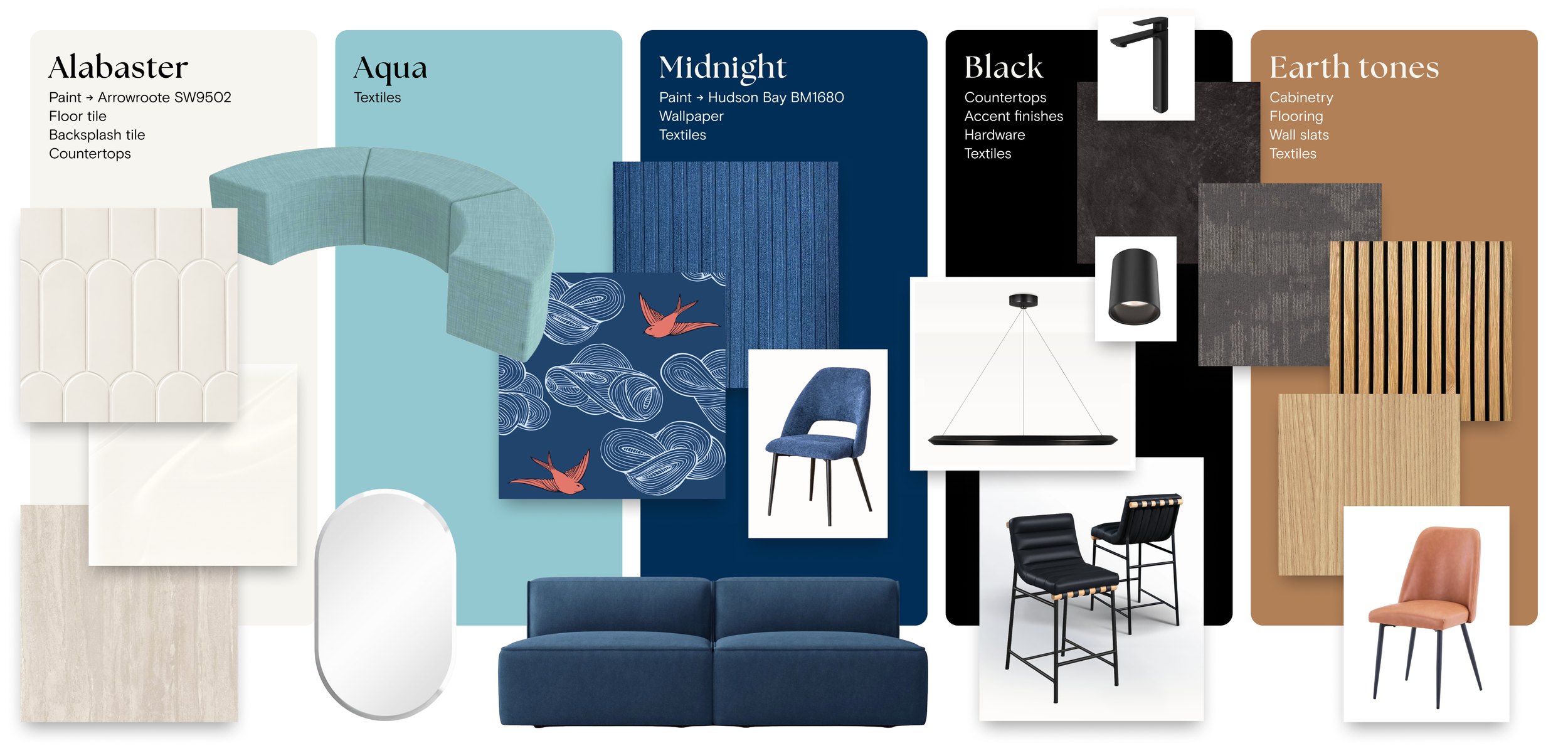
As a physical extension of the CDS identity, the interior carries the same visual language into the built environment. Core brand colors were translated into paint, upholstery, wallpaper and furnishings, while natural wood tones and warmer materials softened the palette and made the space feel more welcoming. The lobby was intentionally designed to feel more like a comfortable home than a traditional waiting room—a place where someone could settle in or work remotely while waiting for a family member.
Curves and rounded forms were repeated throughout the space through the custom reception façade, arched beverage and rinse stations, scalloped backsplash tile, furnishings and customized ellipse wall moulding in the corridors. Together, these elements create an environment that feels approachable, cohesive and recognizably CDS.
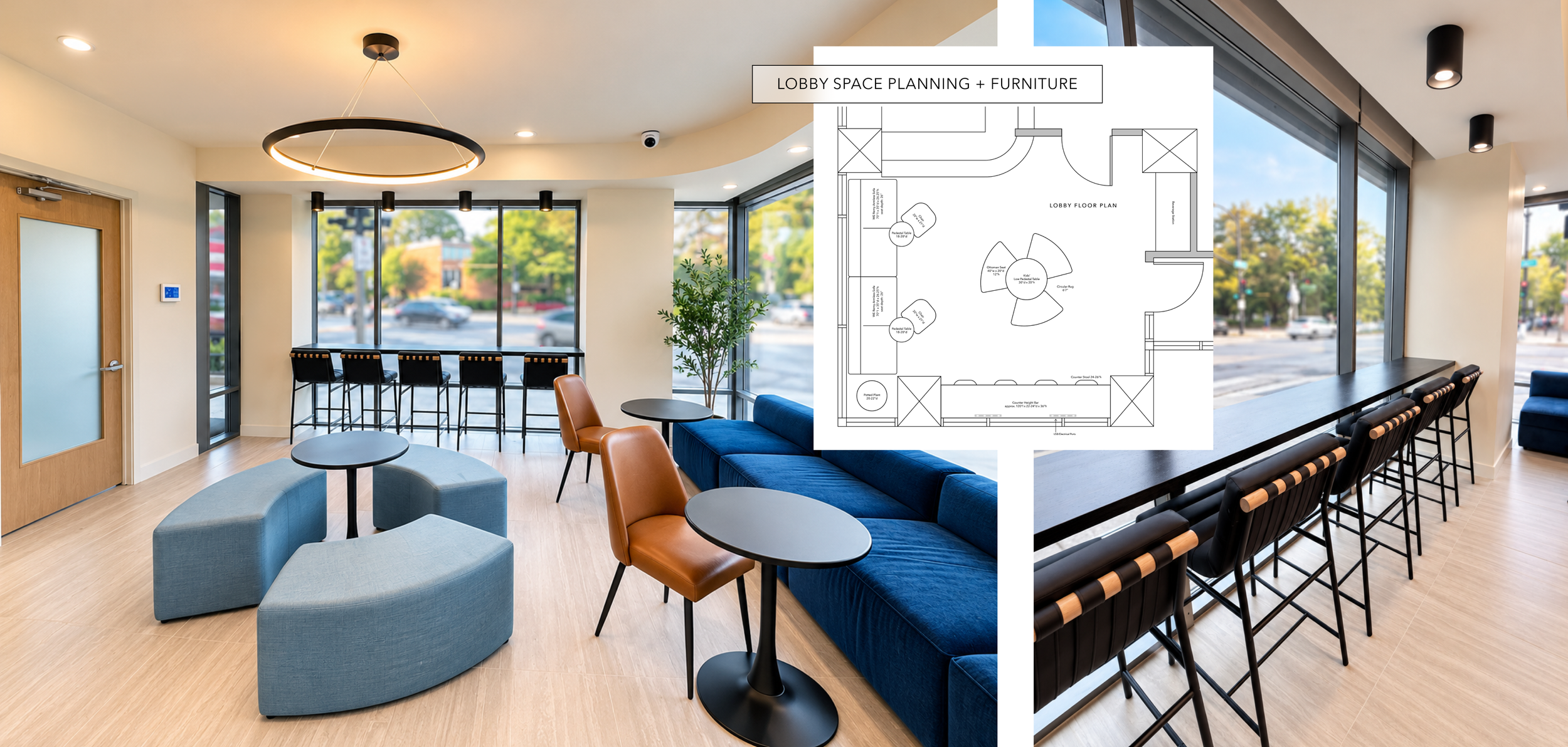
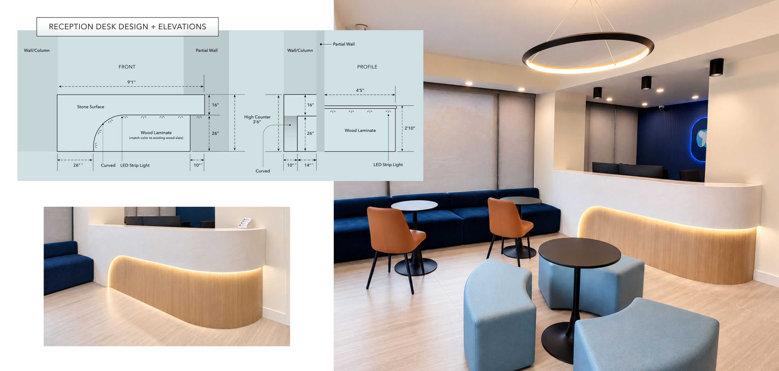
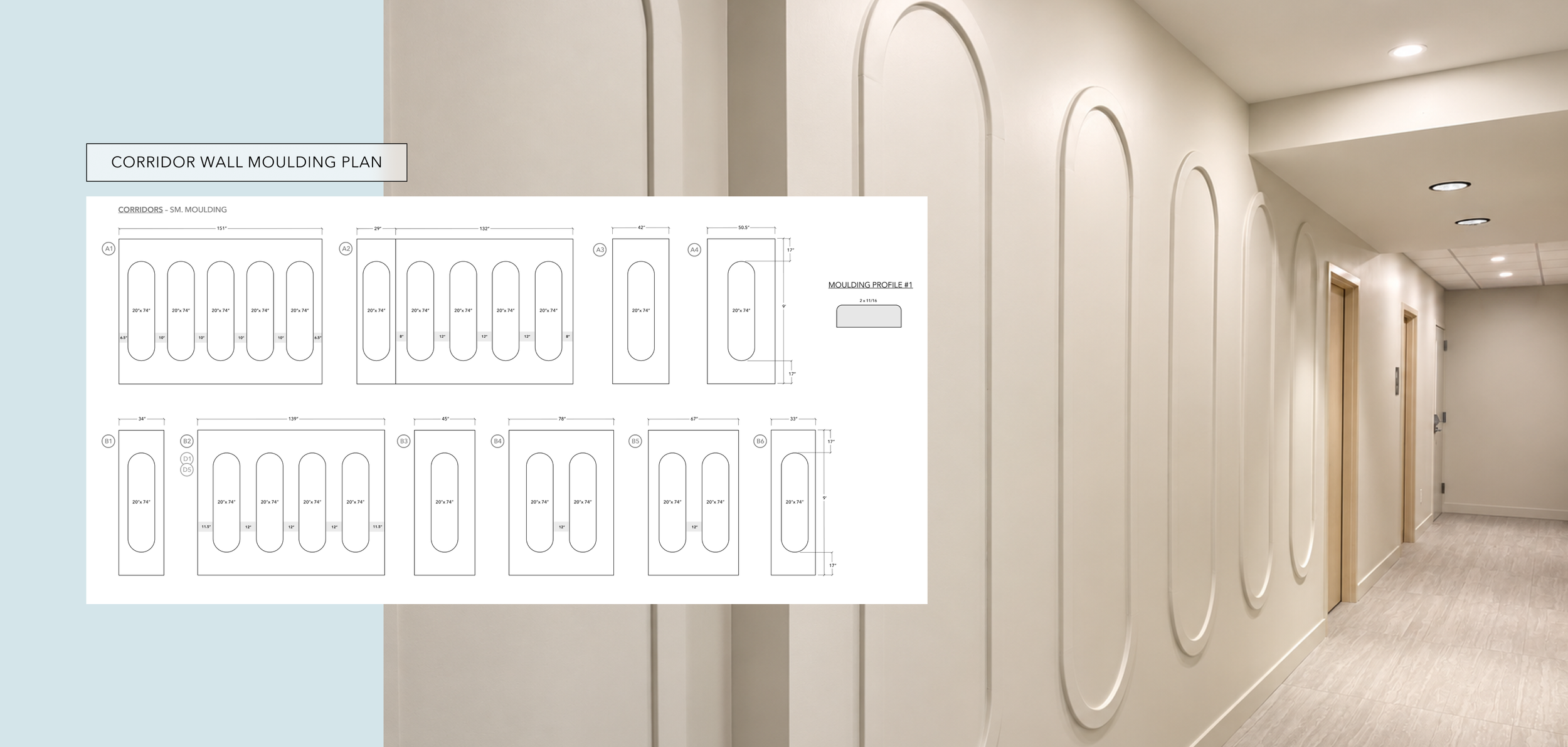
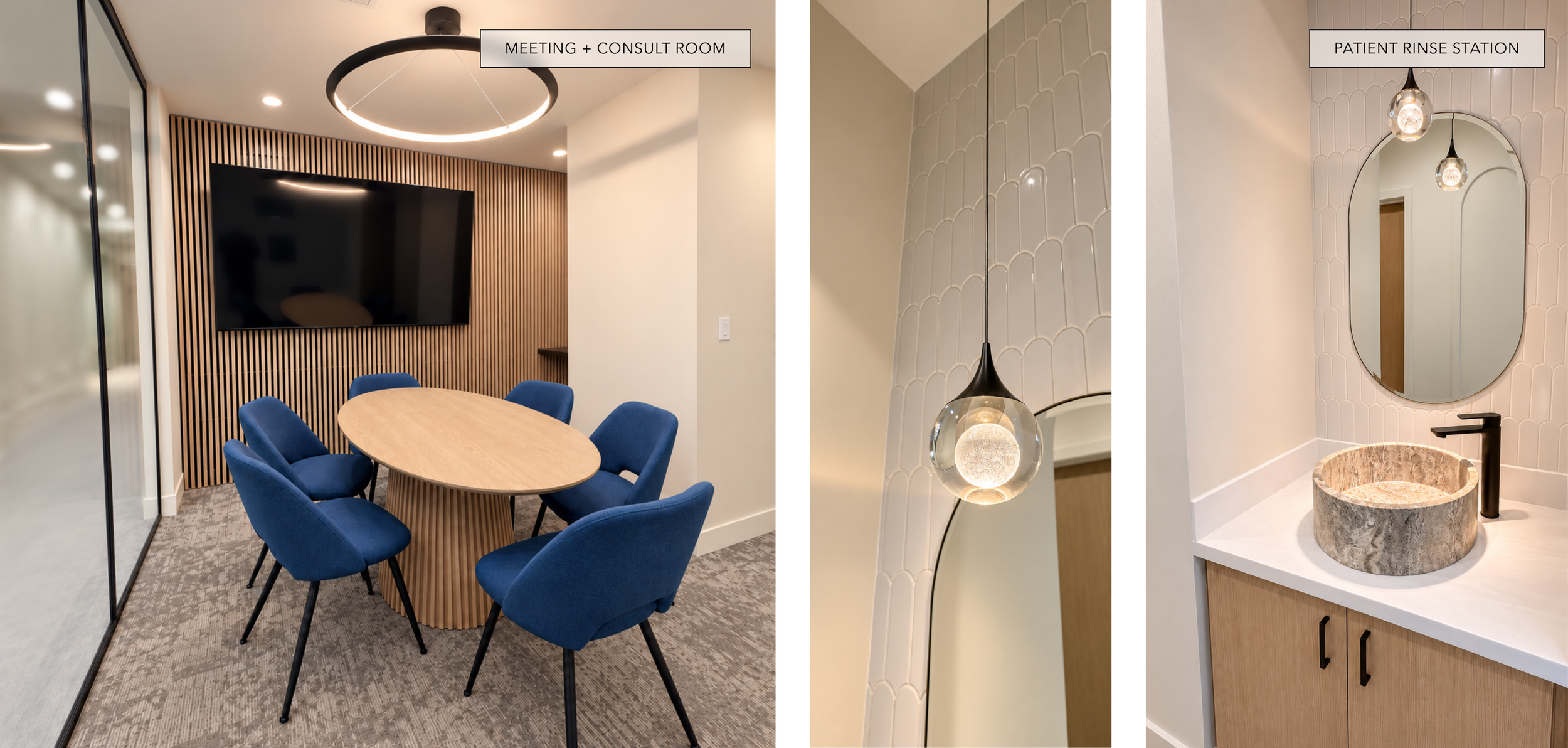
Most of the dental studio uses a minimal, off-white backdrop, allowing the core brand color—midnight blue—to appear more selectively throughout the space. Those moments show up in the furnishings, the textured linear wallpaper in reception and, most dramatically, in the pediatric and orthodontic bay, where the room shifts into a fully immersive blue environment.
Together, these details make the interior feel intentionally designed as part of the broader brand experience rather than simply styled around it.
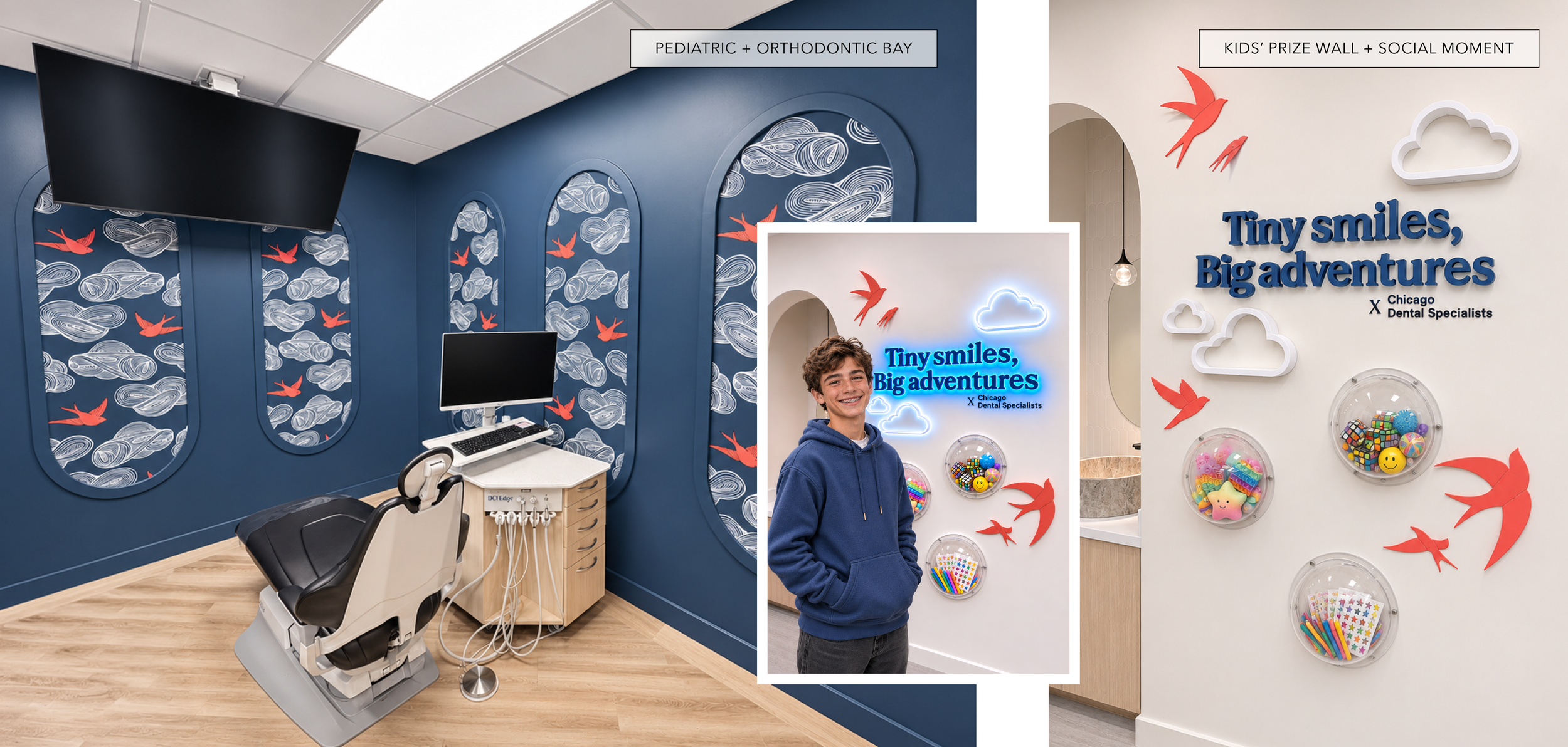
For younger patients, the pediatric and orthodontic bay was purposefully designed to feel fun and visually engaging. Unlike the predominantly alabaster-white corridor, this room is color-drenched in midnight blue, creating a more dramatic backdrop for the whimsical bird-and-cloud wallpaper. Inset within the ellipse moulding, the pattern takes on an almost portal-like effect, turning the treatment room into a more imaginative and memorable experience.
The nearby prize wall extends that thinking beyond treatment. A custom “Tiny smiles, big adventures” neon feature, playful dimensional birds and prize bins create a celebratory post-appointment moment that also doubles as a natural photo and social-sharing opportunity.
↓ Full design scope