
featured work
CDT Remodeling
→ Brand identity
Role + contribution: With two generations of experience behind the business, CDT Remodeling had established a reputation for high-quality residential renovation, but its visual identity had not evolved at the same pace.
The engagement focused on repositioning the brand through a more sophisticated identity system, beginning with the logo and extending into color, typography, brand guidelines, collateral and physical applications. The work balanced modernization with continuity, creating a stronger visual presence that better reflects the craftsmanship, precision and elevated service already associated with the business.
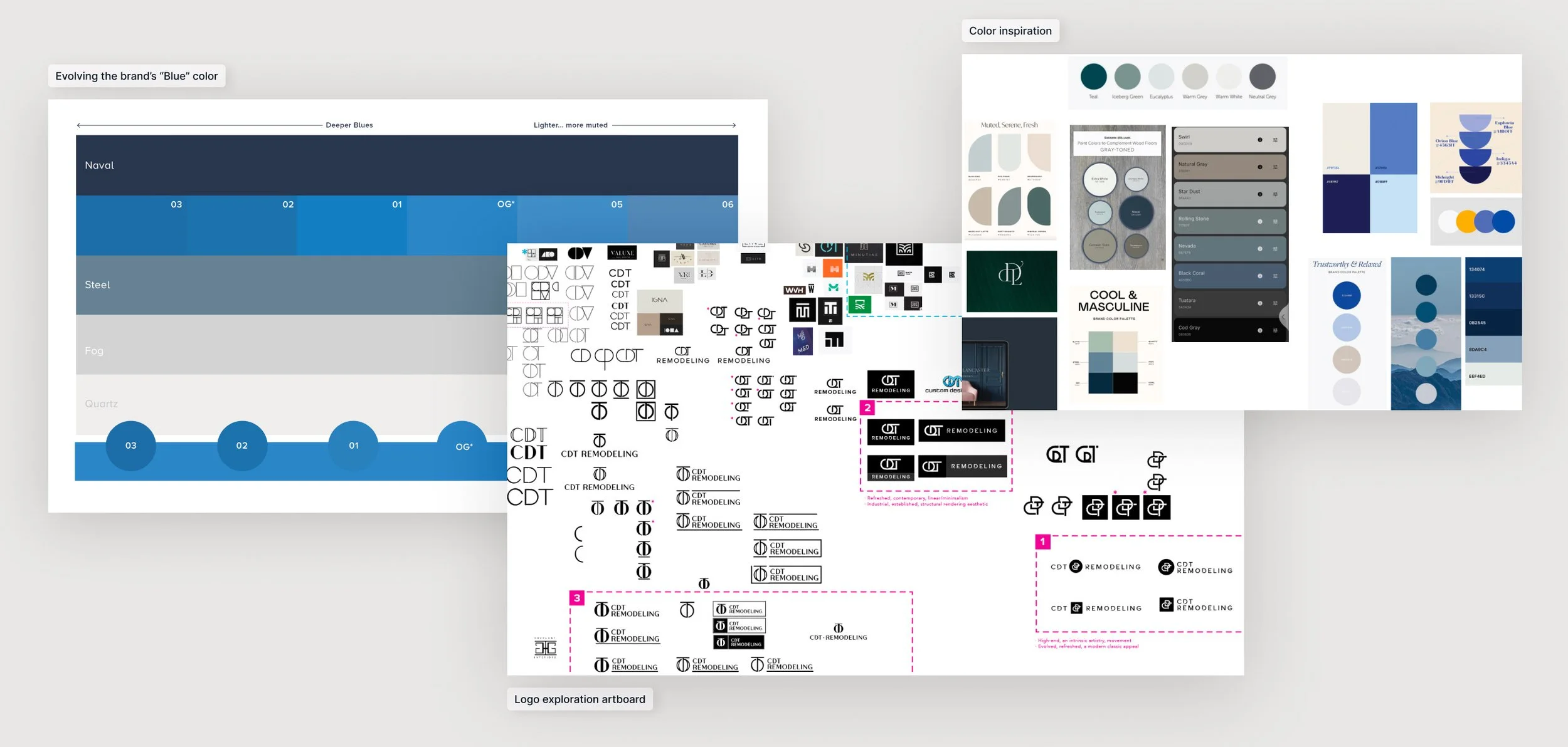
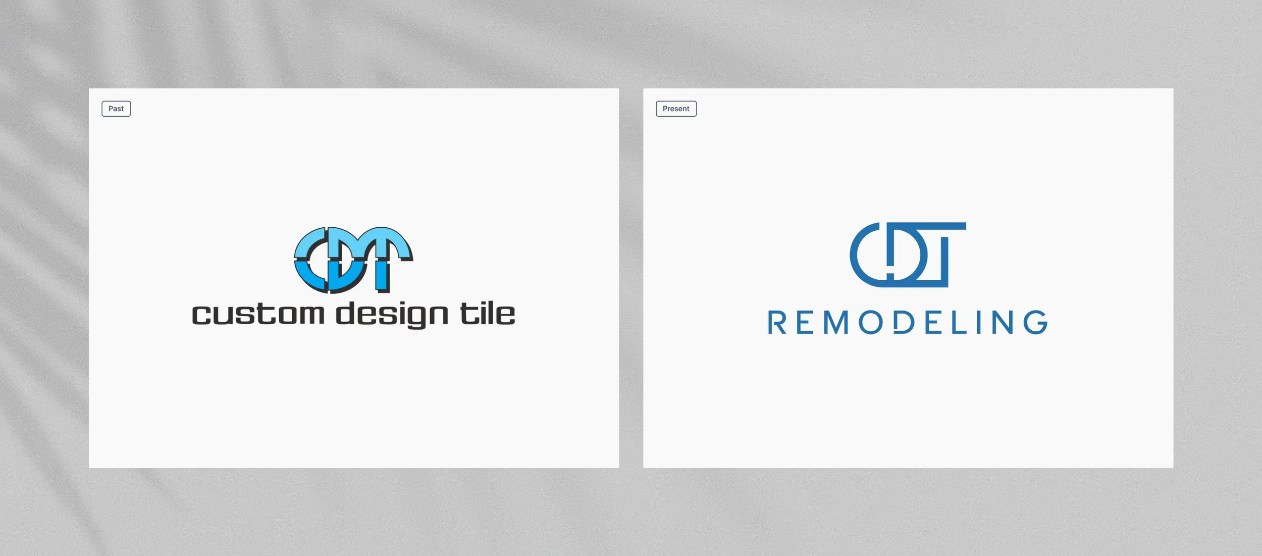
Homage to the past, but a clearly remodeled identity.
Challenge: CDT had built years of recognition around its original identity, but the brand no longer reflected the sophistication or breadth of the business. As the company evolved from Custom Design Tile into CDT Remodeling, the identity needed to signal a broader residential renovation offering without losing the familiarity and equity already established with longtime clients.
Objective: Create a more elevated, current identity while preserving enough visual continuity to feel like an evolution rather than a complete departure. The CDT acronym and signature blue remained important links to the past, but both needed to be reworked into a system that felt more refined, architectural and representative of the company today.
Inspiration: The visual direction drew from floor plans, architectural linework and the structured geometry of interior spaces. Those references informed the interconnected CDT lettermark, while the palette evolved toward deeper, more sophisticated blues and softer neutrals inspired by contemporary interior finishes.
Outcome: The refreshed identity retains recognizable elements from the original brand but gives them greater clarity, structure and maturity. The custom lettermark intertwines the CDT initials through linear forms reminiscent of walls and openings in a floor plan, while the expanded palette balances Marine and Midnight blues with quieter neutral tones. The result feels more elevated and masculine, reflecting both the father-and-son team behind the business and the level of craftsmanship they bring to their work.
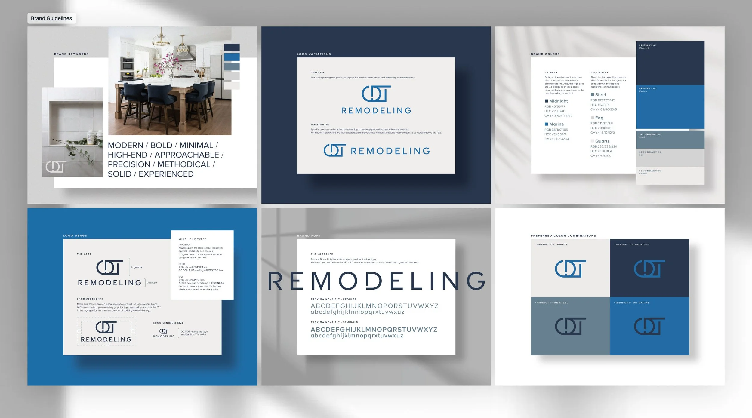
Brand guidelines + applications
The identity was designed to work well beyond the primary logo. Brand guidelines established the core rules for typography, color, logo usage and preferred combinations, creating enough structure to protect the visual language while still allowing it to adapt across different applications.
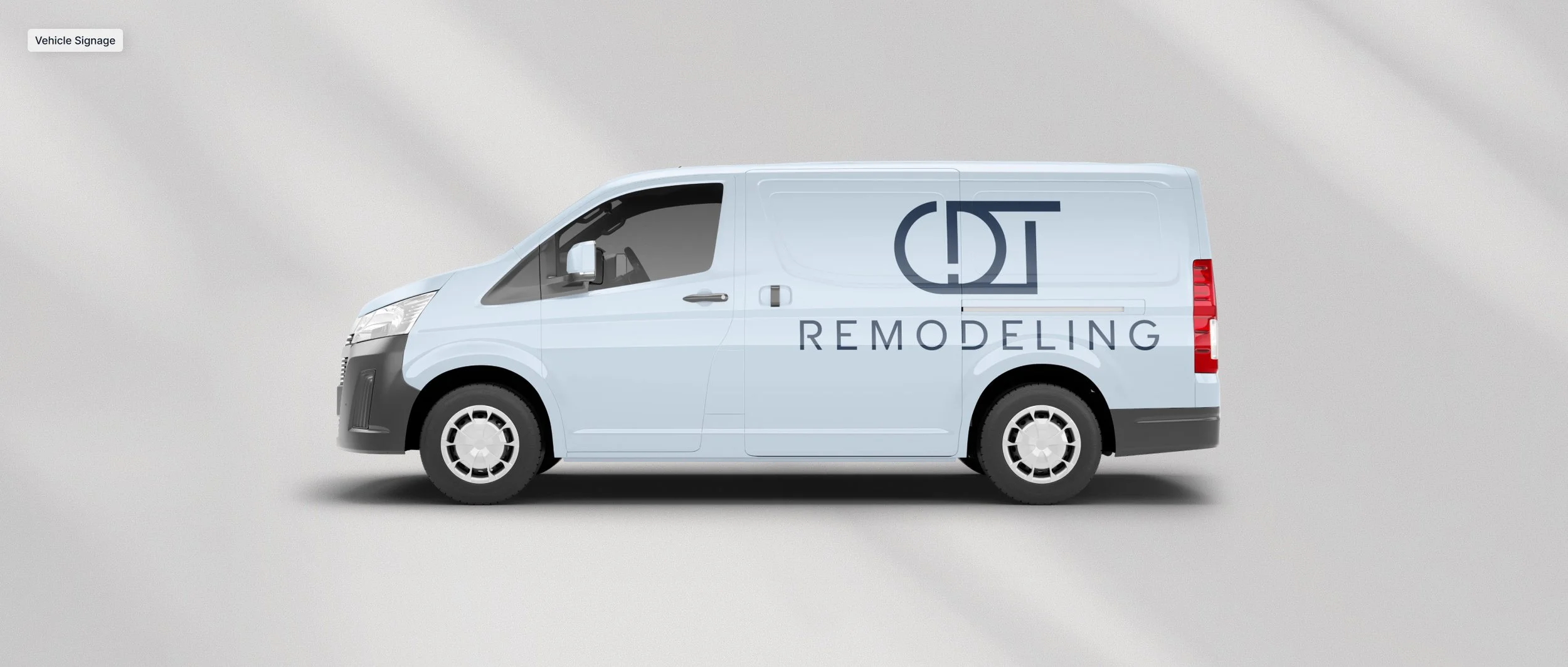
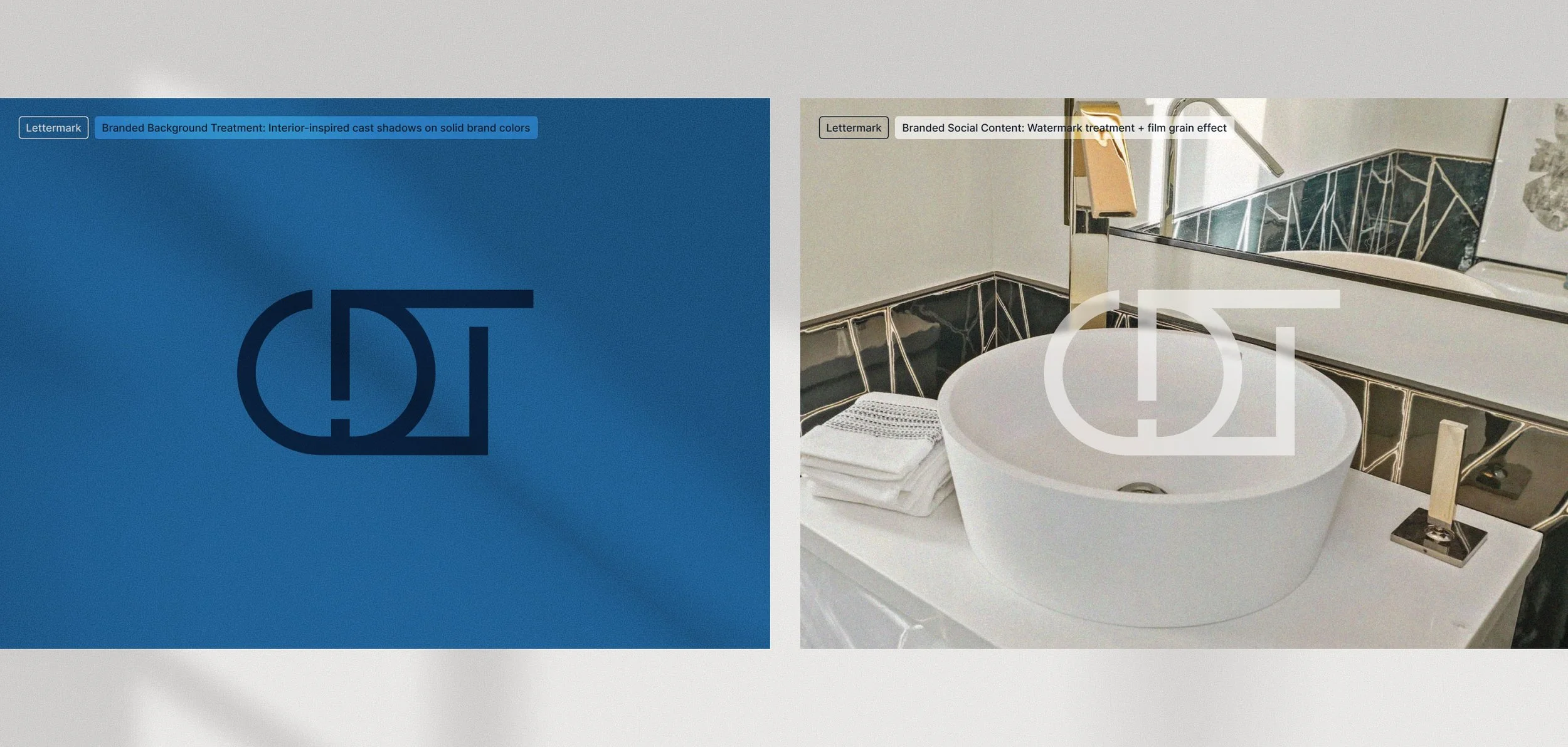
Supporting treatments added another layer of recognition. Cast shadows inspired by windows, foliage and residential interiors bring a subtle sense of place to solid brand-color backgrounds, while the CDT lettermark can be used as a watermark across project photography. A soft film-grain treatment helps visually connect imagery captured across different homes, lighting conditions and stages of work.
From vehicle signage to social content, each application extends the same visual thinking without requiring every piece to look exactly the same.
Alternate identity directions.
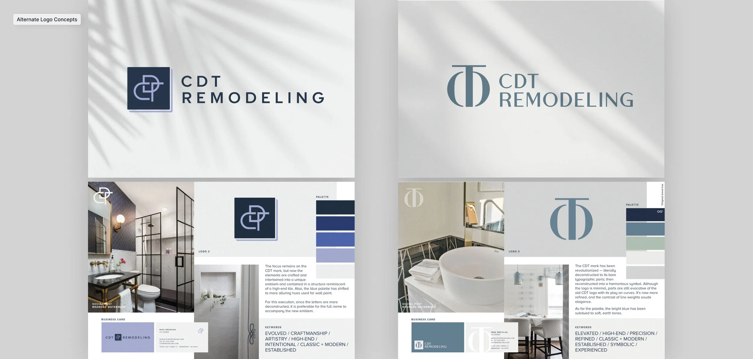
Two additional identity directions were developed as strong contenders alongside the selected concept, each exploring how far the CDT brand could evolve. Both moved further from the framework of the previous identity, relying primarily on the CDT initials as the visual connection to the past. The client strongly considered these more transformative directions before ultimately choosing the concept that struck a closer balance between familiarity and change.
The first concept draws from the geometry and materiality of high-end tile, creating a compact monogram with a more crafted feel. The second takes the CDT initials in a more sculptural direction, with proportions and detailing reminiscent of luxury hardware or jewelry.
Together, the concepts helped define the range of possibilities for the refresh and gave the client a clear view of both evolutionary and more transformative paths forward. While the selected identity felt right for this stage of the brand, these directions also point to how CDT could continue to evolve over time.
↓ Full design scope