
featured work
Barrier (Max Barrier 40)
→ Brand identity
Role + contribution: GranuLotion had an established medicated cream and a loyal customer base, with years of brand and marketing work already in place. As part of the treatment process, a zinc-oxide skin protectant was used to protect the healthy skin surrounding over-granulated tissue, creating a natural opportunity for the company to develop its own complementary product rather than direct customers to another brand.
The engagement focused on creating the identity for a new skin protectant cream. Initially launched as Barrier, the brand was designed to speak to a broad audience of parents seeking a gentle, natural-ingredient option for babies.
As the product entered a crowded diaper-rash category, its positioning evolved. Barrier later became Max Barrier 40, with the identity shifting toward a more medical, product-driven expression that could align more closely with GranuLotion while still maintaining its own distinct presence.
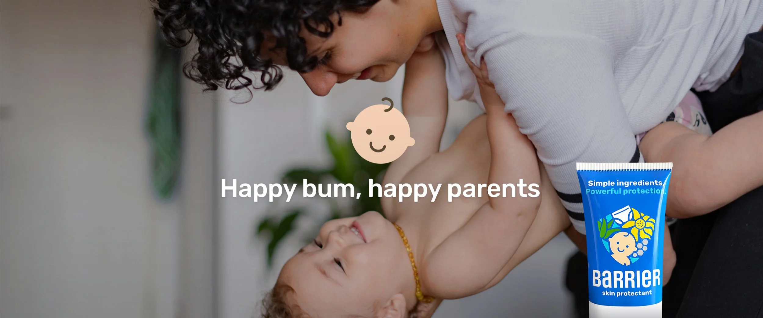
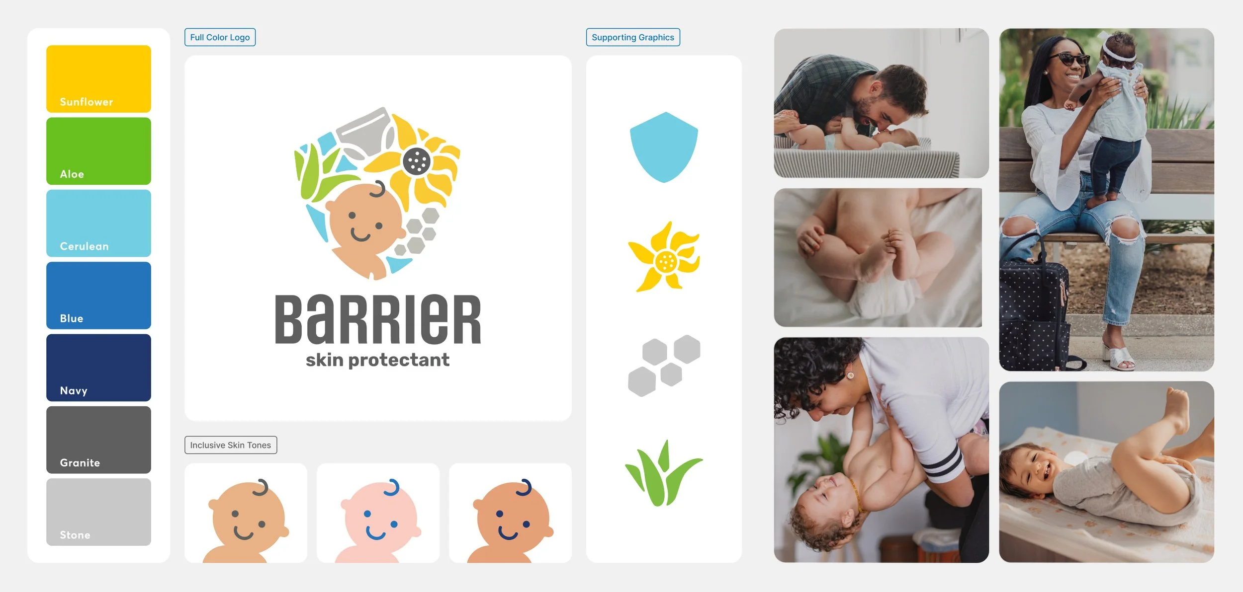
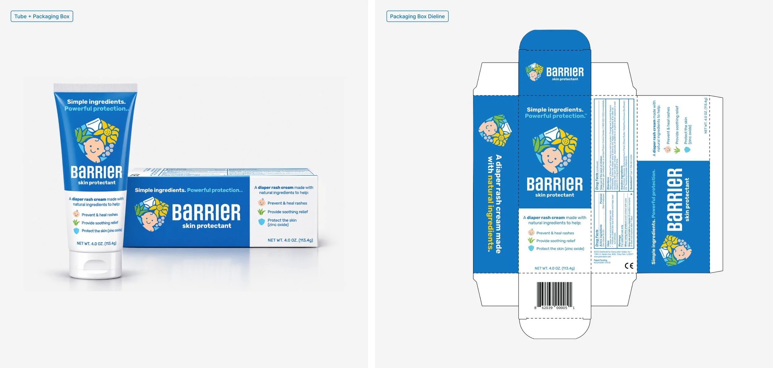
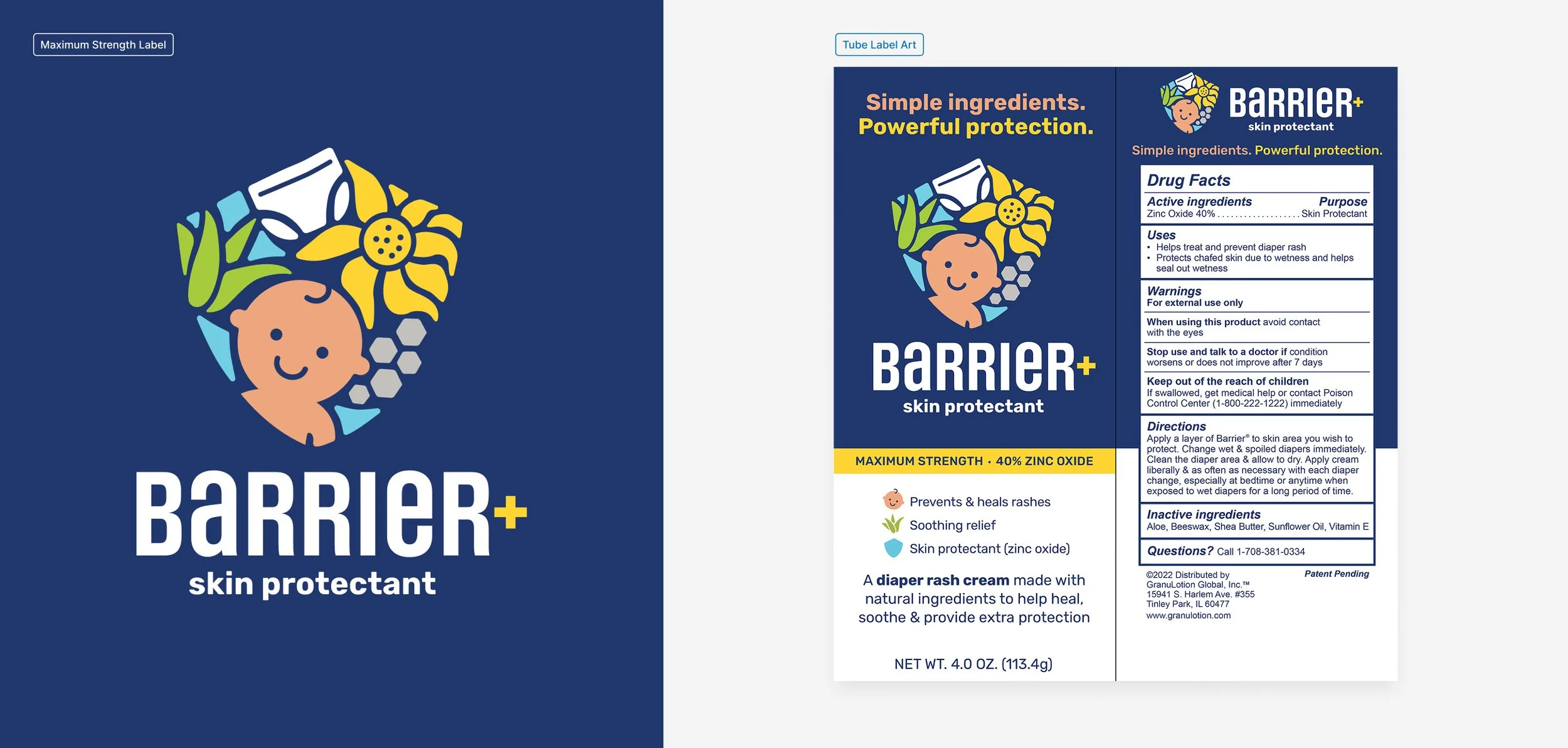
Barrier skin protectant
Challenge: Barrier entered a crowded diaper-rash category dominated by long-established products. The identity needed to stand out to parents while balancing a gentle, natural-ingredient story with the credibility and efficacy expected from a clinically informed skin protectant.
Objective: Create a brand identity that could speak clearly to parents while making the product feel approachable, trustworthy and easy to understand. The system also needed enough personality to stand apart on shelf and across marketing without losing credibility.
Outcome: The identity balanced clinical credibility with a warmer, more approachable visual language. Bright color, simple illustration and natural ingredient-inspired graphics came together around a protective shield mark, creating a recognizable system built around care, protection and product efficacy.
A confident blue palette established trust, while warmer accents, inclusive baby illustrations and supporting graphics added personality and accessibility. Designed to extend across packaging and marketing, this system gave Barrier a distinct, family-friendly presence while keeping the product’s protective purpose clear at every touchpoint.
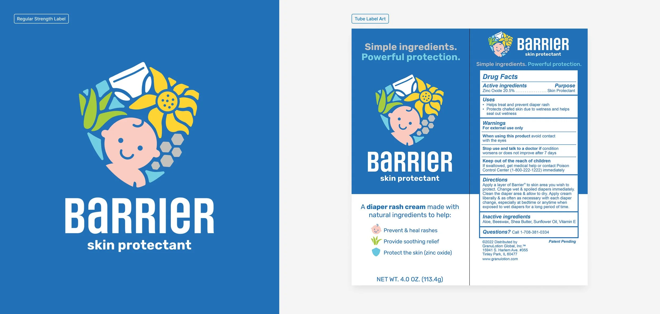
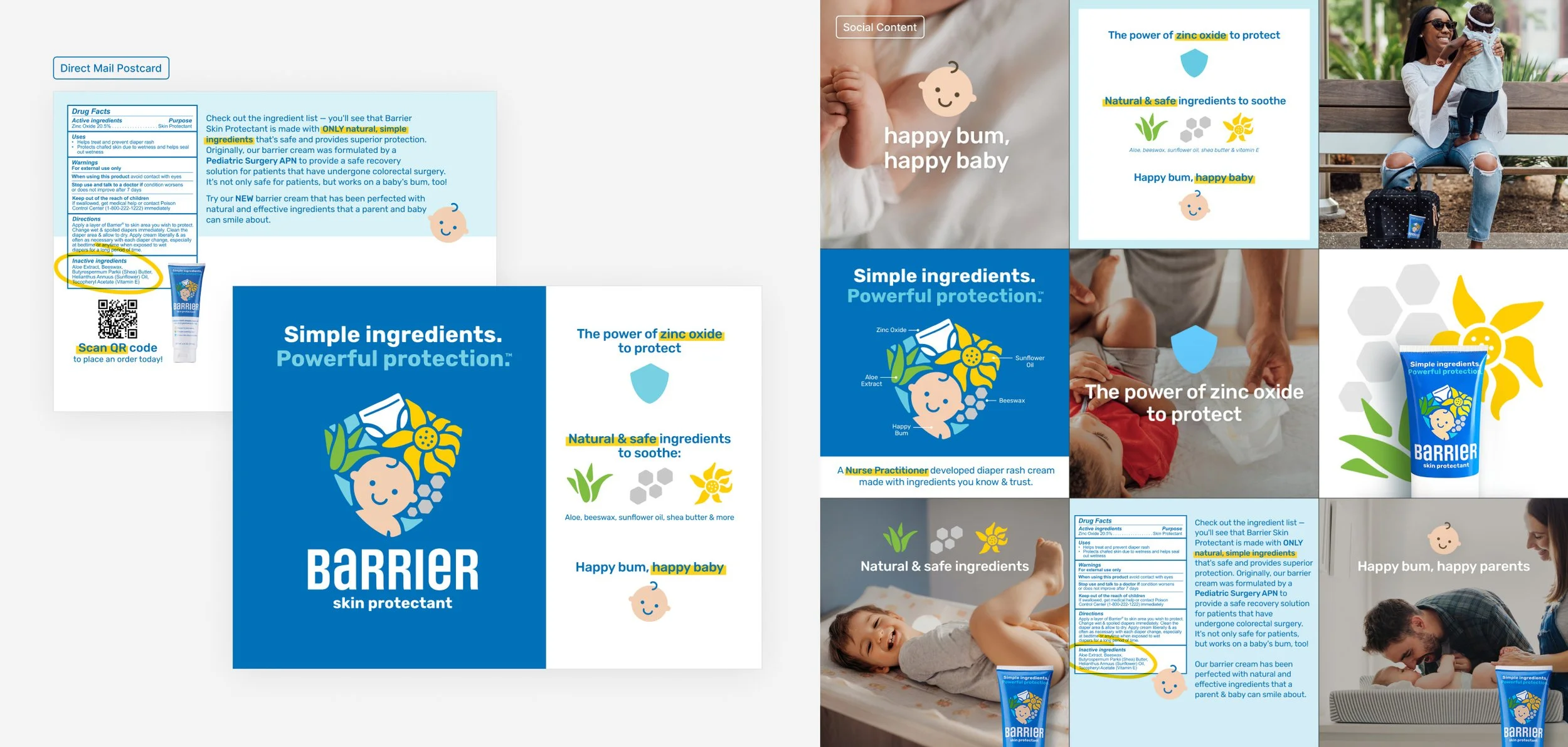
Packaging + marketing
The goal across packaging and marketing was clarity without oversimplification. Product strength needed to be immediately distinguishable, benefits needed to be easy to scan, and the visual language had to remain consistent enough to build recognition across multiple formats. Color became the primary navigation tool, separating Barrier from Barrier+ while the broader identity system maintained continuity across both products.
That same principle shaped the brand voice. Clinical information was translated into direct, approachable messaging that made the product feel easier to understand and more relevant to parents. Across packaging, direct mail and social, the creative system balanced education with personality—giving the brand a clear point of view without compromising credibility.
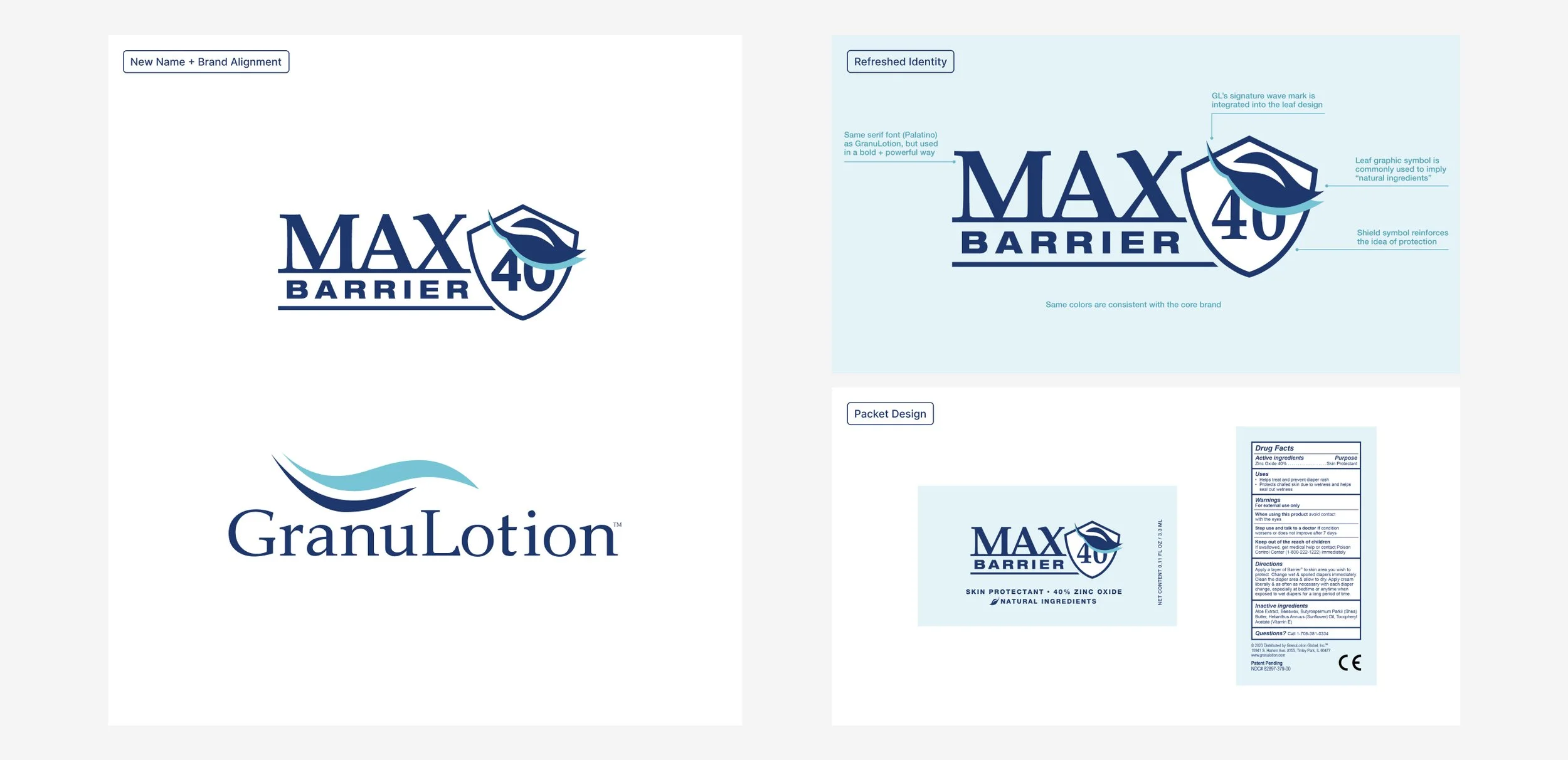
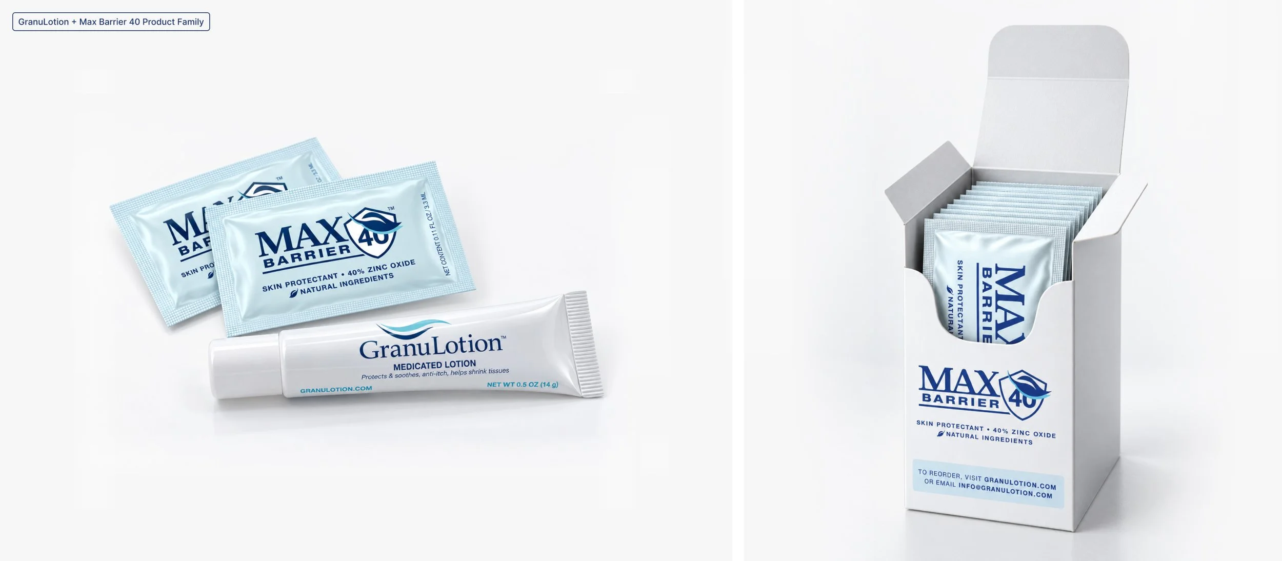
Redesigned as a sister brand to GranuLotion.
As the product matured, its positioning evolved with a clearer understanding of where the strongest opportunity existed. Rather than compete broadly within an already saturated diaper-rash category, the brand shifted closer to GranuLotion’s established medical audience—where the company already had trust, recognition and a highly relevant customer base.
Barrier then became Max Barrier 40, with the identity redesigned to feel more clinical, credible and connected to the GranuLotion family. Shared typography, color and the signature wave created visual continuity between the two brands, while the shield, leaf and “40” established a distinct product identity of its own. The result was a more focused brand architecture that strengthened the relationship between the products without making them feel interchangeable.
↓ Full design scope